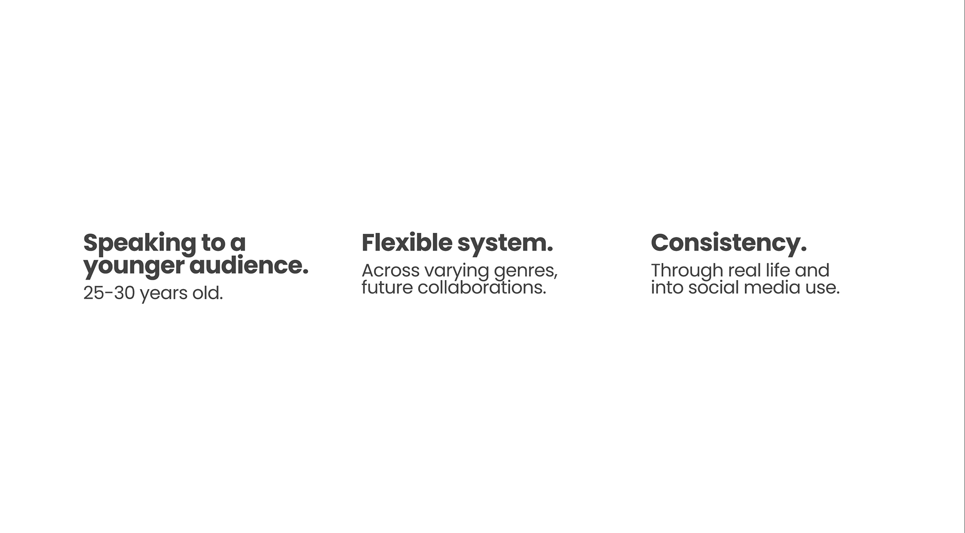
As part of the R/GA x SCAD Studio II course, our team collaborated with industry professionals from R/GA to reimagine the branding of Rock in Rio, one of the world’s largest music festivals, as it approached its 40th anniversary. The goal was to modernize the festival's identity to appeal to a younger audience while honoring its history, embracing diverse musical genres, and highlighting its commitment to environmental sustainability.
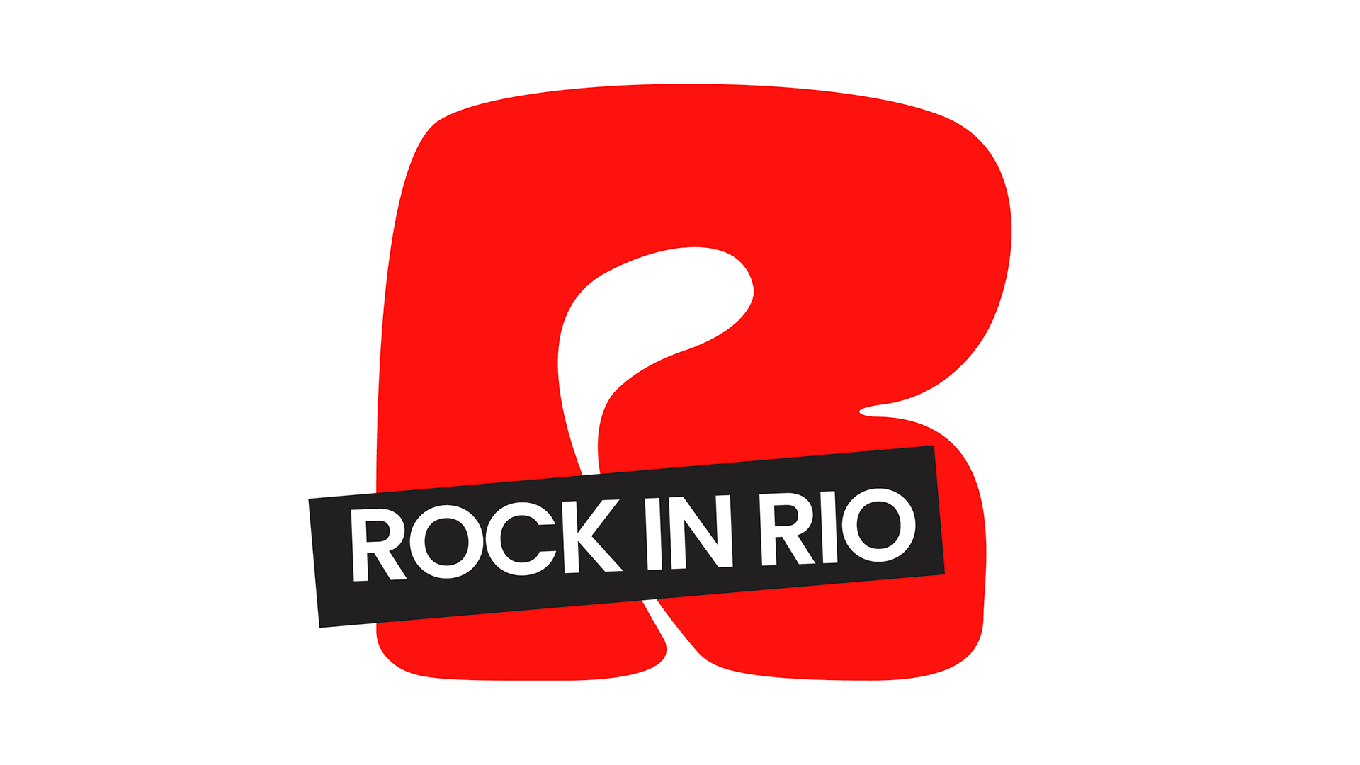
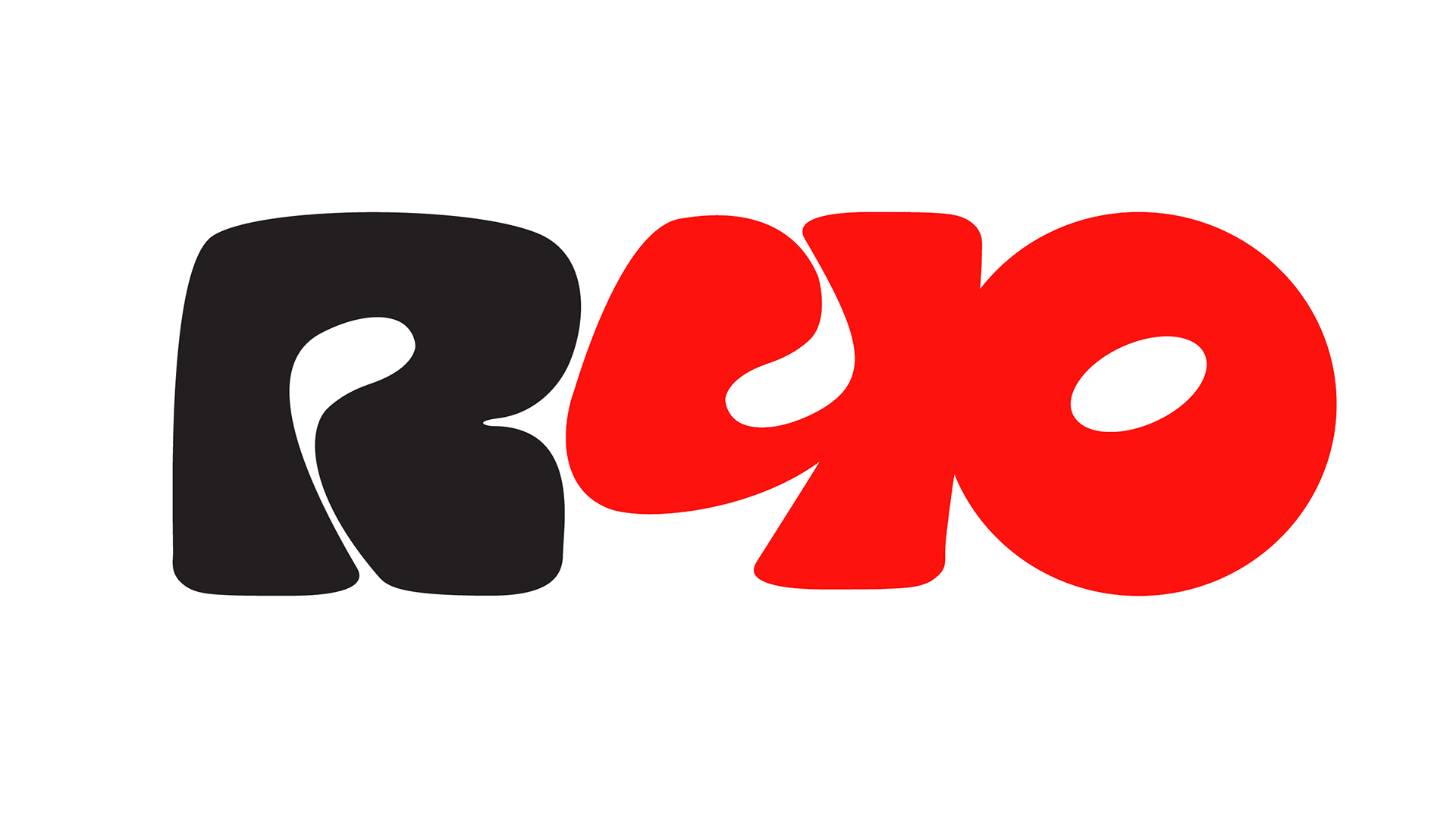
Logo
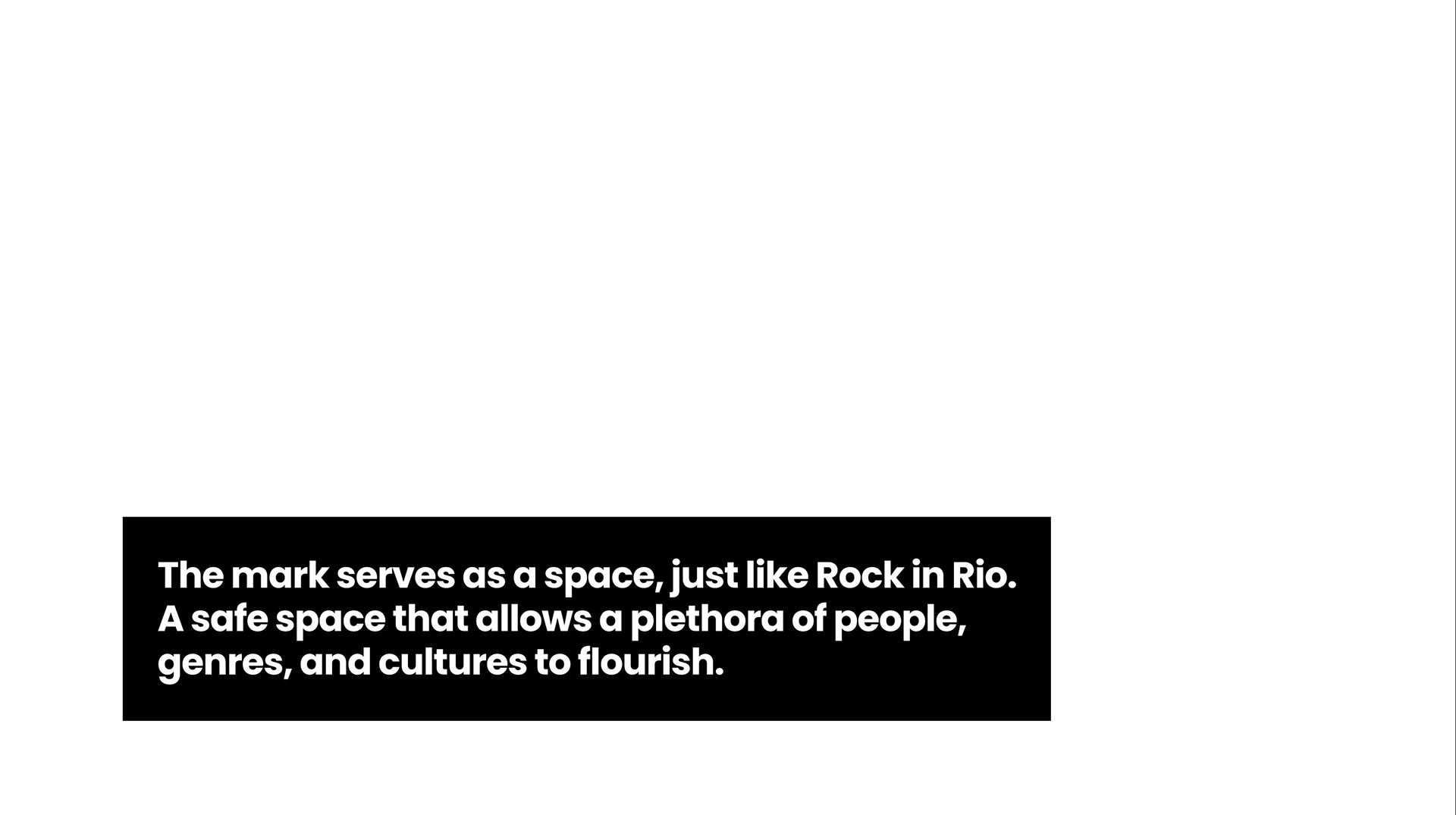
For our rebrand, we developed a new mark that embodies this spirit, serving as a safe haven where all genres, artists, and fans can unite. The design is round and friendly, reflecting inclusivity, energy, and the welcoming nature of the festival. This shape not only symbolizes unity but also creates a dynamic, adaptable identity that resonates across digital, physical, and environmental applications.
Motion
As Motion Lead, I created dynamic stage screen animations that enhanced the live concert experience, bringing energy and immersion to each performance. I also developed social media visuals, ensuring a cohesive and engaging brand presence across digital platforms.
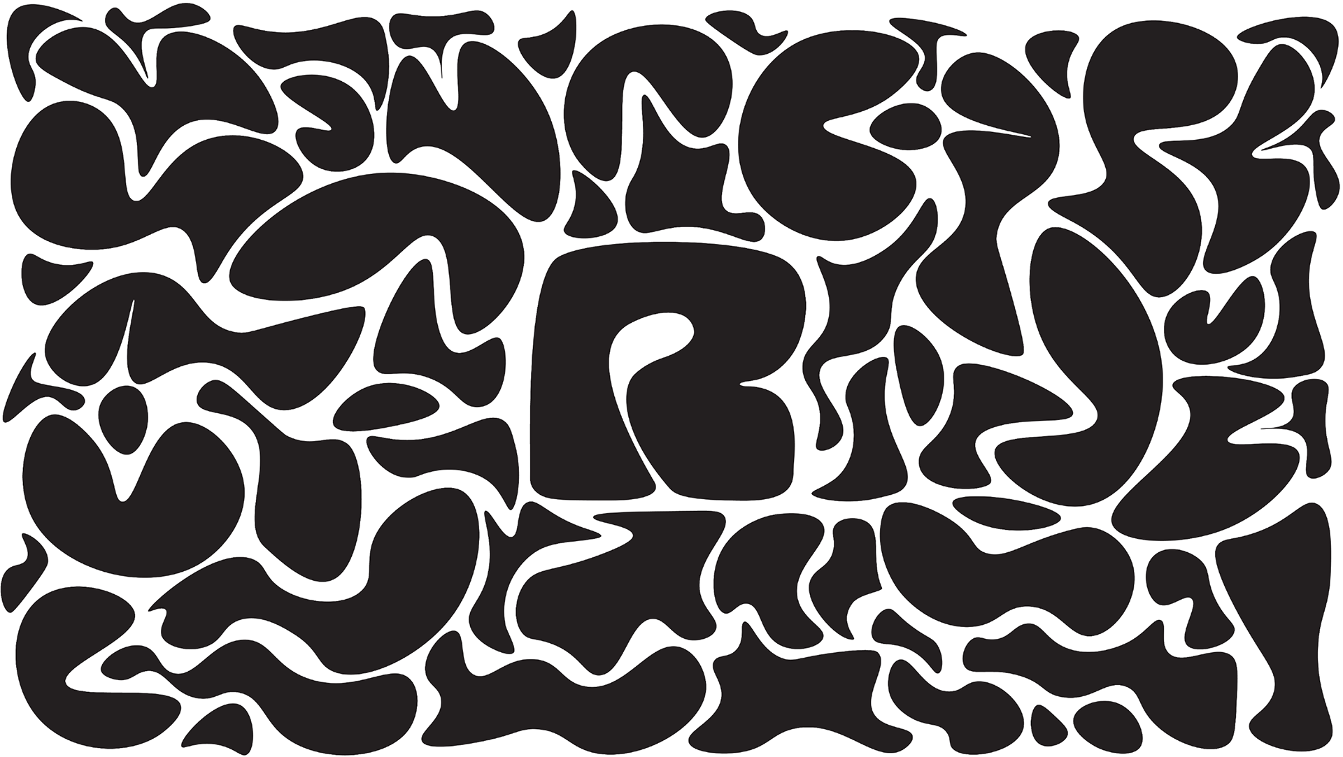
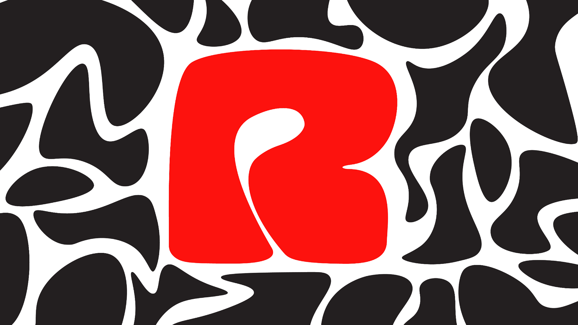
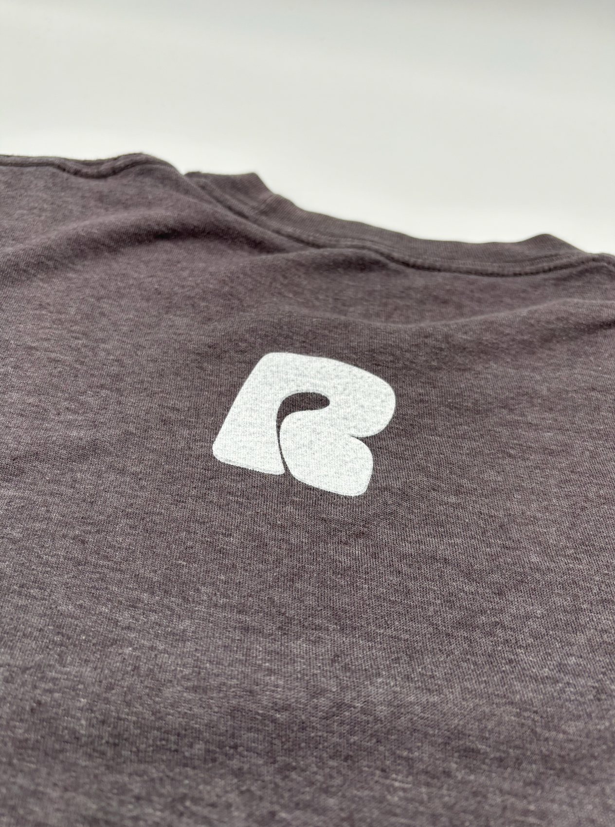
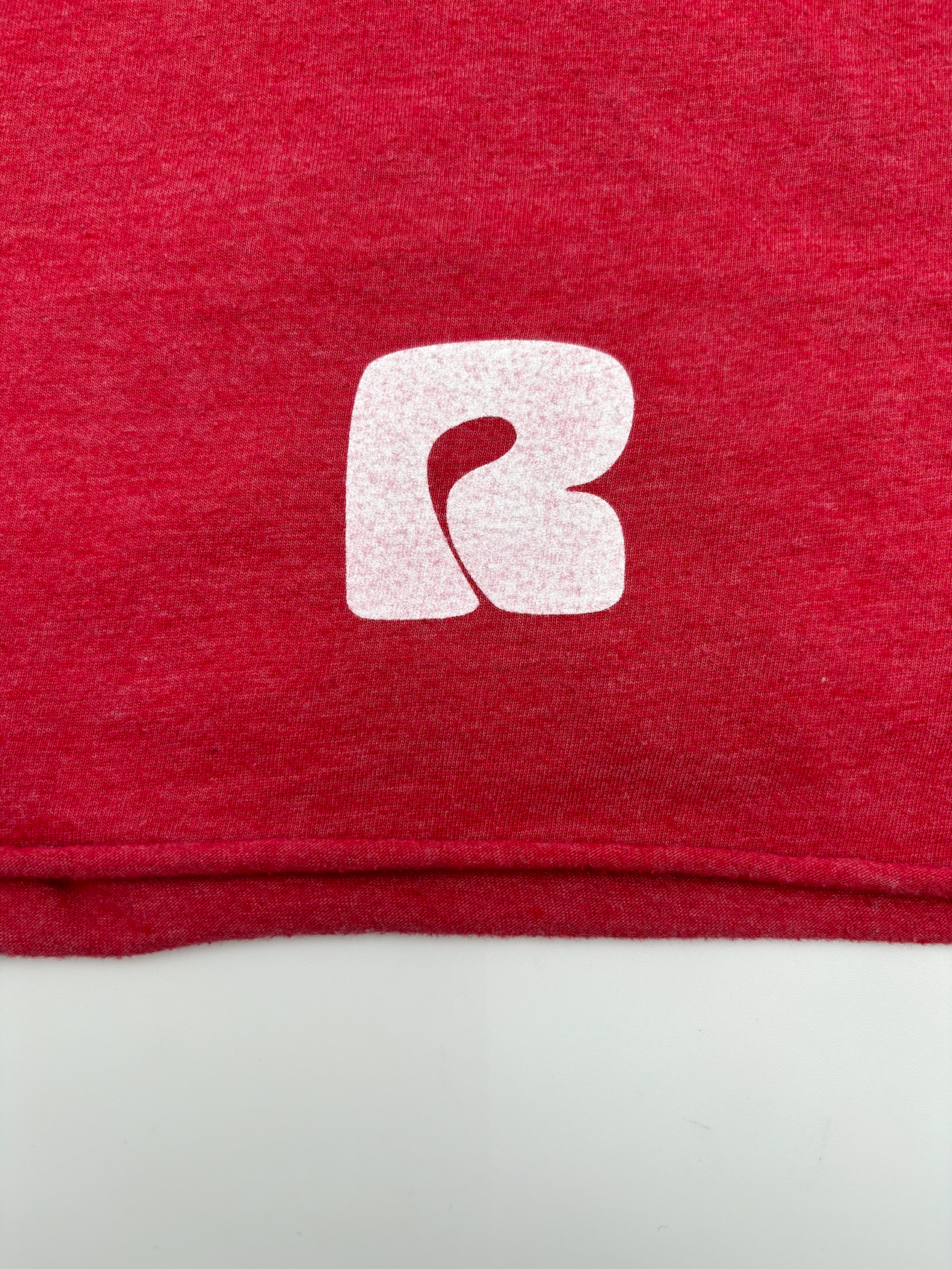
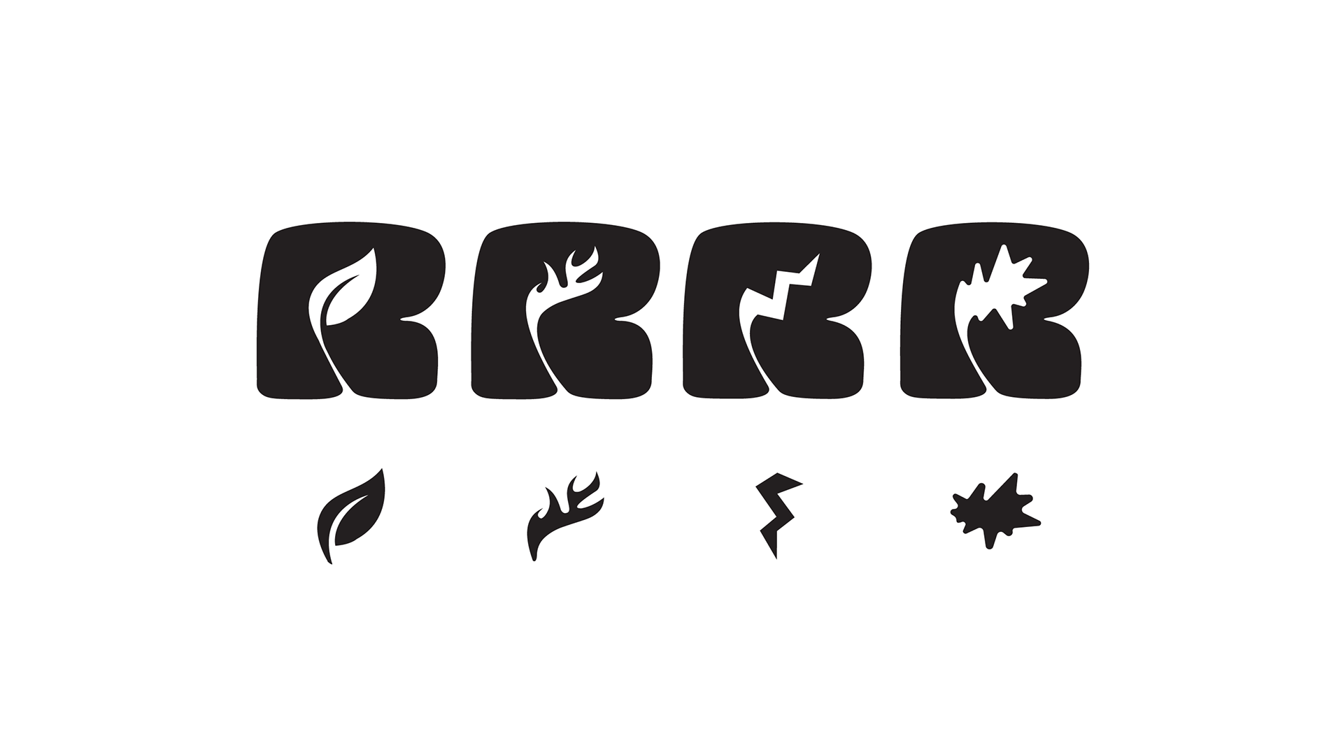
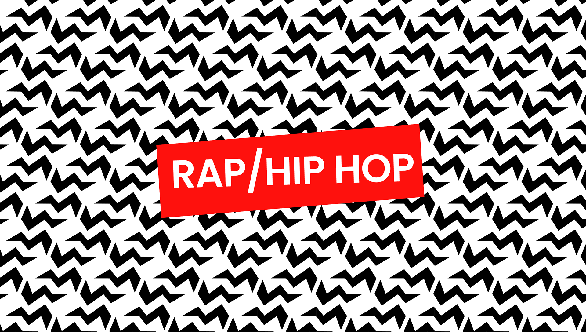
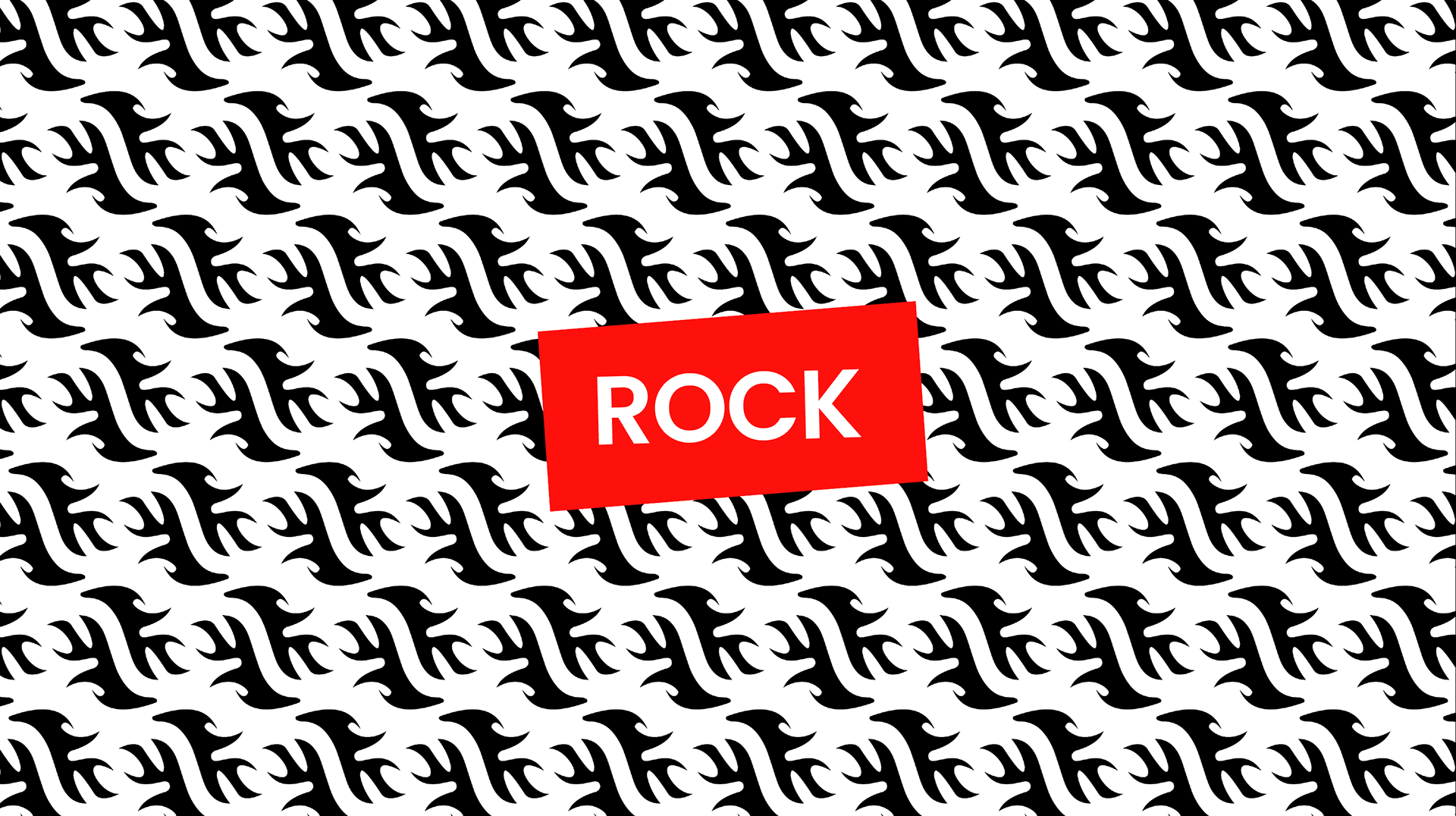
Counter of our "R"
A defining feature of our rebrand is the counter of our "R", which serves as a dynamic shape that adapts to different festival elements. This negative space was transformed into a versatile icon system, representing Rap, Pop, Rock, and a leaf for sustainability, reinforcing Rock in Rio’s diverse musical genres and its commitment to environmental responsibility.
System
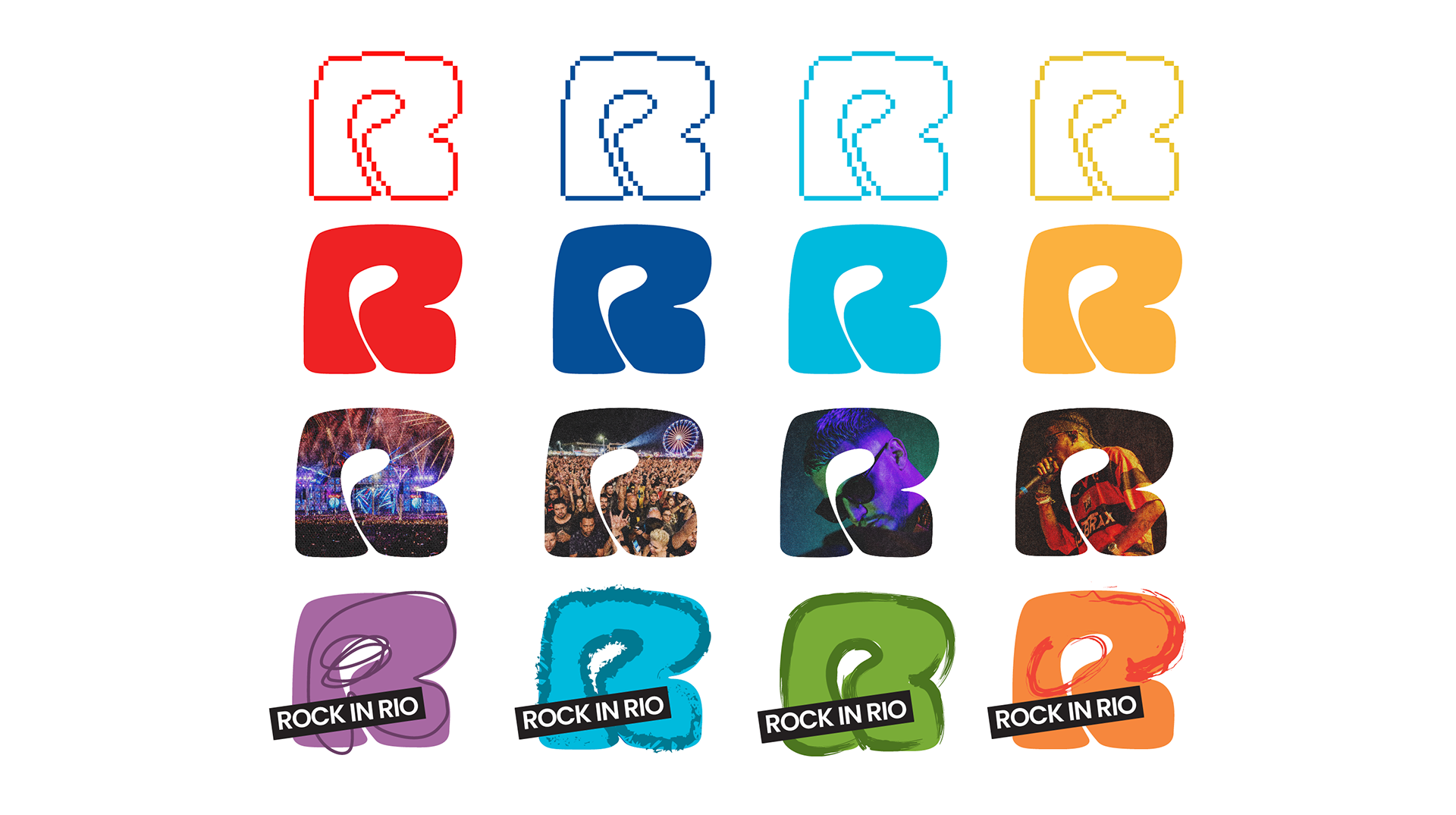
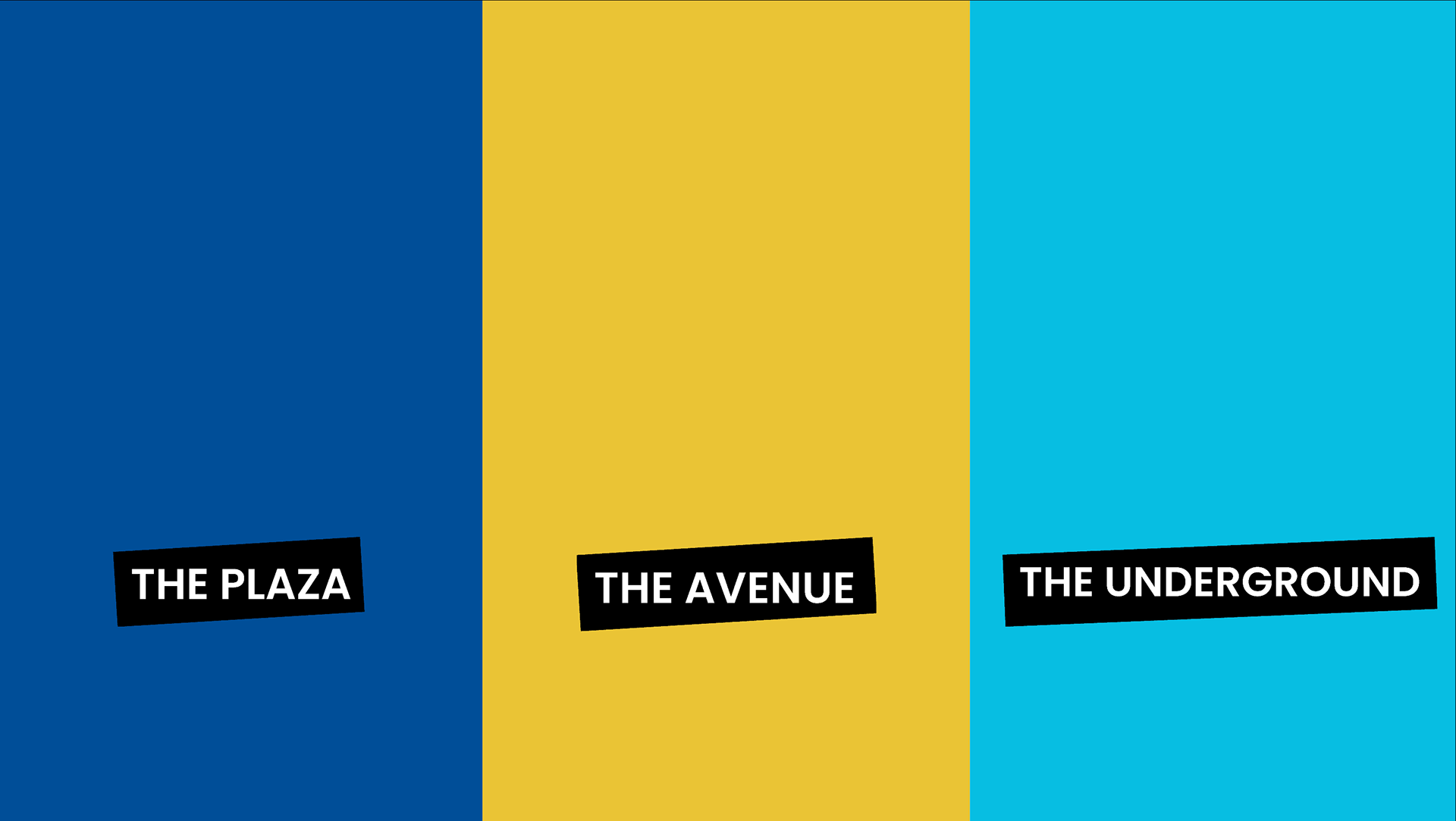
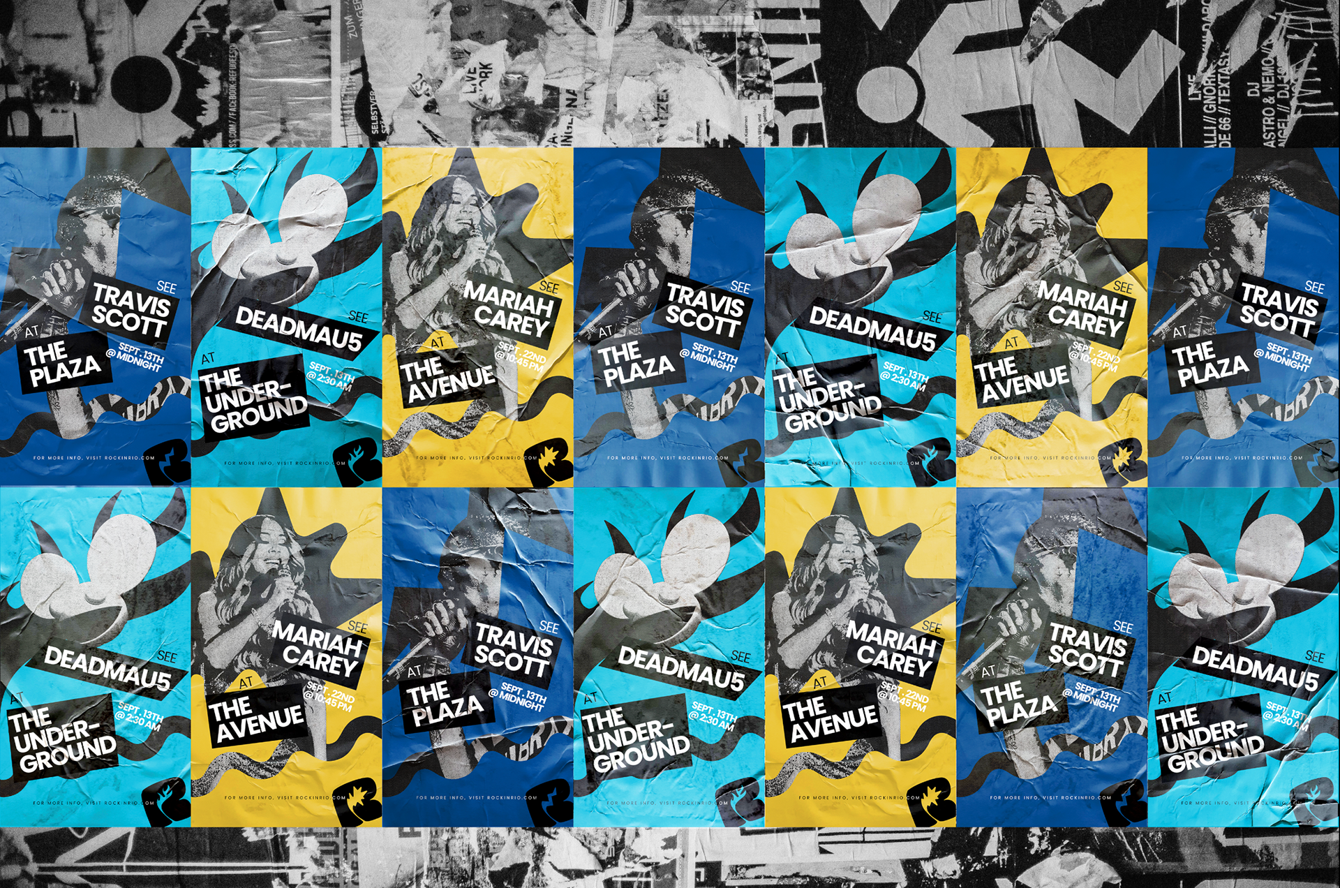
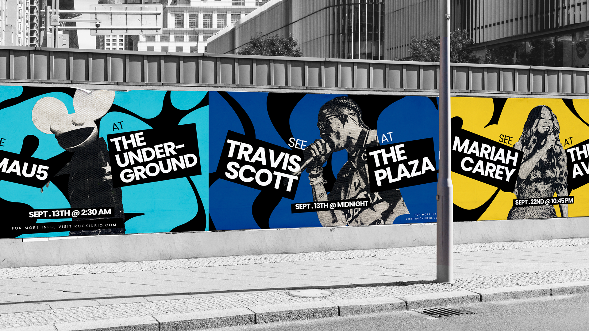
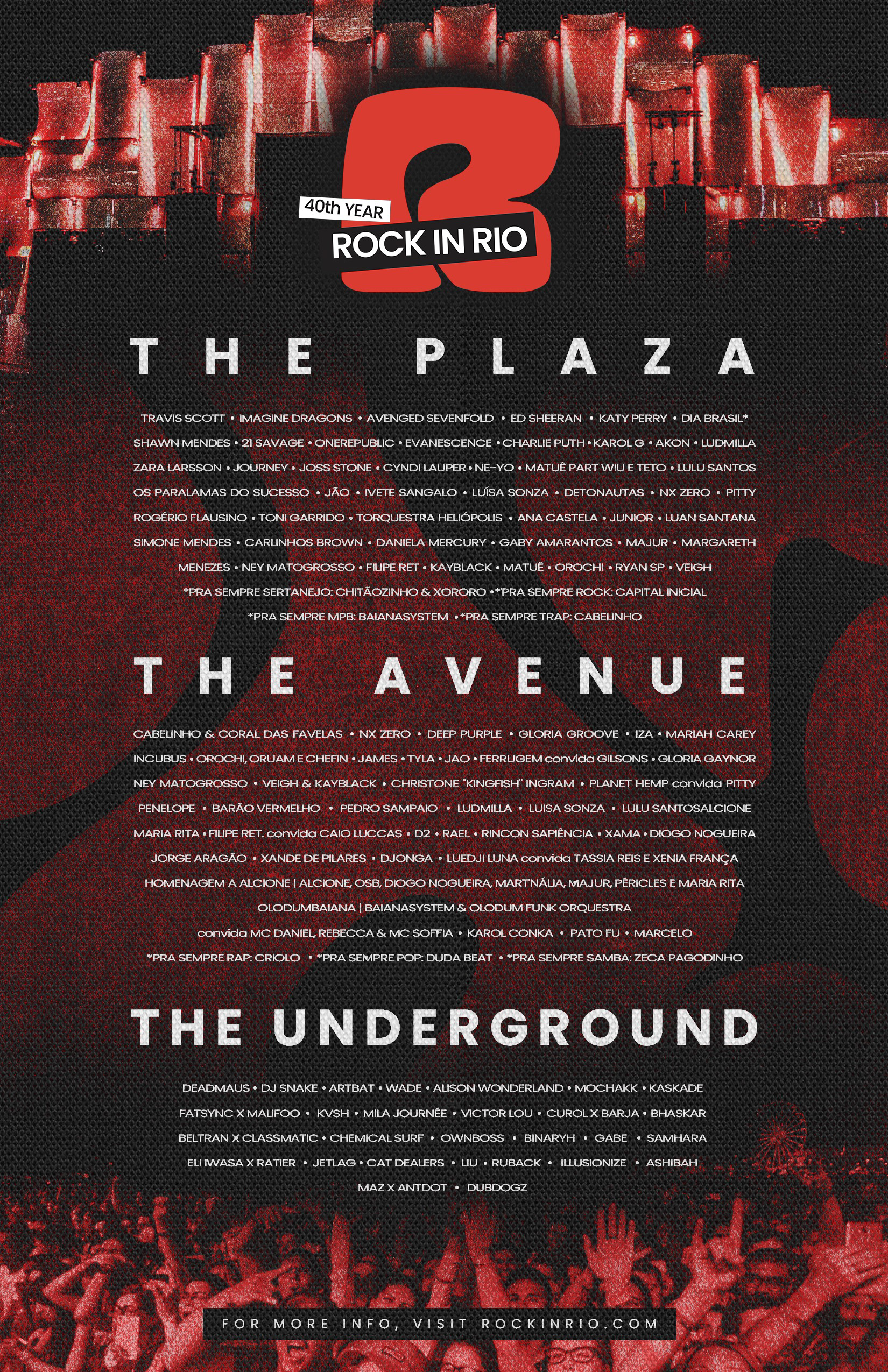
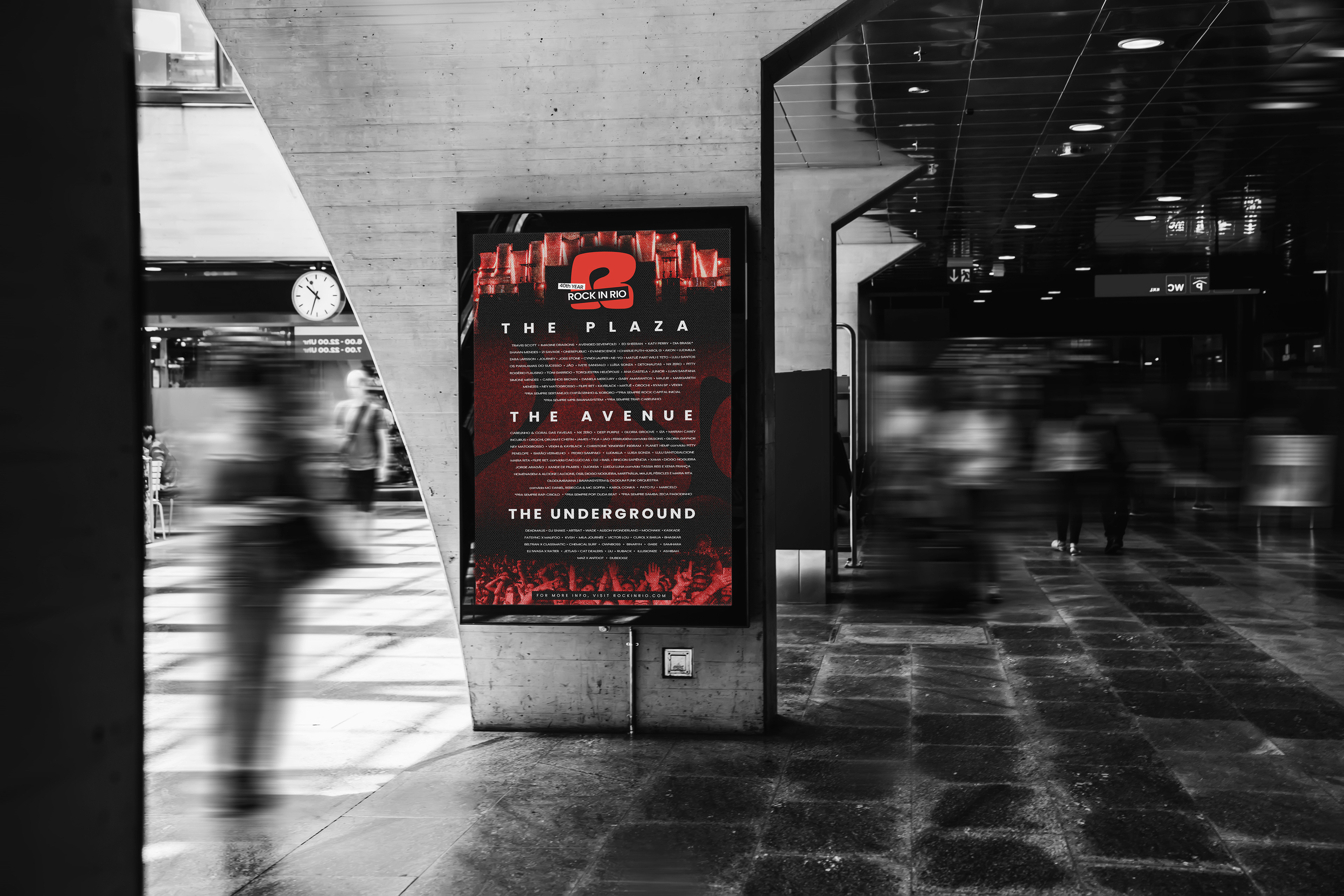
We established a bold and modern visual identity that reflects the festival’s energy and inclusivity. Our primary color palette—red, black, and white—reinforces the festival’s iconic and dynamic presence, while our secondary colors— blue, yellow, and teal—add vibrancy and versatility across applications. We also renamed the festival’s main stages to create a stronger sense of place. The stages are now The Plaza, The Avenue, and The Underground, each reflecting a distinct atmosphere within the festival experience.


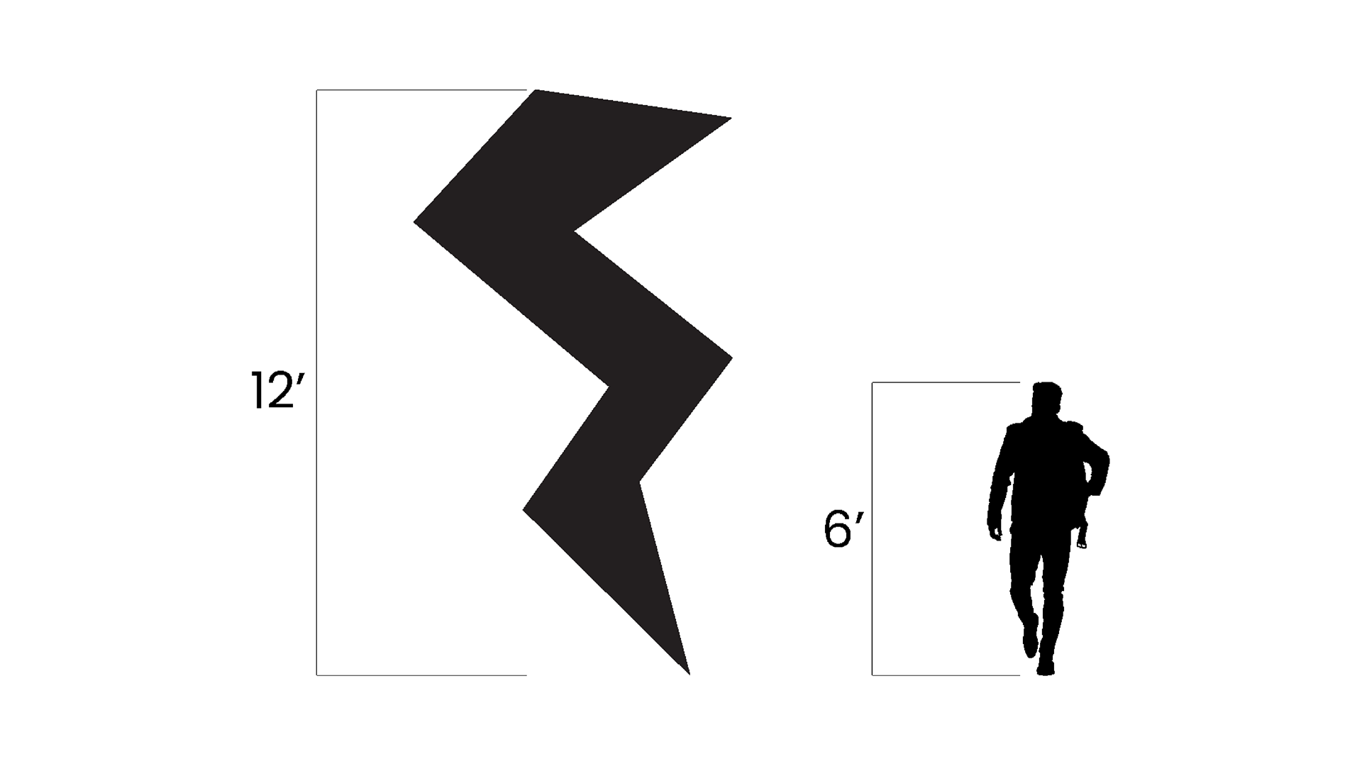
Wayfinding
To ensure a seamless festival experience, we extended this iconography into the wayfinding system. The same shapes from our icons, such as the lightning bolt, were used as directional signage throughout the festival grounds. These forms create a cohesive visual language, making navigation intuitive while reinforcing the festival’s energetic and bold identity.


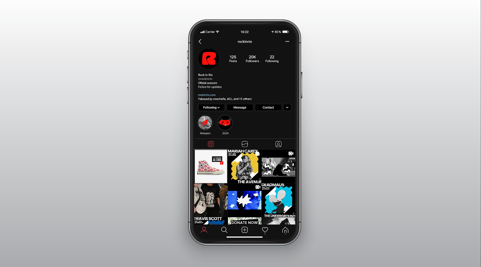
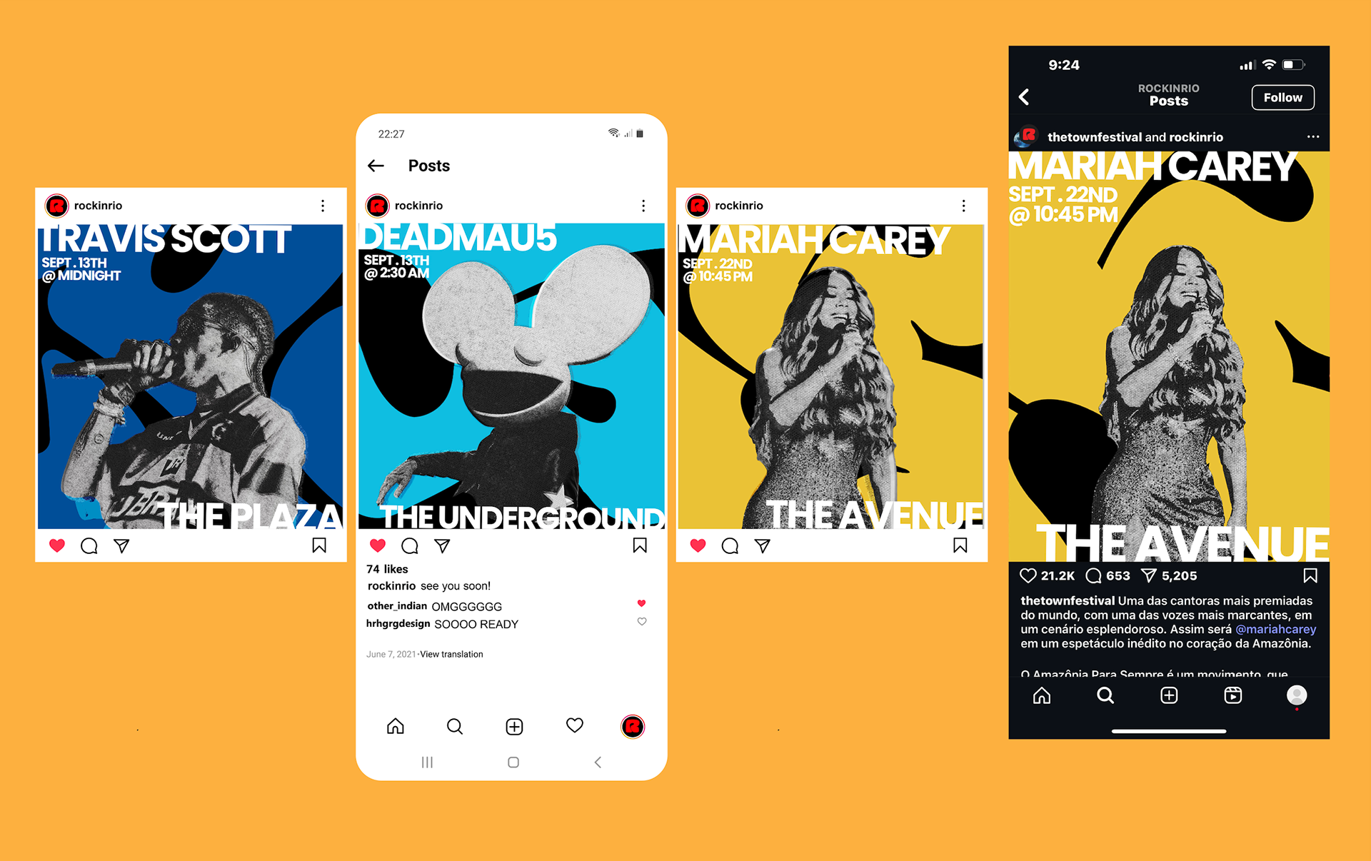
App Design
We also redesigned the Rock in Rio app, creating a sleek, user-friendly interface that enhances the festival experience. The app incorporates the new brand identity with bold typography, vibrant colors, and motion elements, making navigation engaging and intuitive. Key features include personalized schedules, real-time updates, and exclusive AR experiences that bring the festival to life.
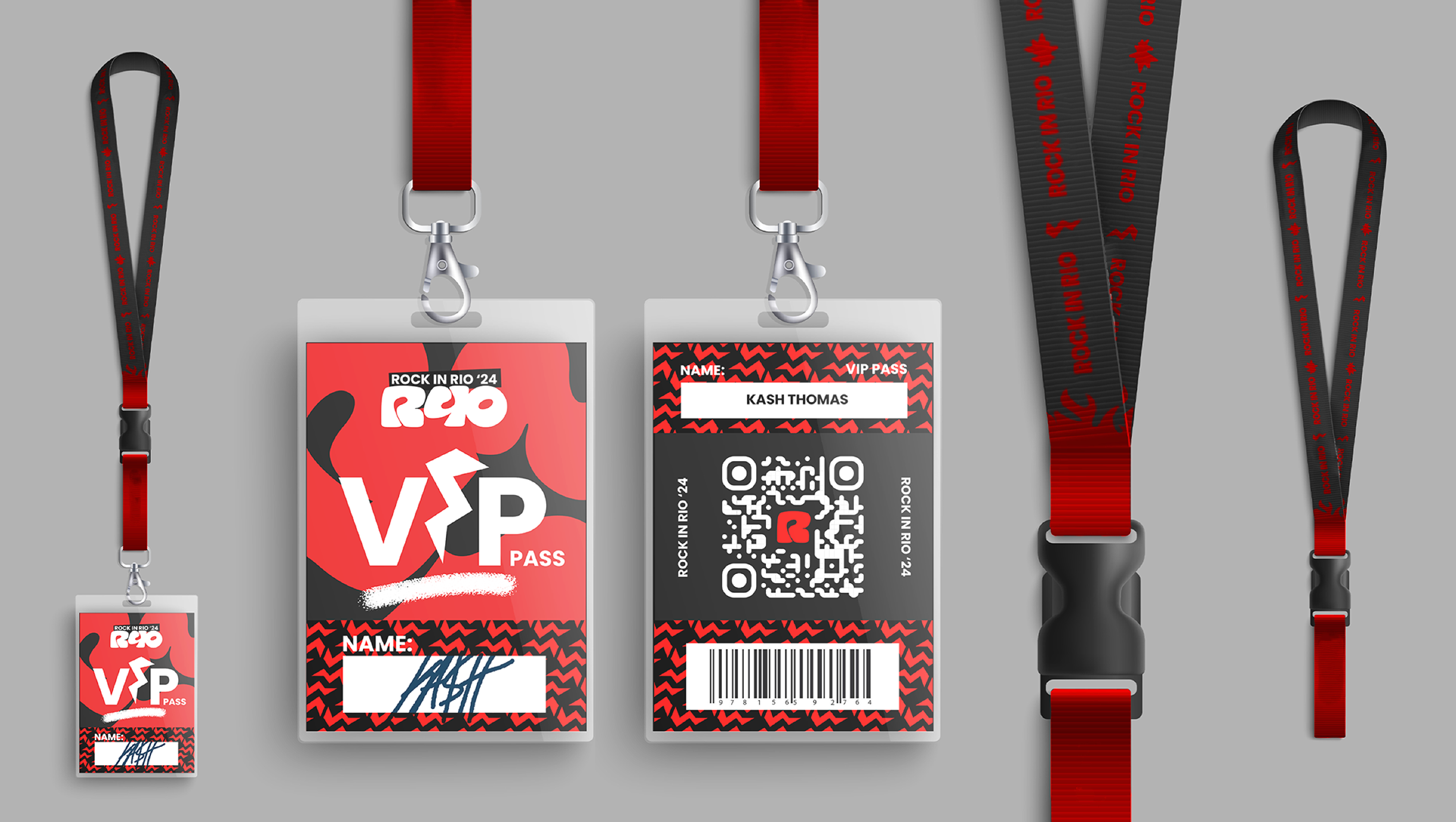
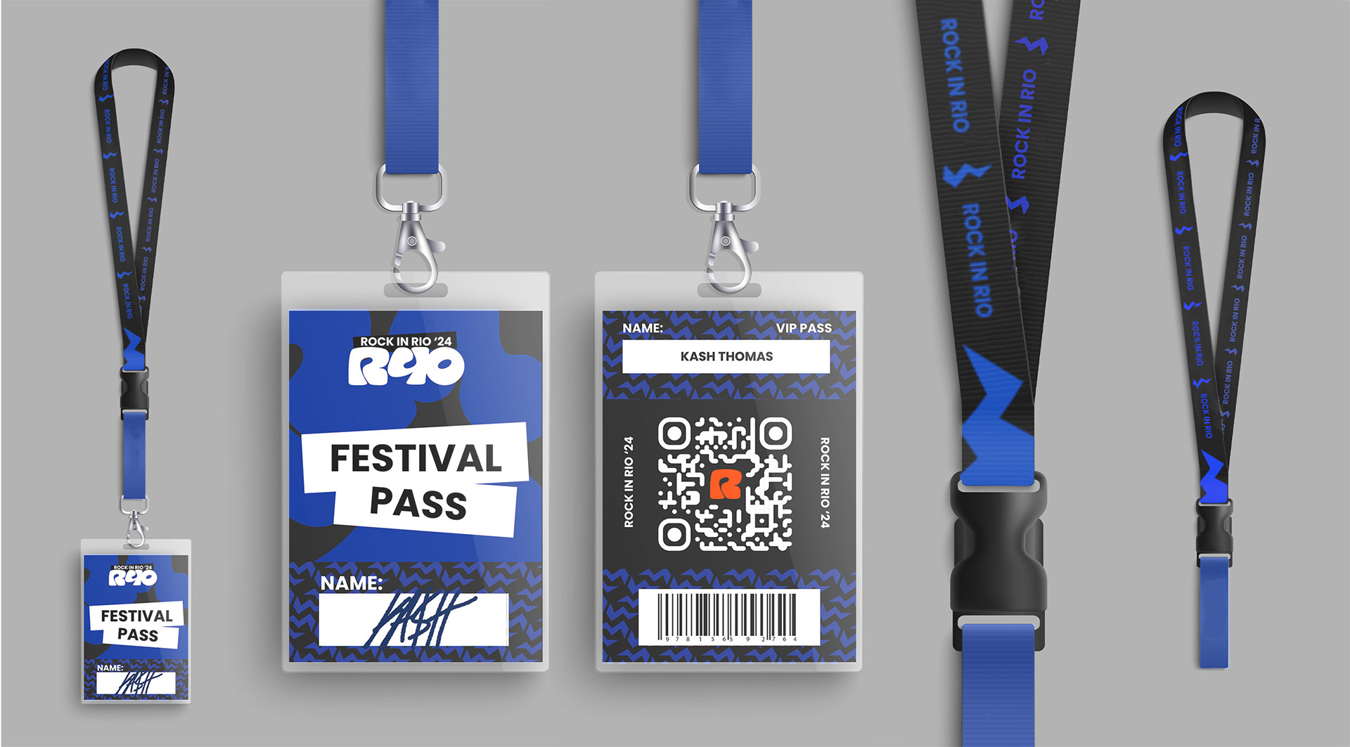
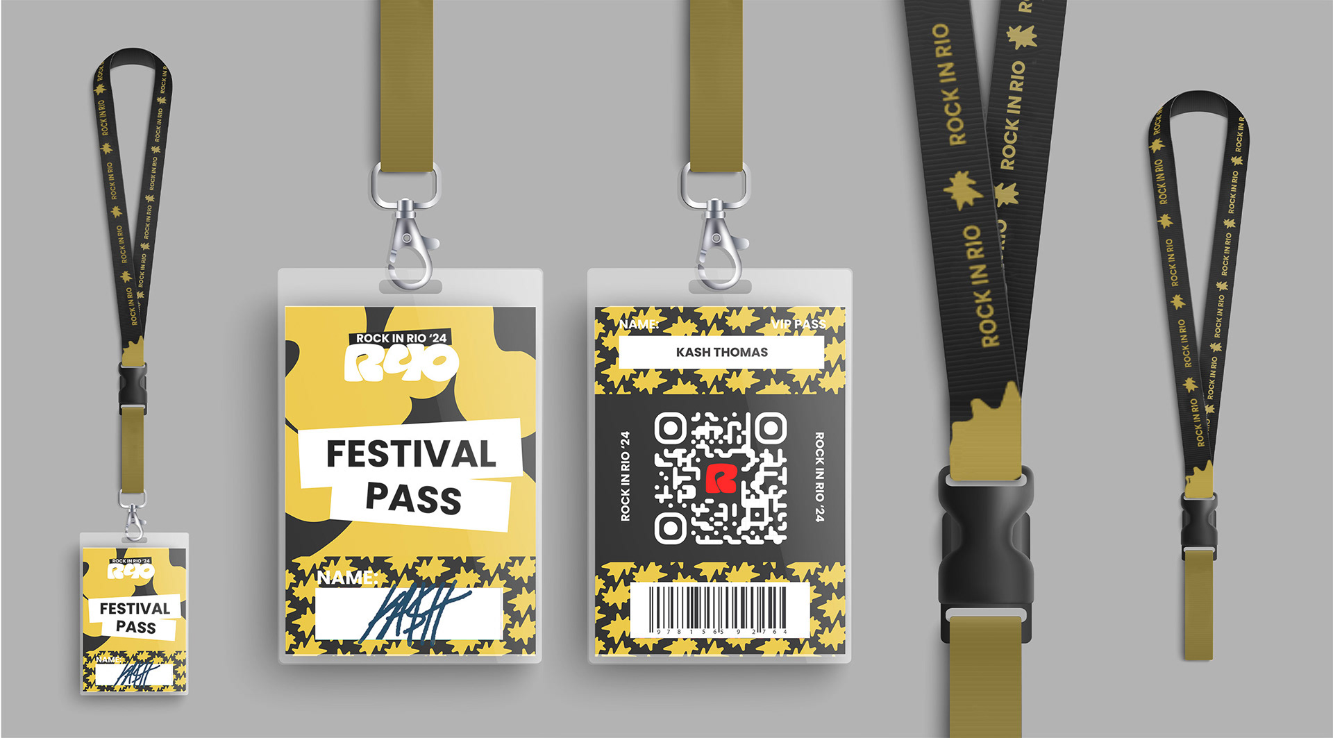
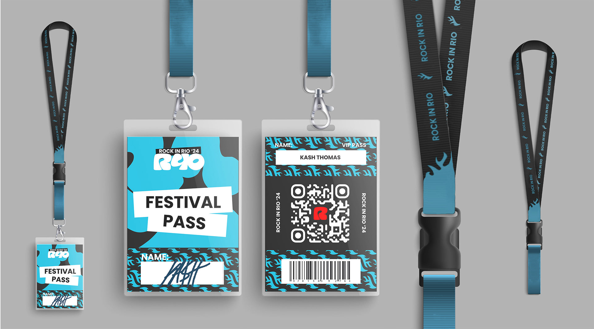
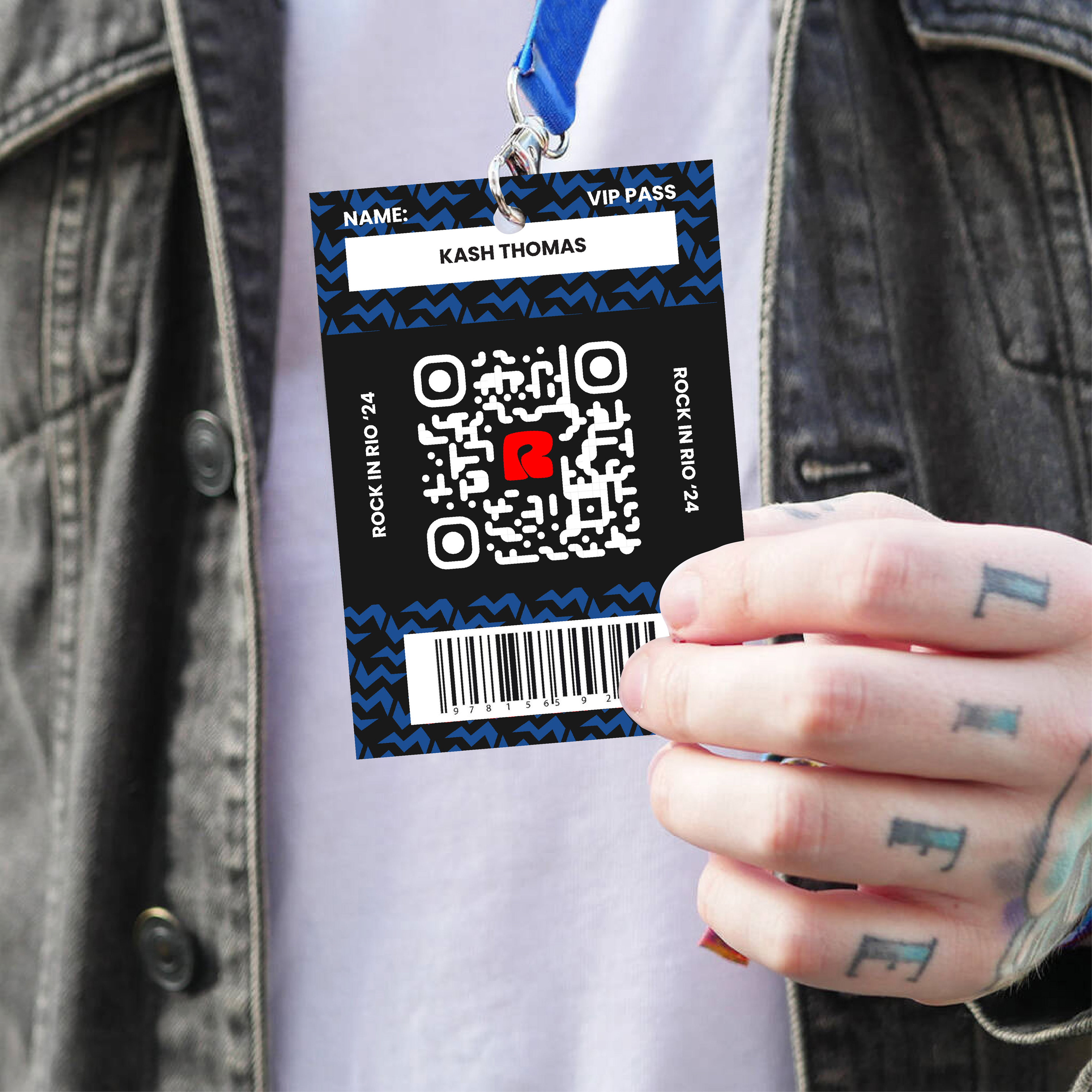
Badges
A distinctive aspect of our rebrand is the VIP and General Admission badge system, designed not just for identification but as a conversation starter. VIP badges are bold red, reinforcing the festival’s core identity, while General Admission badges feature secondary colors— blue, yellow, and teal—creating a striking contrast that naturally encourages festivalgoers to engage with one another. This intentional design choice invites curiosity and interaction, sparking conversations among attendees while making the badges a recognizable and integral part of the Rock in Rio experience.
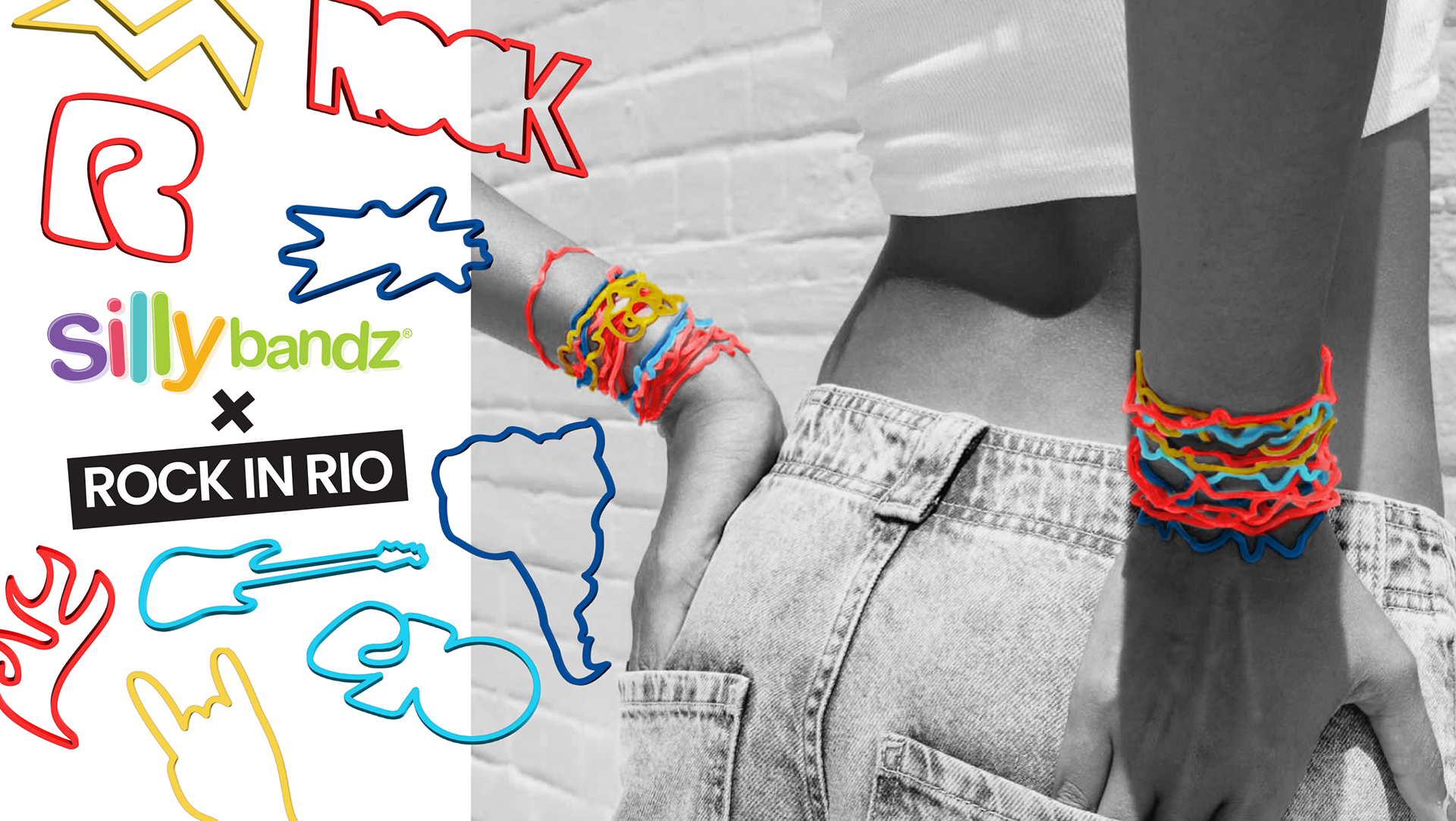
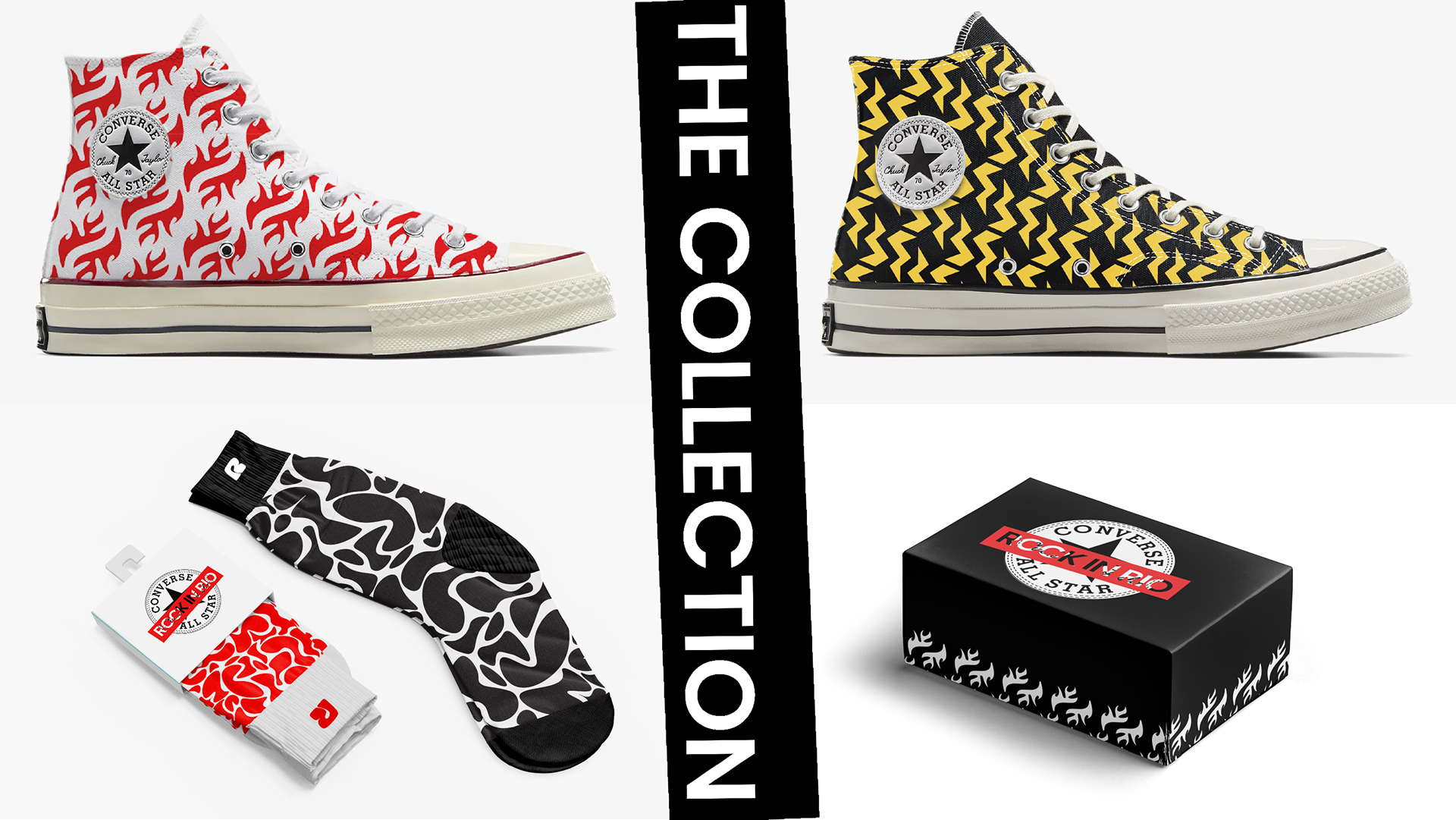
Collaborations
One of the festival’s most recognizable landmarks is the giant Converse sneaker statue, a symbol of both rock culture and youthful rebellion. This inspired us to explore an official Rock in Rio x Converse collaboration, seamlessly tying the festival’s brand to a globally recognized name in music and streetwear. We also introduced a Rock in Rio x Silly Bandz collaboration, bringing a nostalgic yet fresh take on festival culture wristbands.
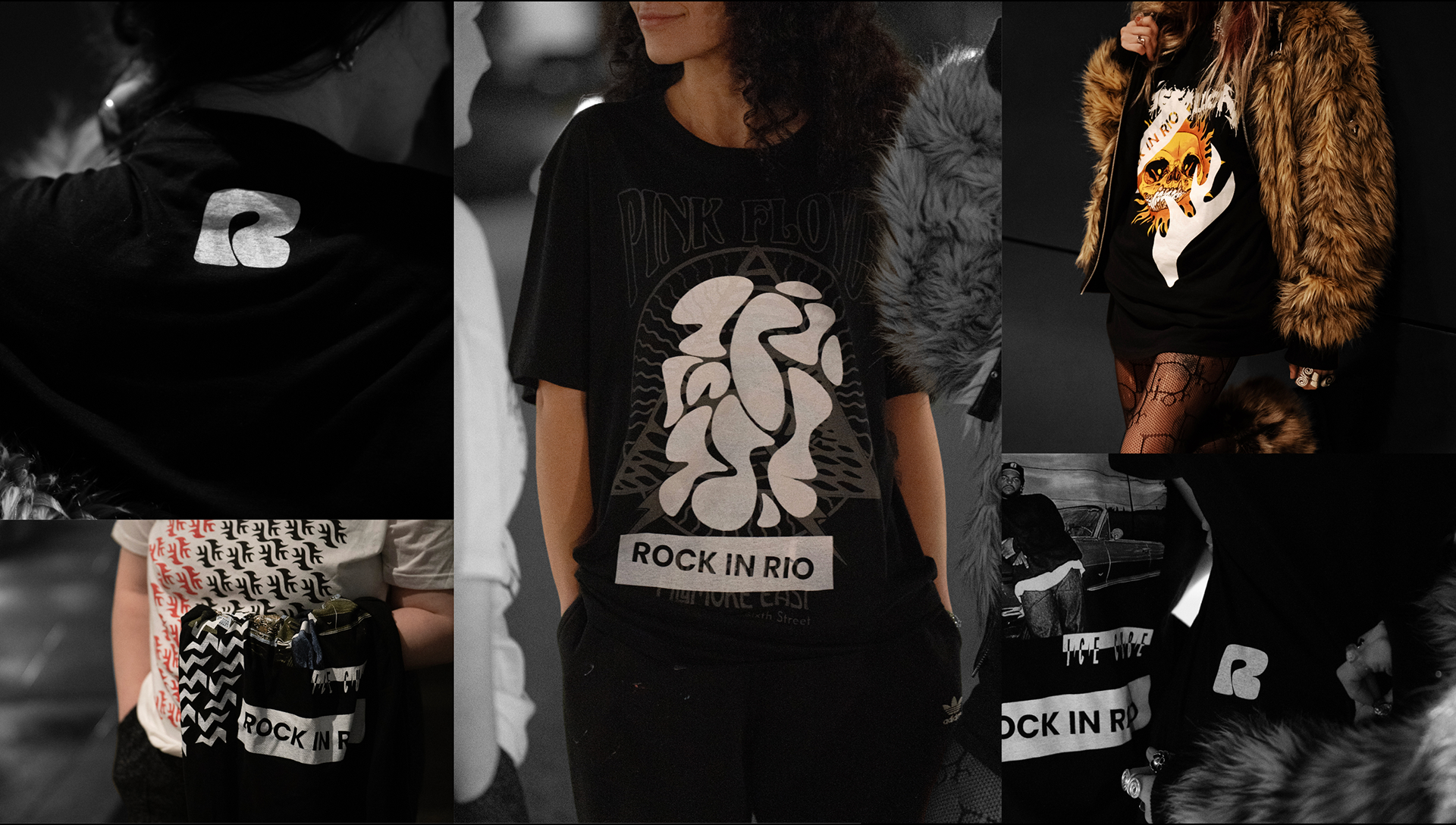
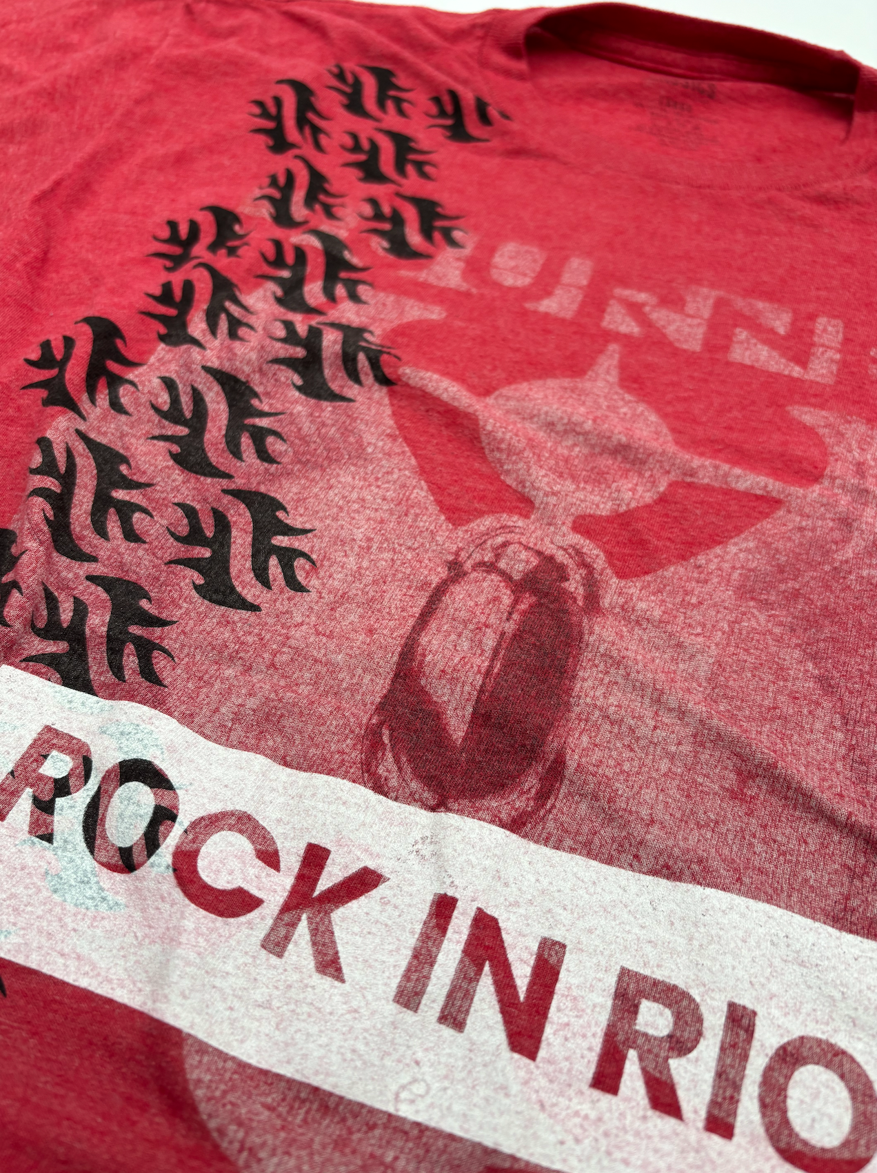
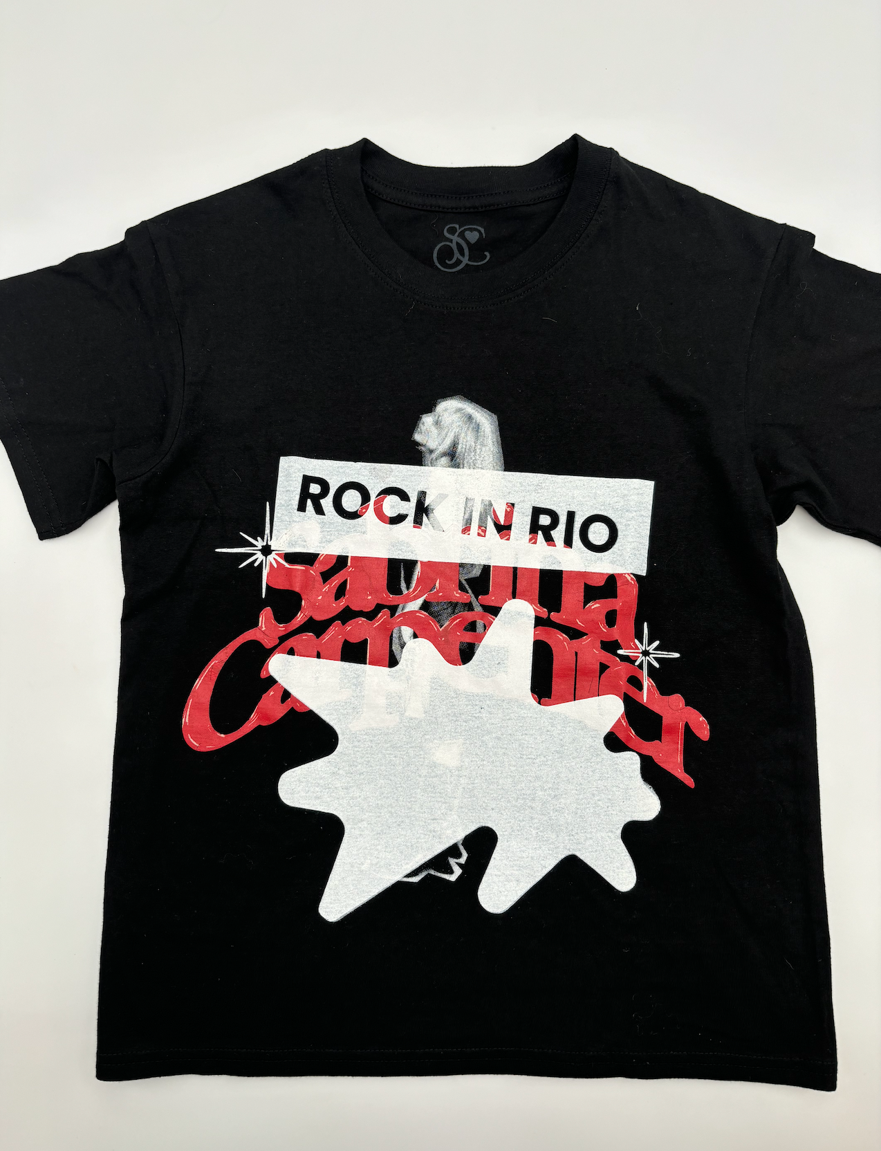
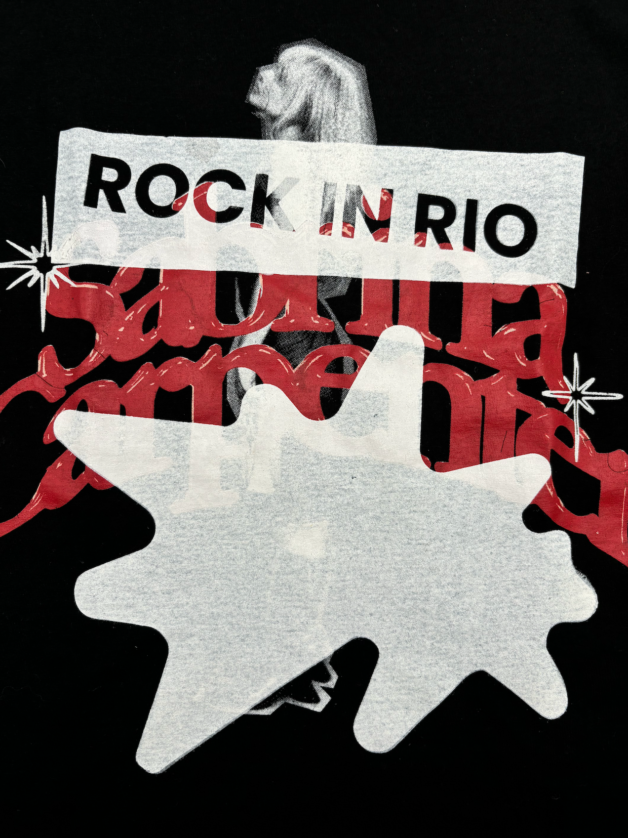
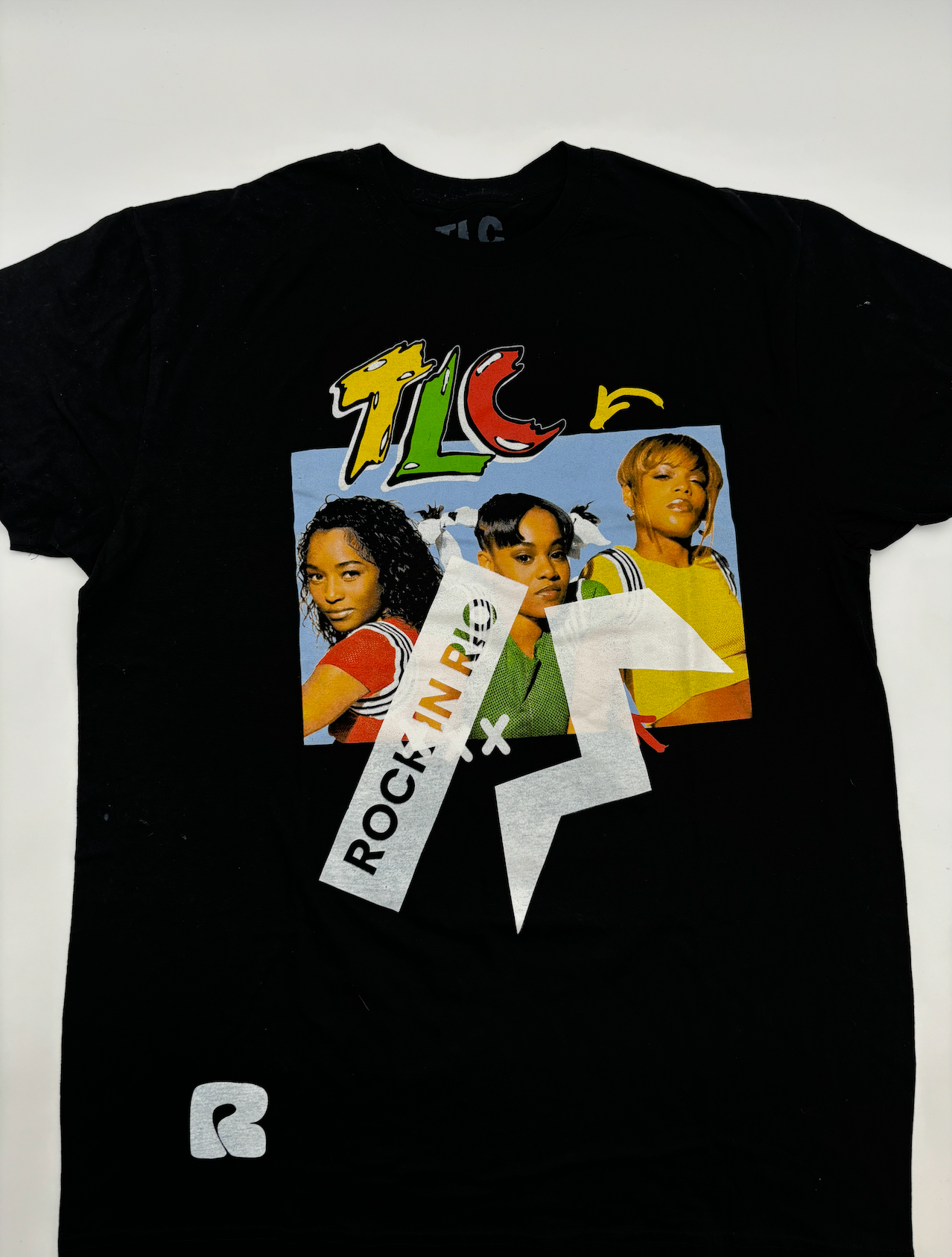
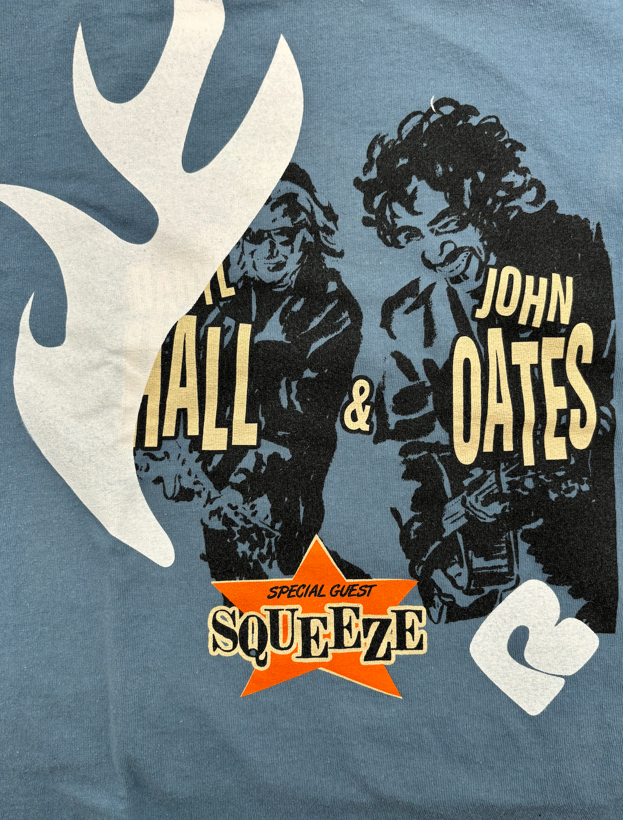
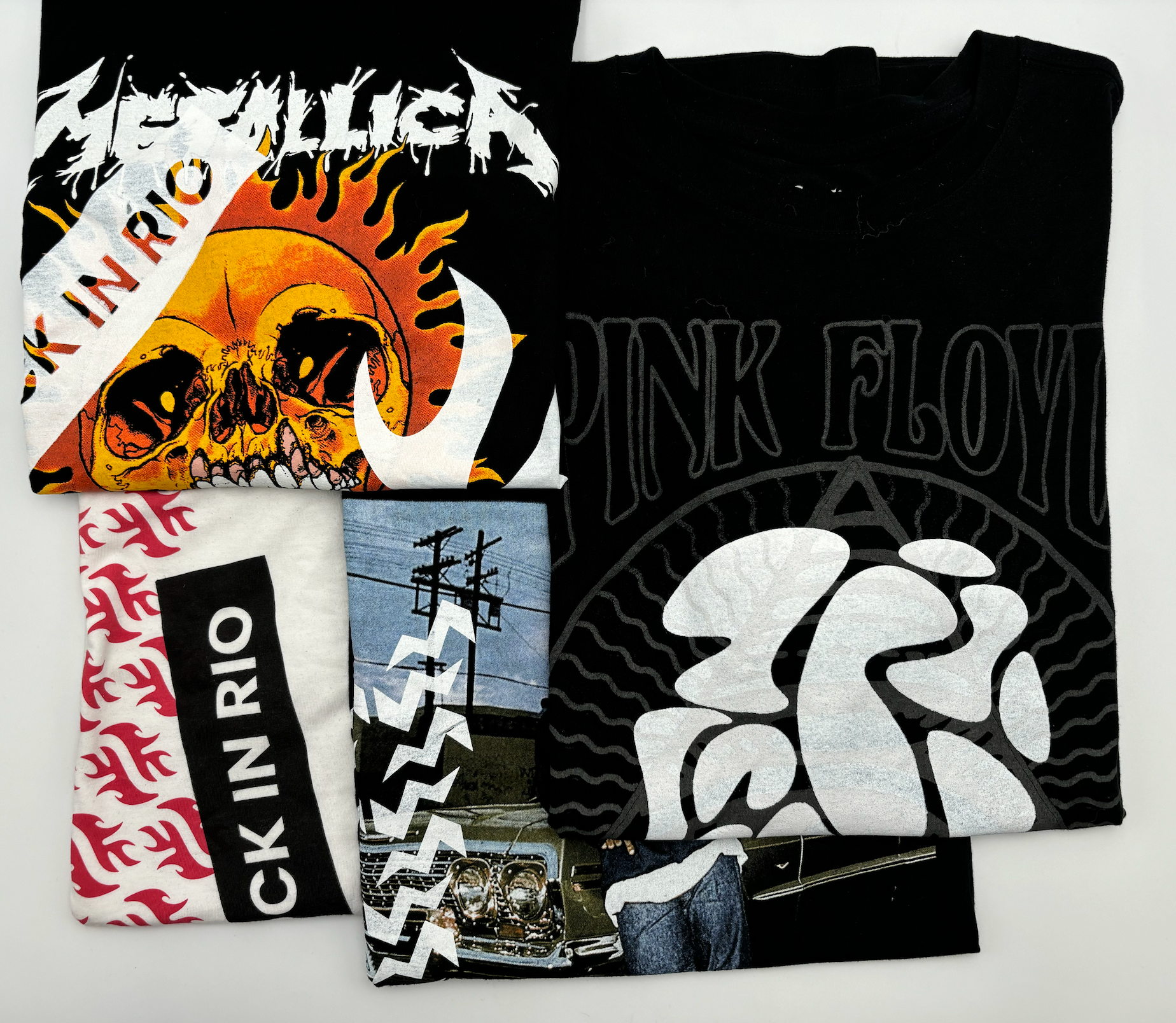
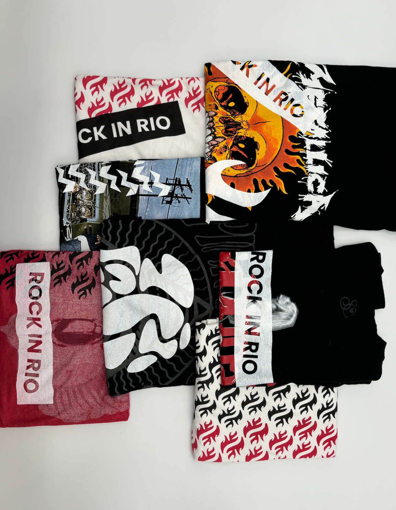
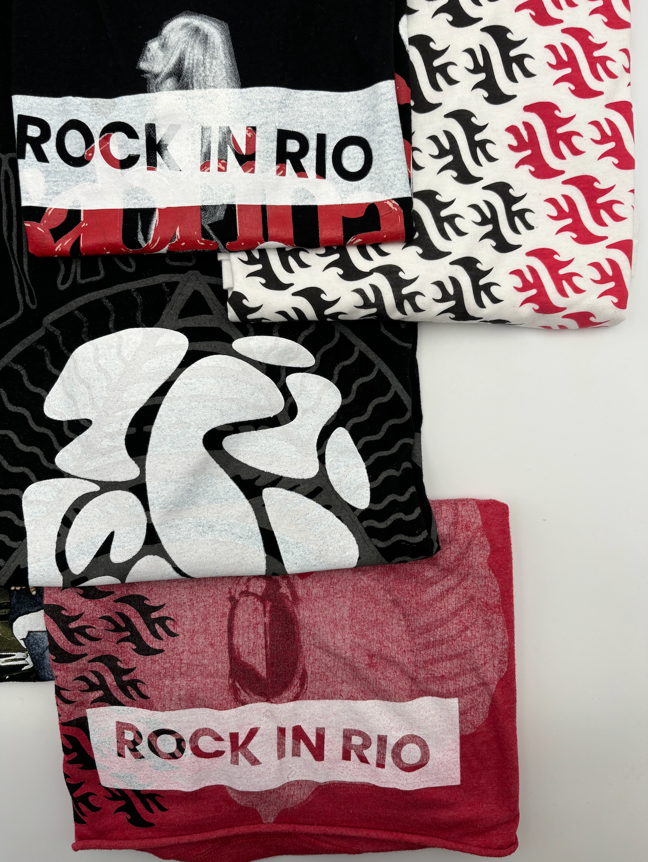
Sustainability
To reinforce Rock in Rio’s commitment to sustainability, we introduced live screen-printing stations at the festival, repurposing existing festival and band T-shirts instead of producing new ones. Attendees could bring their own shirts or choose from pre-owned tees, watching as new Rock in Rio designs were printed on-site. This interactive initiative reduced waste, encouraged eco-conscious choices, and gave fans a unique, sustainable festival souvenir, turning merchandise into a hands-on experience that aligned with the festival’s environmental values.