Wayfinding & Environmental Design Strategy for FIFA 2026
Graphic Designer | SCADpro Collaboration
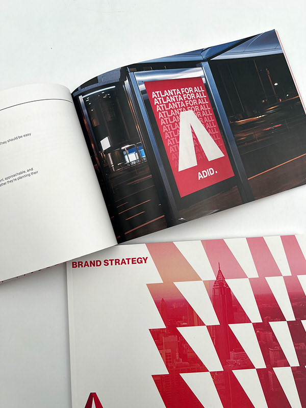
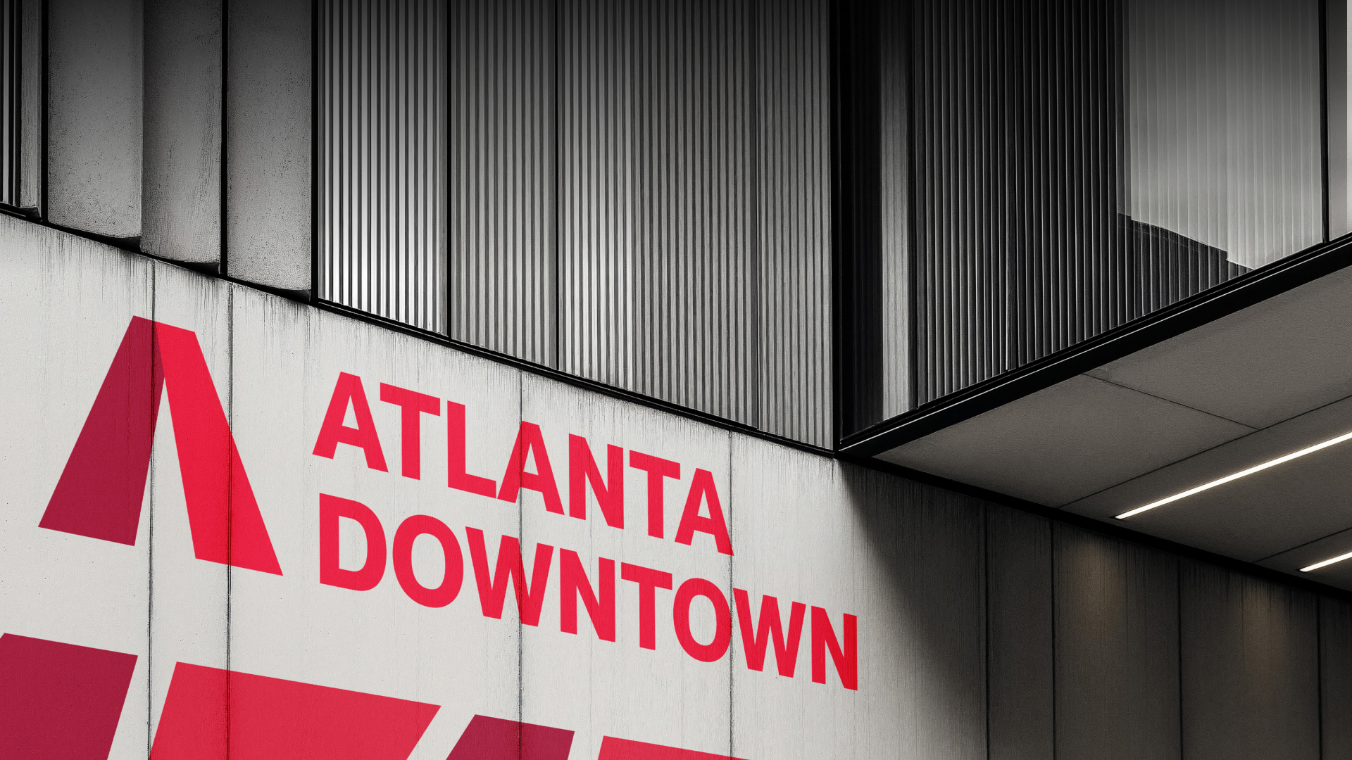
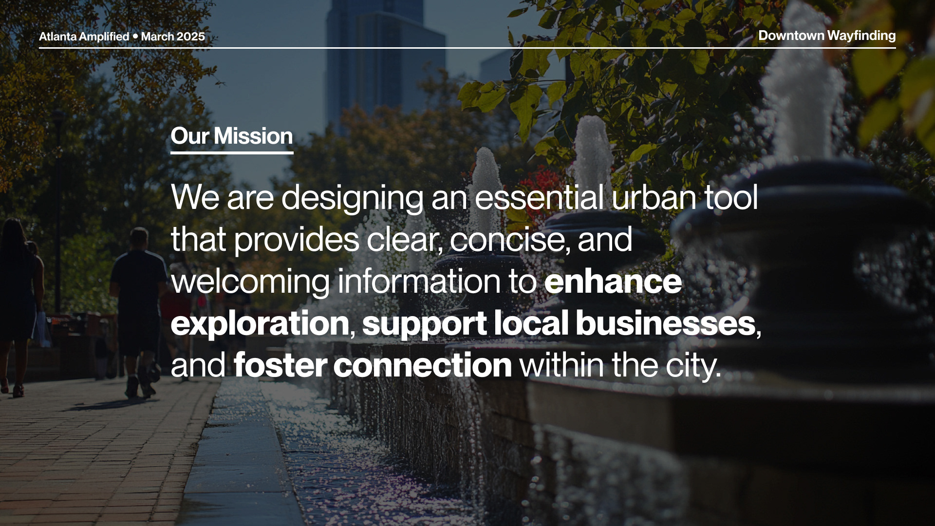
As part of a SCADpro collaboration with the Atlanta Downtown Improvement District (ADID), I contributed to the development of a comprehensive wayfinding and environmental design system for Downtown Atlanta. The goal of the project was to improve the city’s navigability and sense of identity ahead of the 2026 FIFA World Cup, welcoming both locals and international visitors with clarity and character.
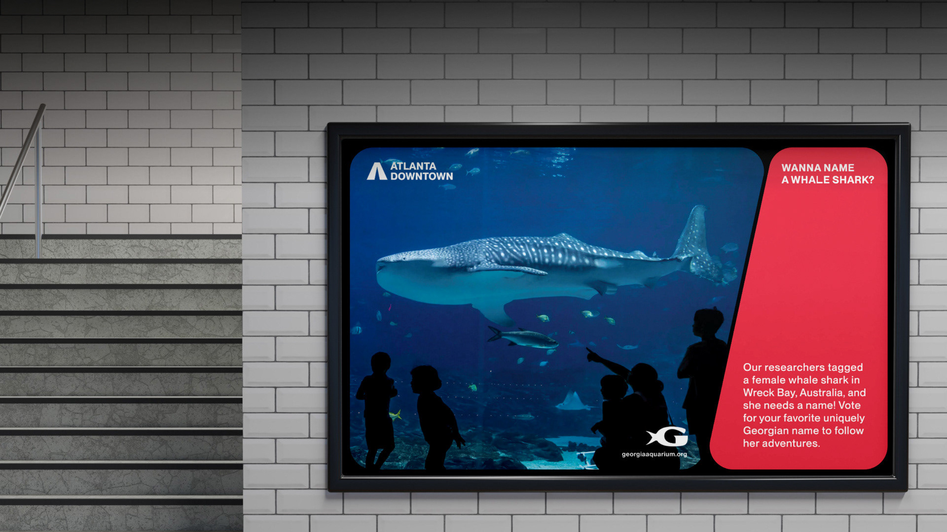
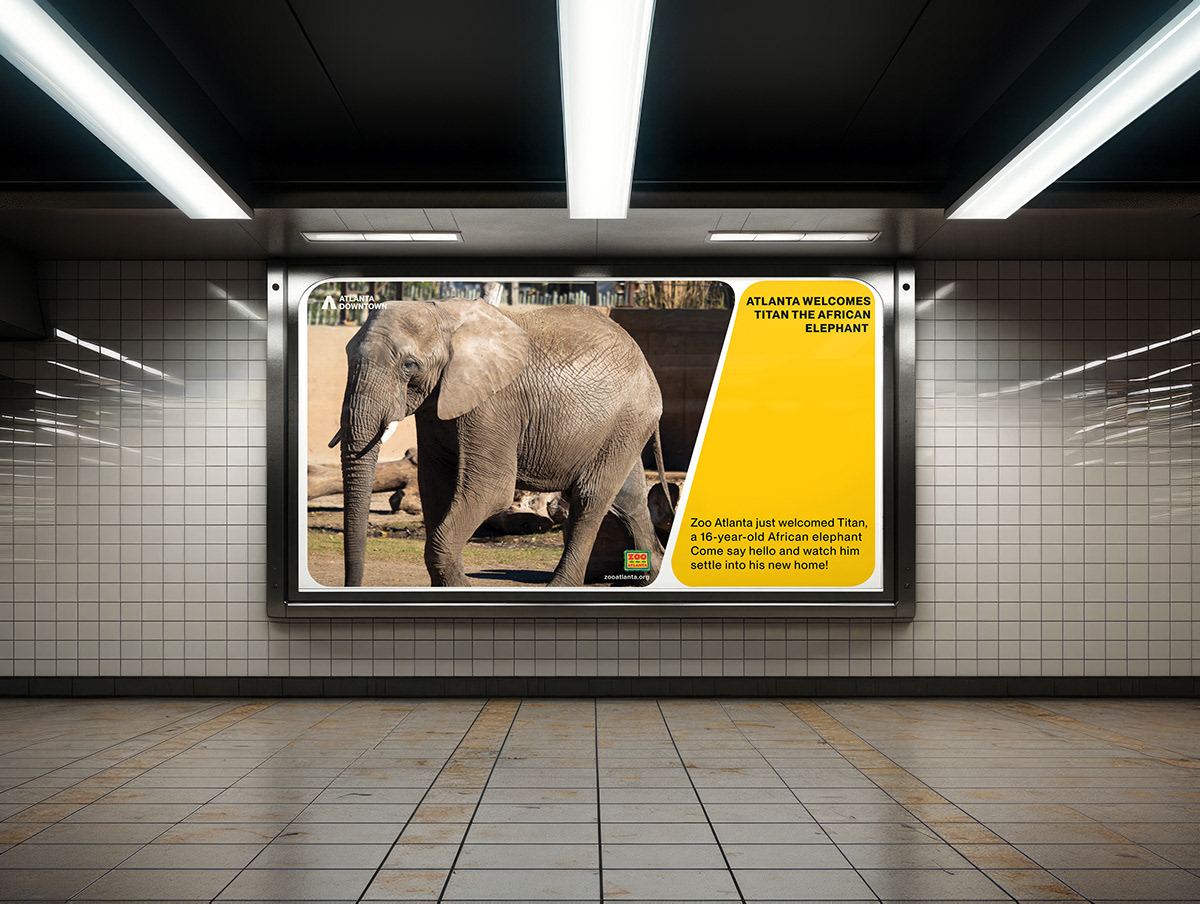
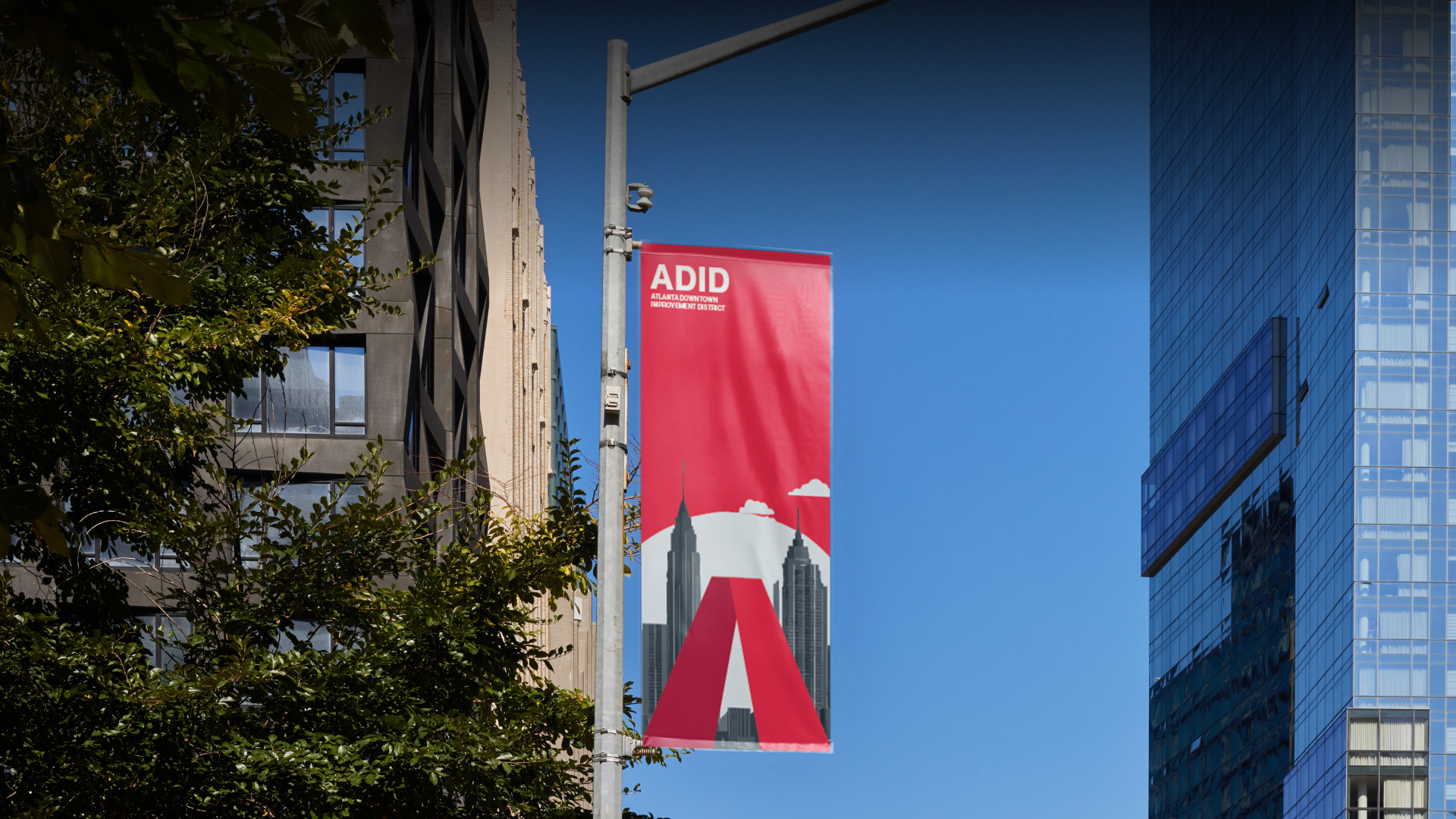
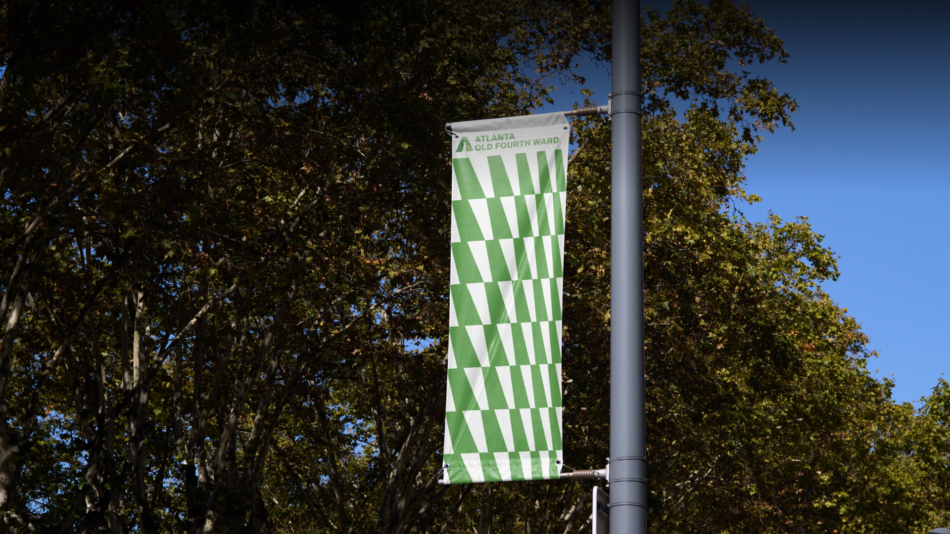
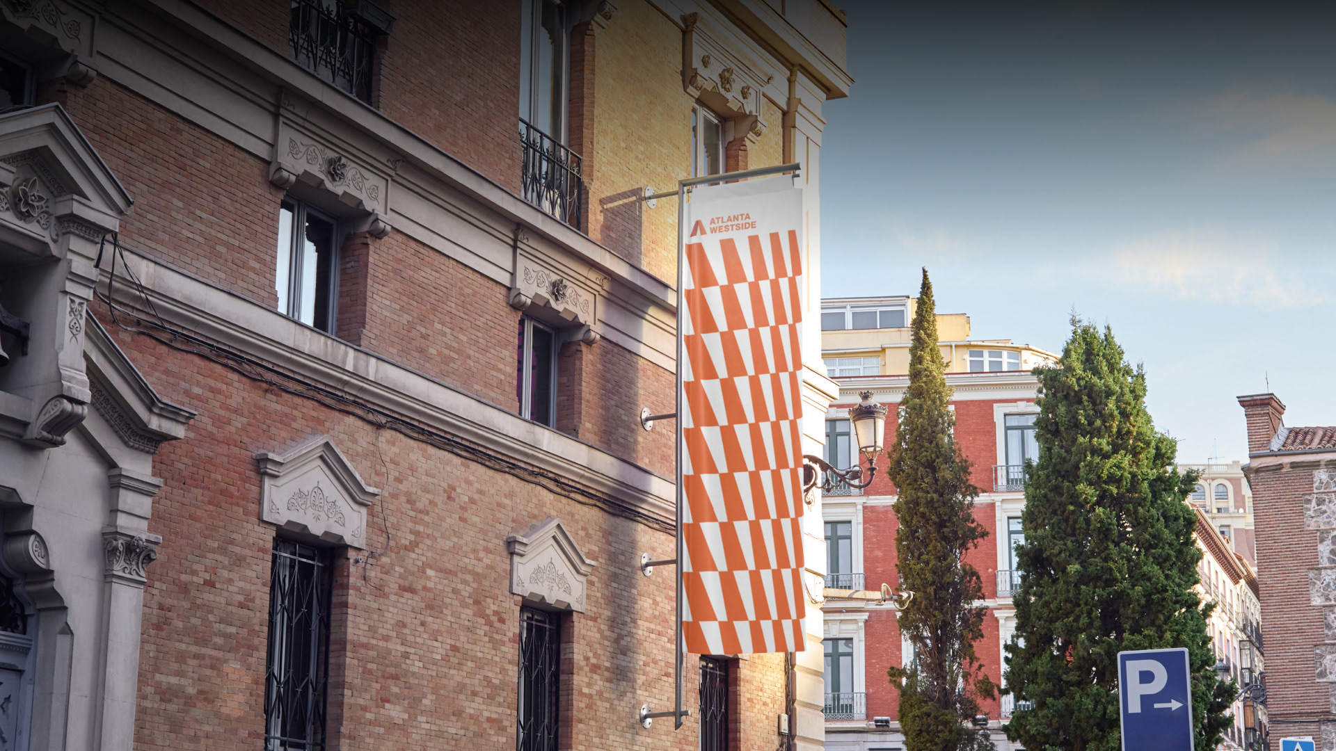
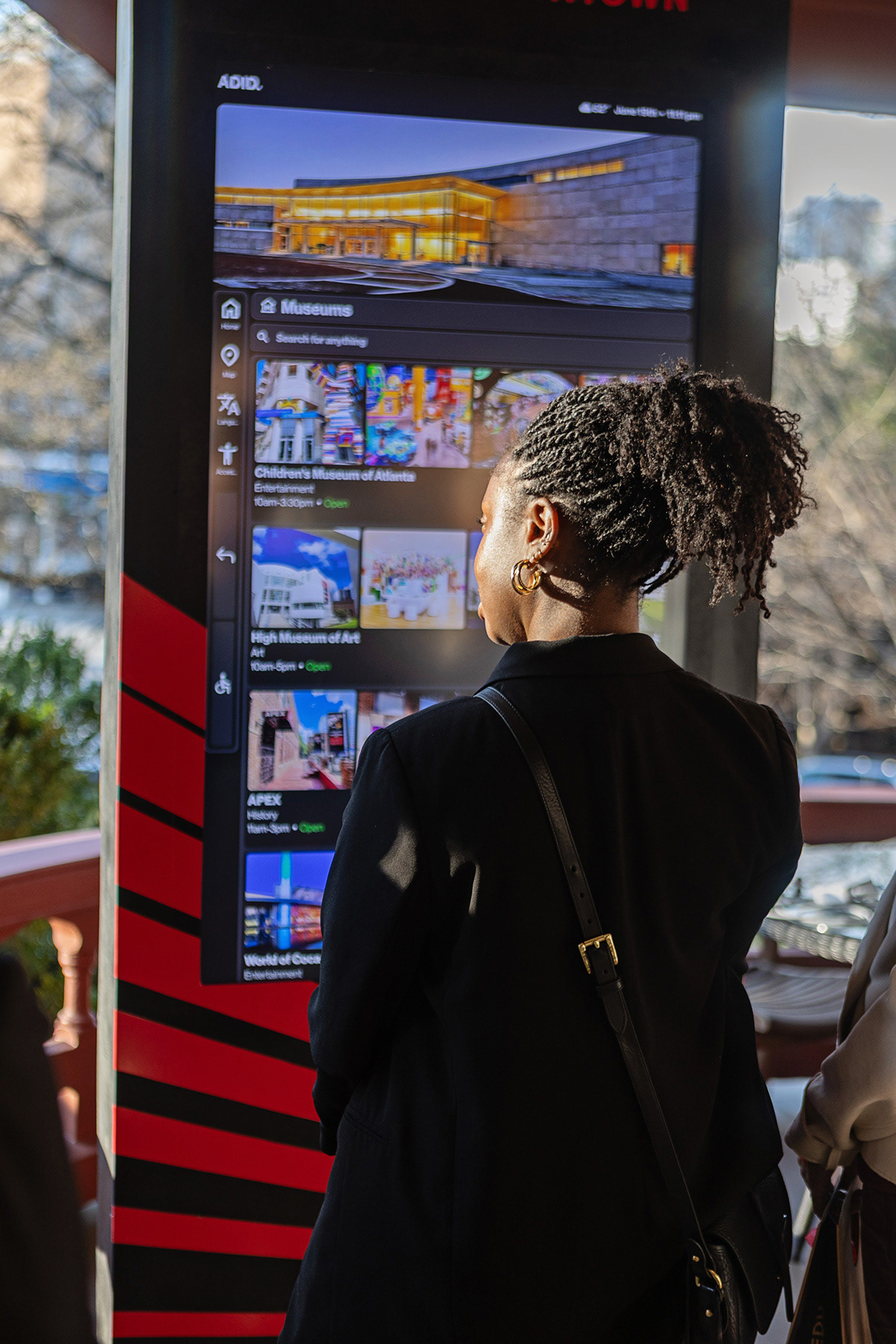
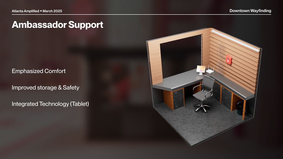
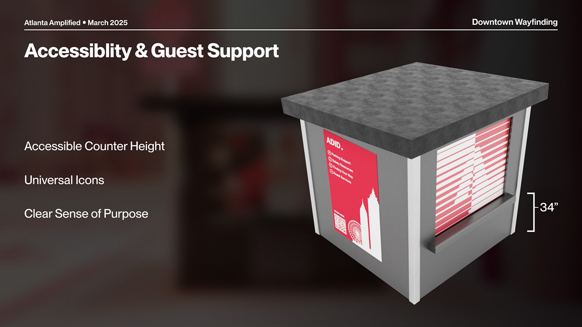
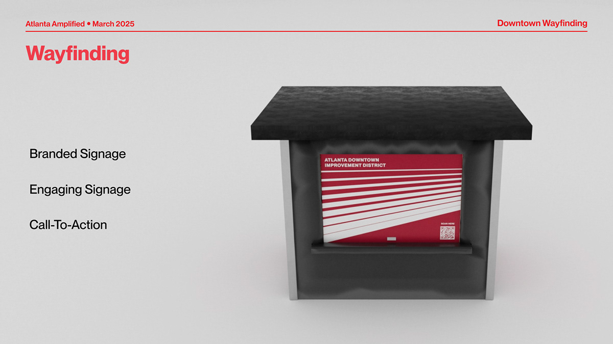
Working across departments like UX, marketing, and fabrication, we translated our system into real world applications including street banners, a redesigned information booth wrap, and consistent visual elements throughout the city’s busiest intersection—an area that welcomes over a million visitors annually.
Working across departments like UX, marketing, and fabrication, we translated our system into real world applications including street banners, a redesigned information booth wrap, and consistent visual elements throughout the city’s busiest intersection—an area that welcomes over a million visitors annually.
Branding
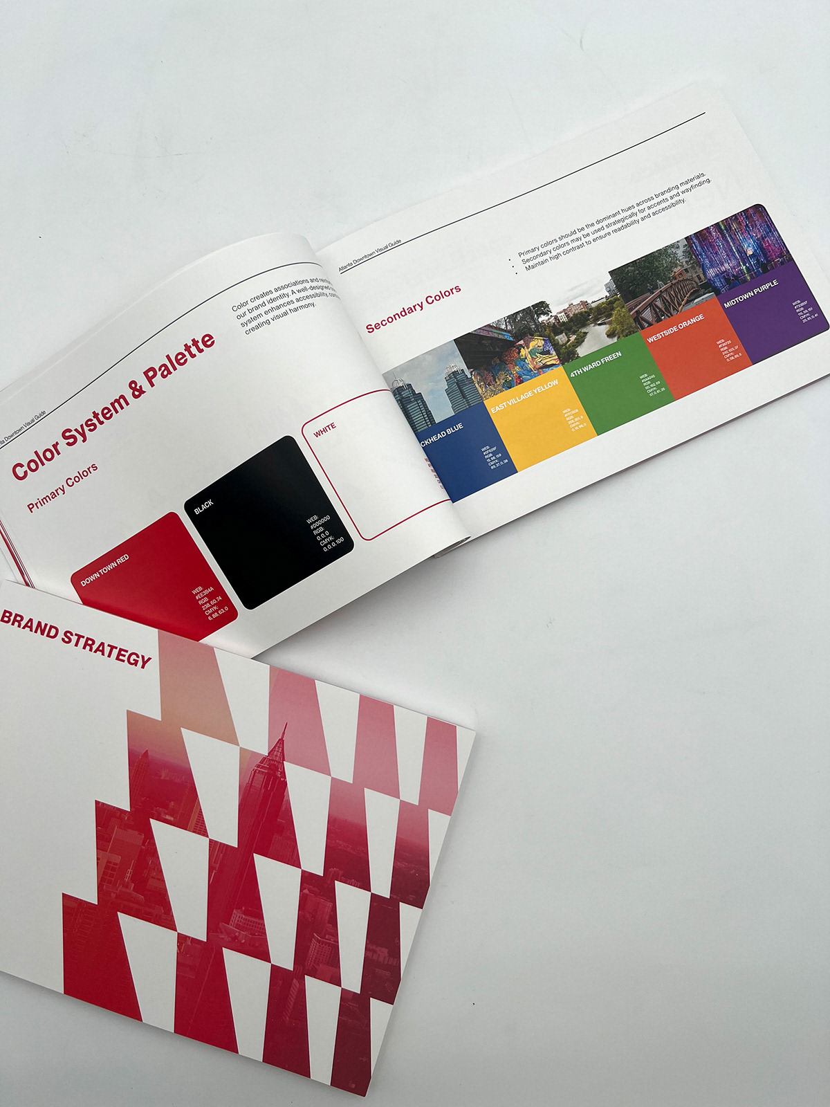
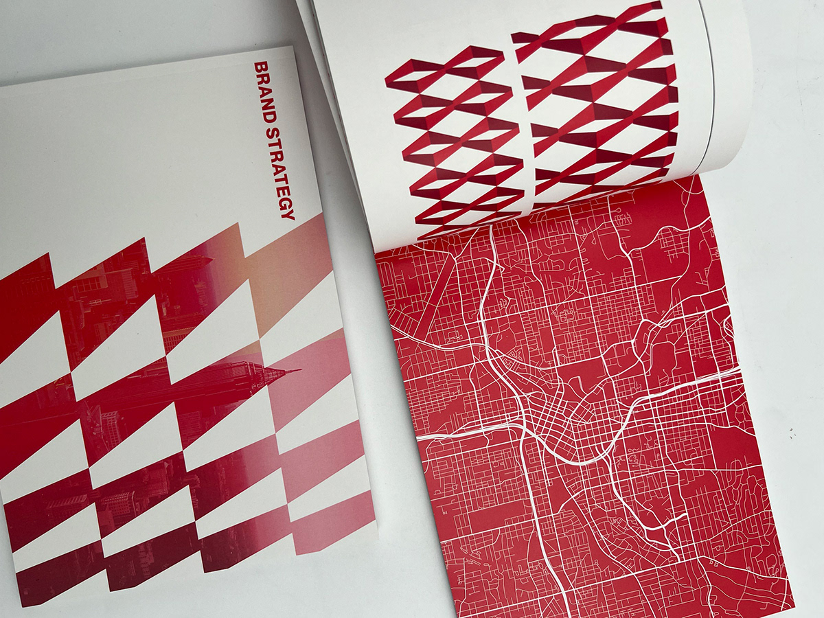
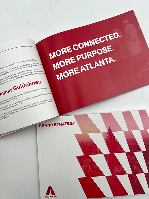
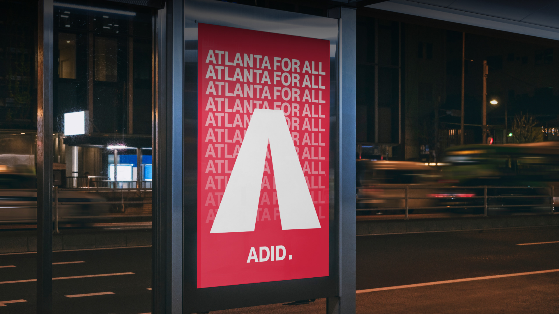
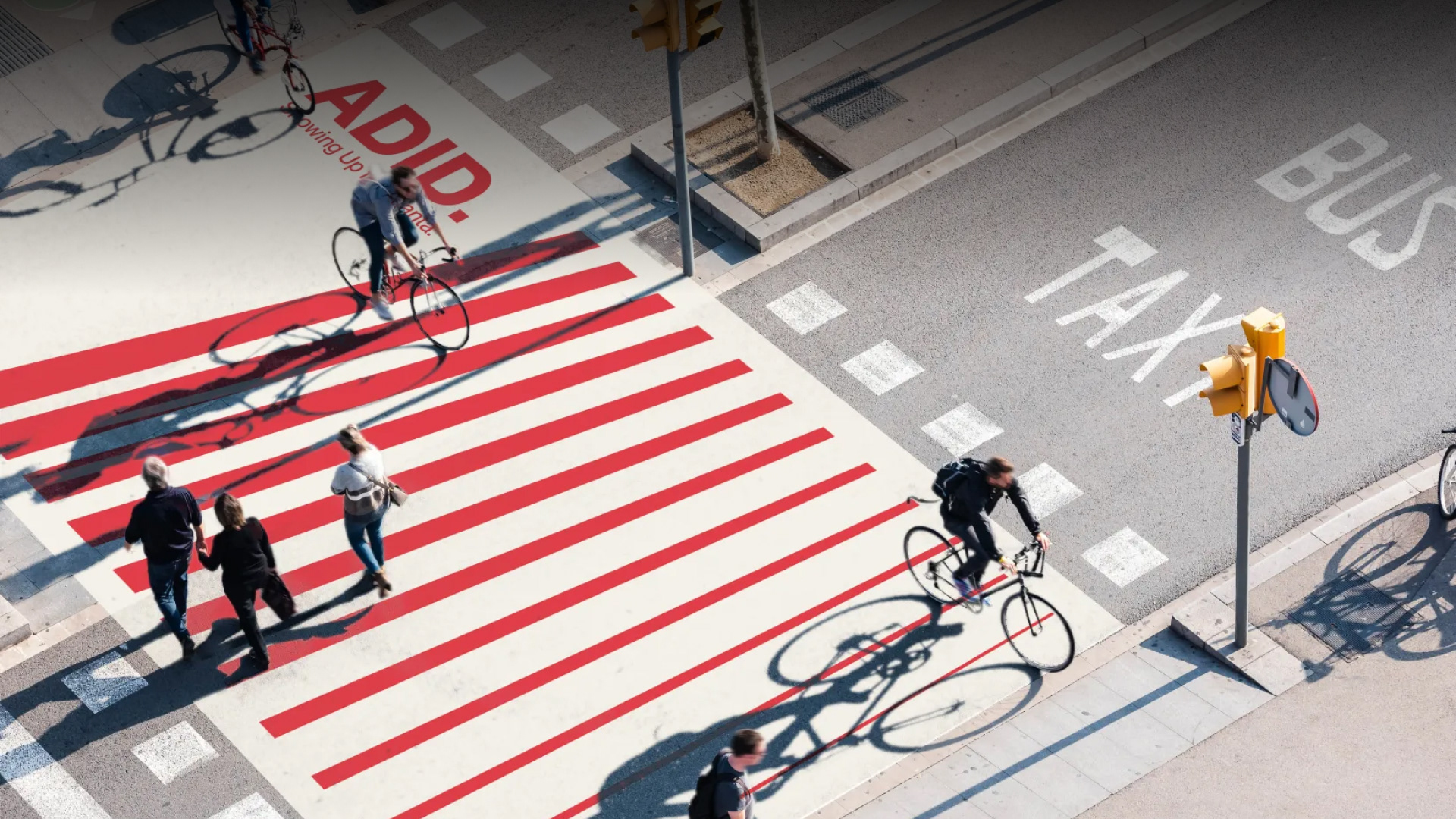
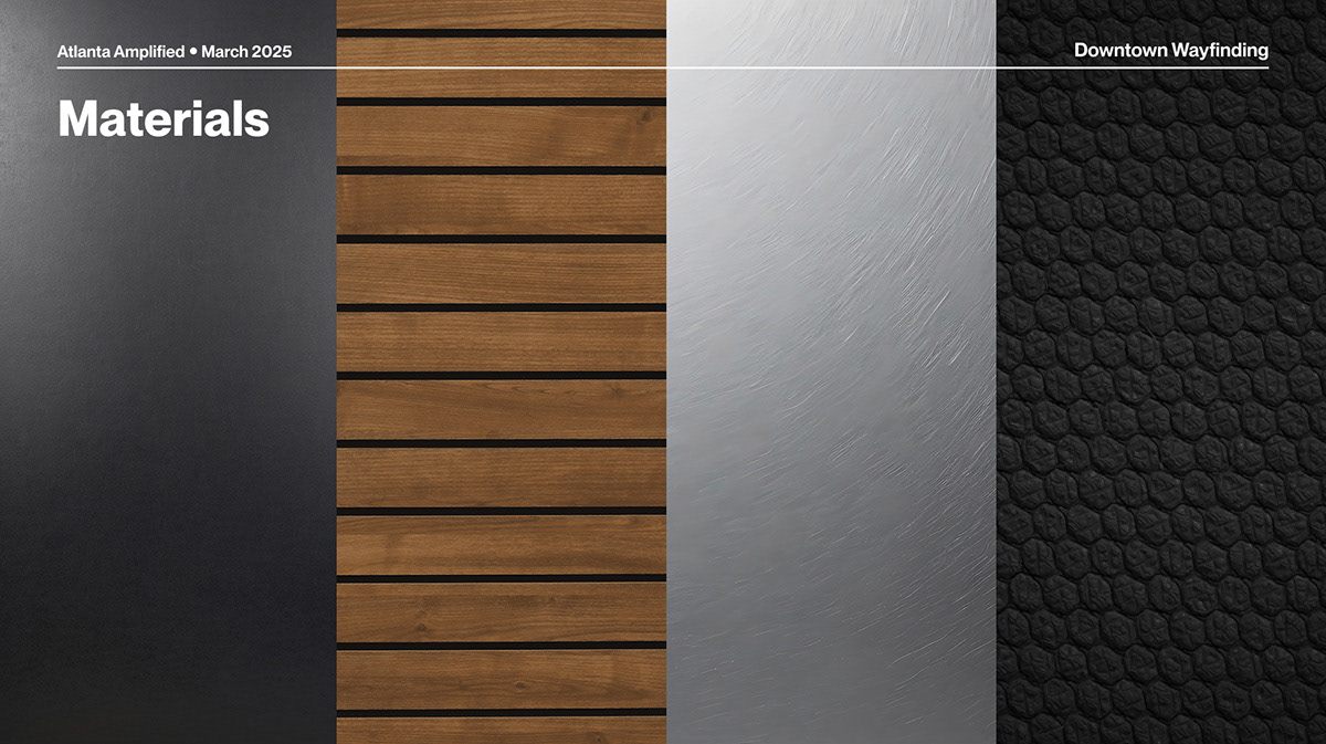
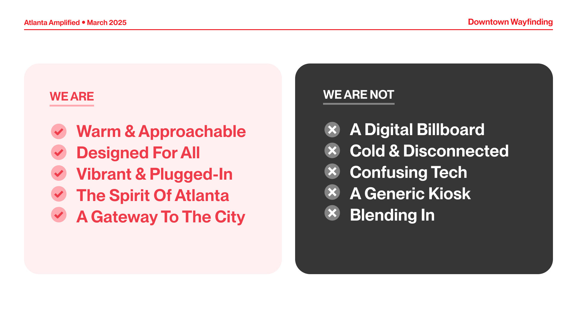
We began by creating a comprehensive brand extension that redefined how ADID’s visual language could function across environmental, digital, and printed platforms. This involved refining typography, layout systems, iconography, and tone of voice, and ultimately producing a detailed brand book that documented how the identity should flex across applications—from signage and kiosks to banners and digital screens. The goal was to make the brand more adaptable without losing its integrity, especially in the context of a global event.
One of my primary responsibilities was developing a comprehensive neighborhood-based color system tailored for wayfinding. To ensure the system was authentic and accessible, we conducted surveys, visited each neighborhood in person, and researched existing branding, social media presence, and the dominant brand colors of local institutions and businesses. This research formed the basis for assigning distinct, meaningful color palettes that reflect how each neighborhood sees itself—and how it’s seen by others.
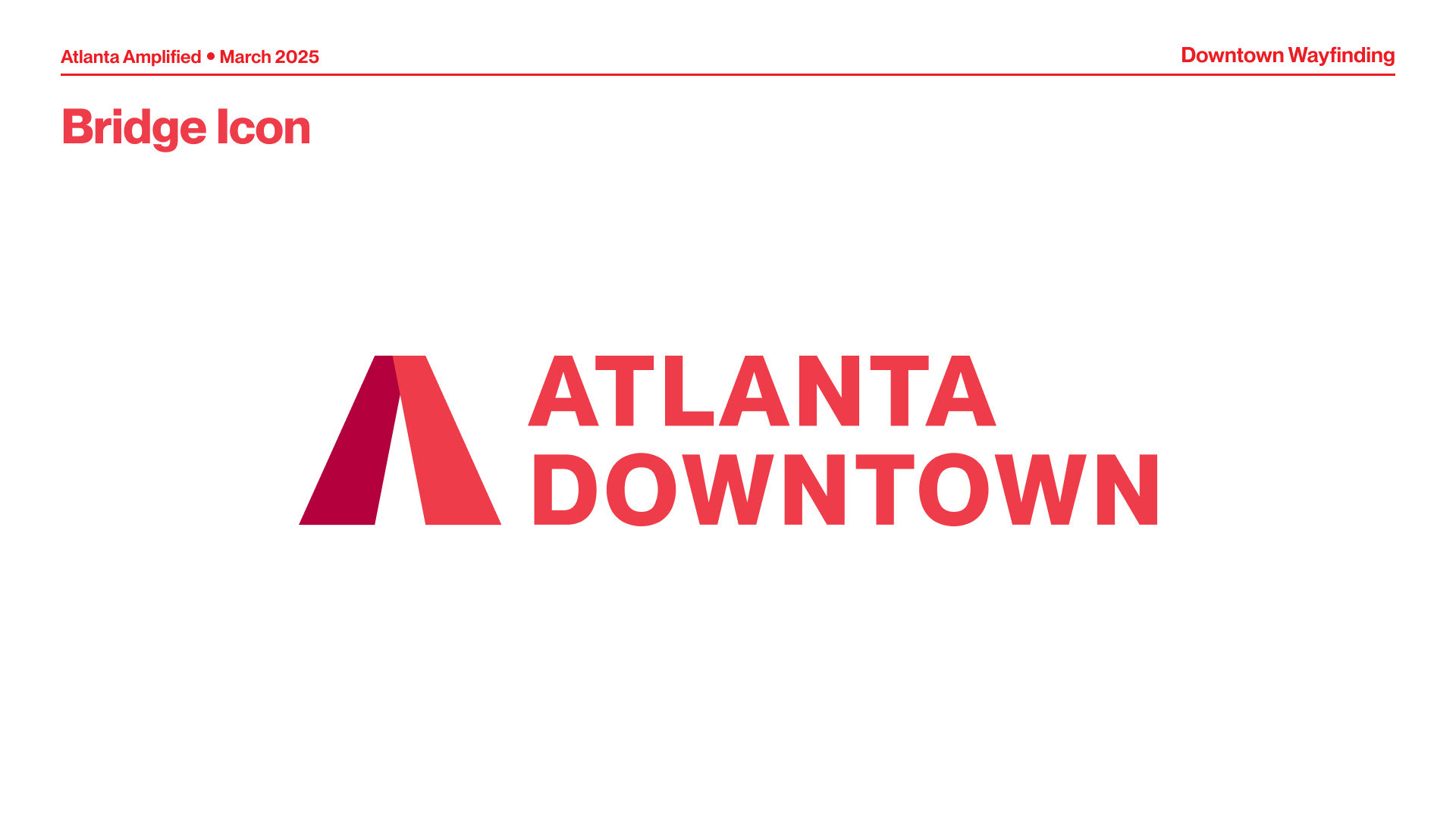
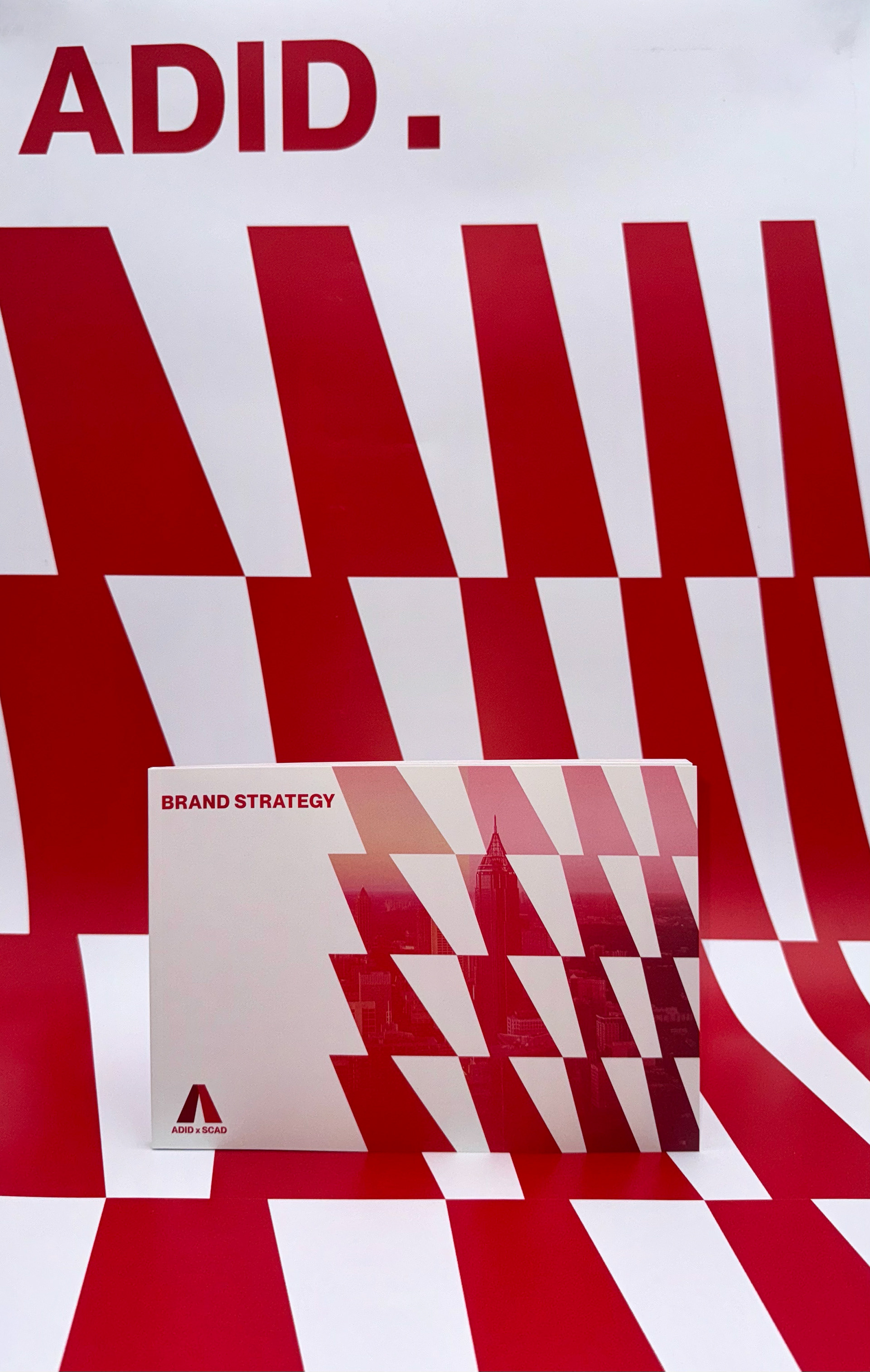
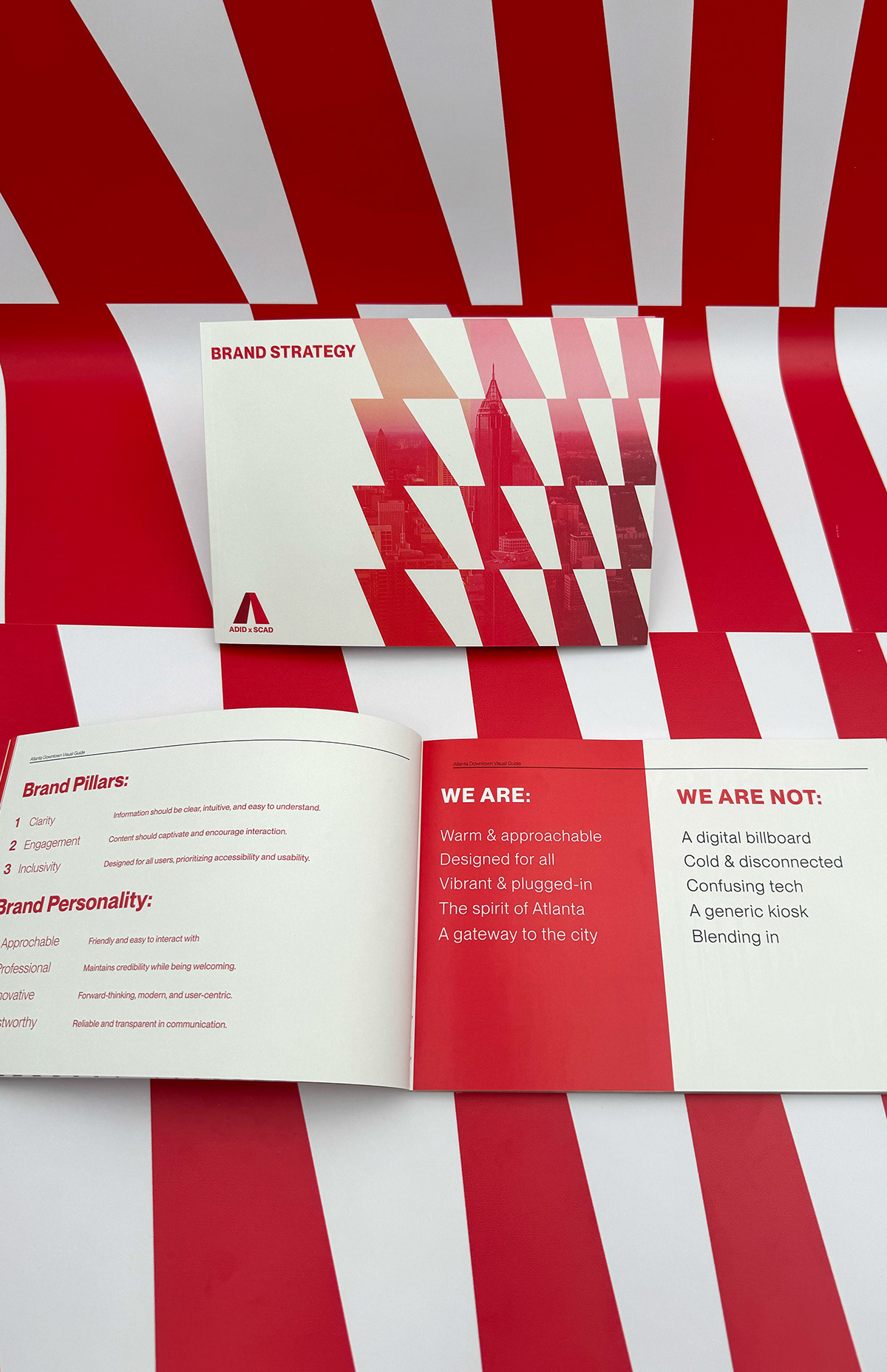
Our team designed a comprehensive brand book that expanded ADID’s visual language—refining their type system, layout structure, icon style, and tone of voice for broader applications. This extension allowed for greater flexibility while staying true to the core brand.