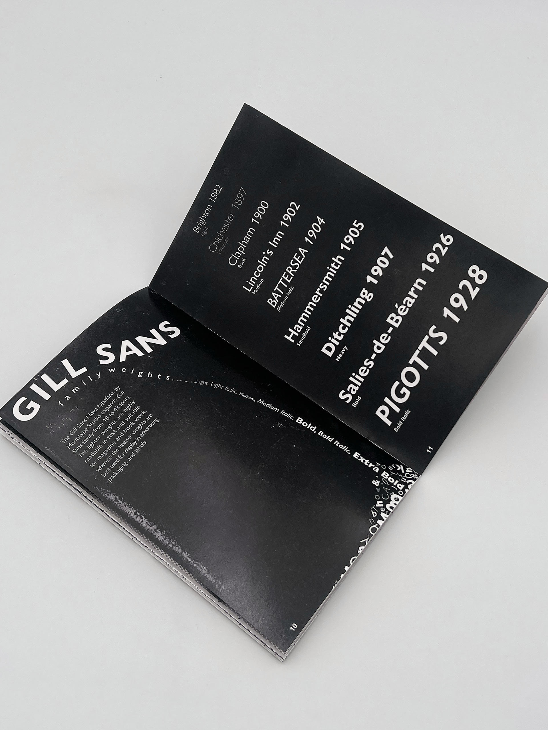
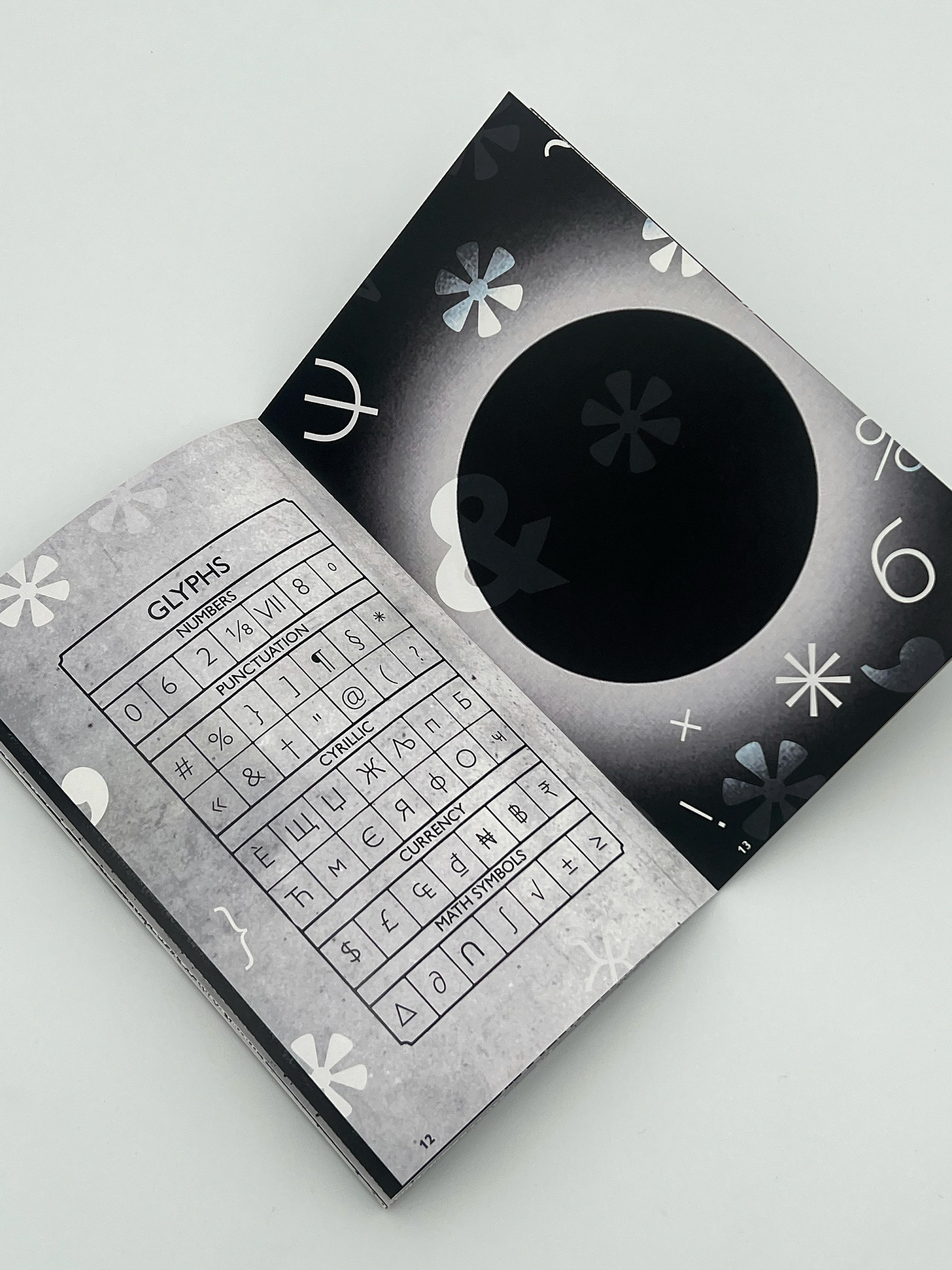
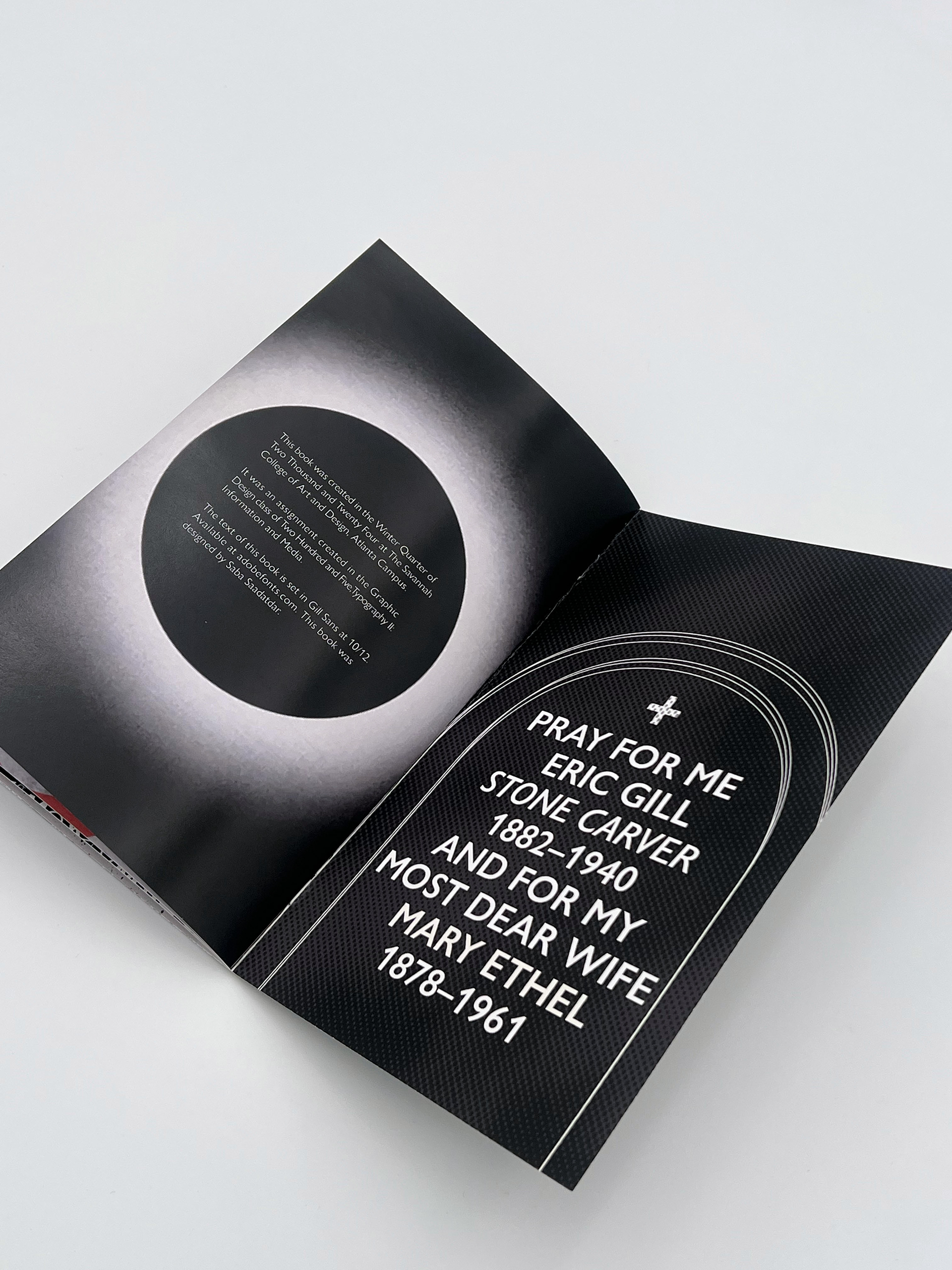
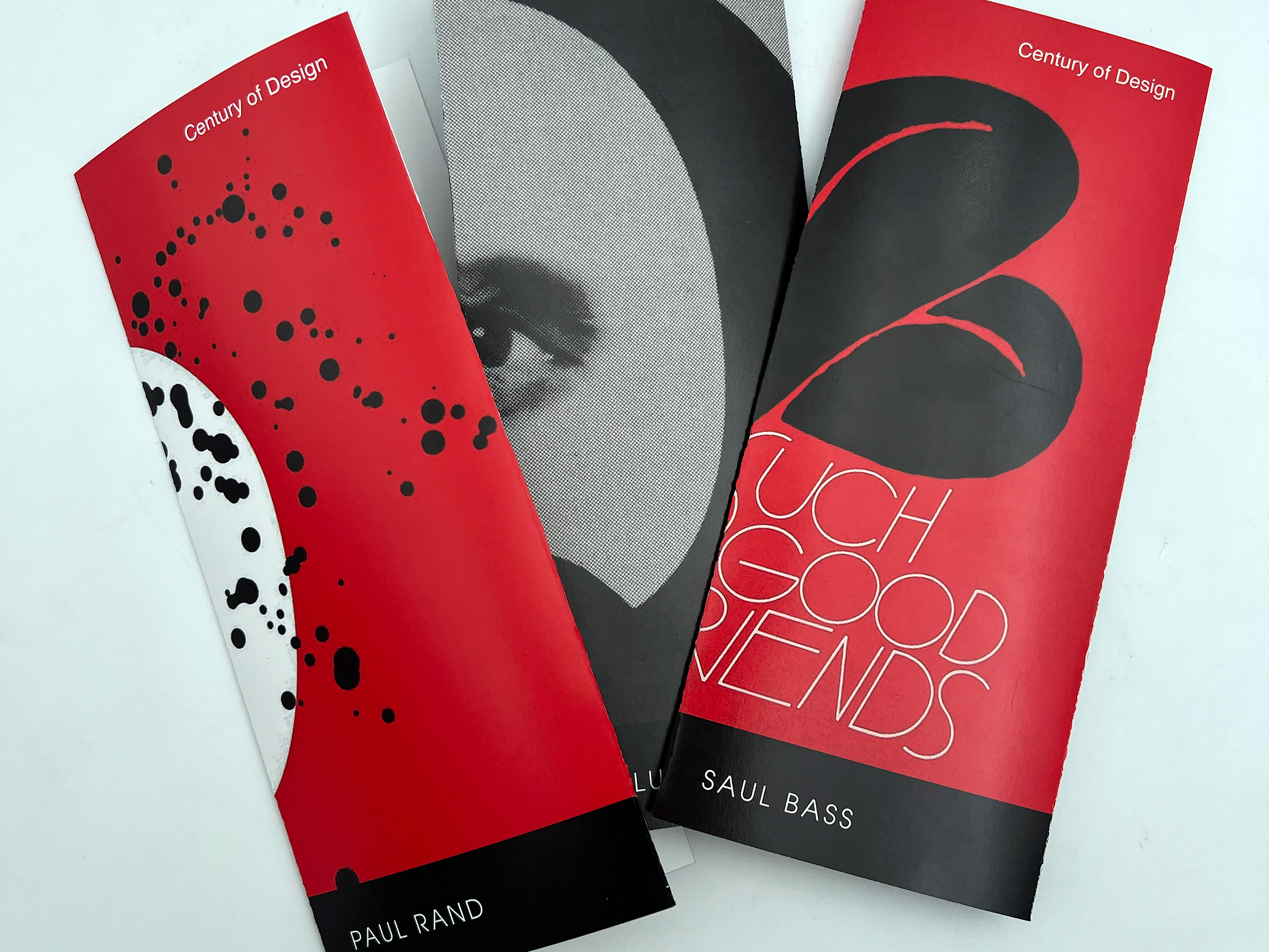
This project was developed for GRDS 353 Typography II, exploring type specimens as a historical and contemporary tool for showcasing typefaces. Traditionally, type specimens demonstrate the capabilities of a typeface, helping designers evaluate and select fonts for various applications. This project extends beyond conventional type specimens by examining type in both print and motion, treating it as a form of commercial art while exploring its historical significance and cultural impact. The objective is not only to inform the audience about the typeface’s history and usage but also to critically engage with its legacy, considering both its design and the complex history of its creator.

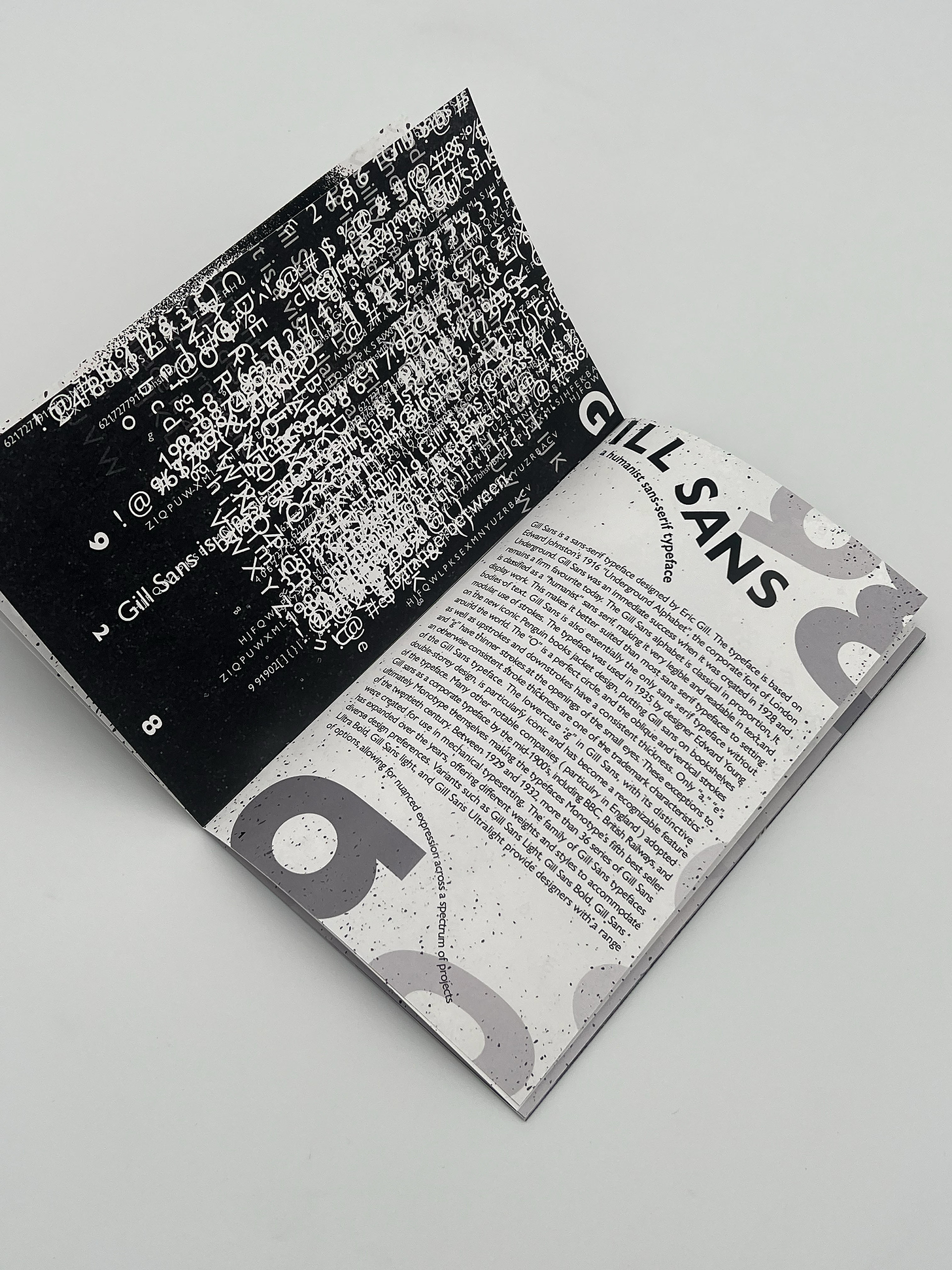

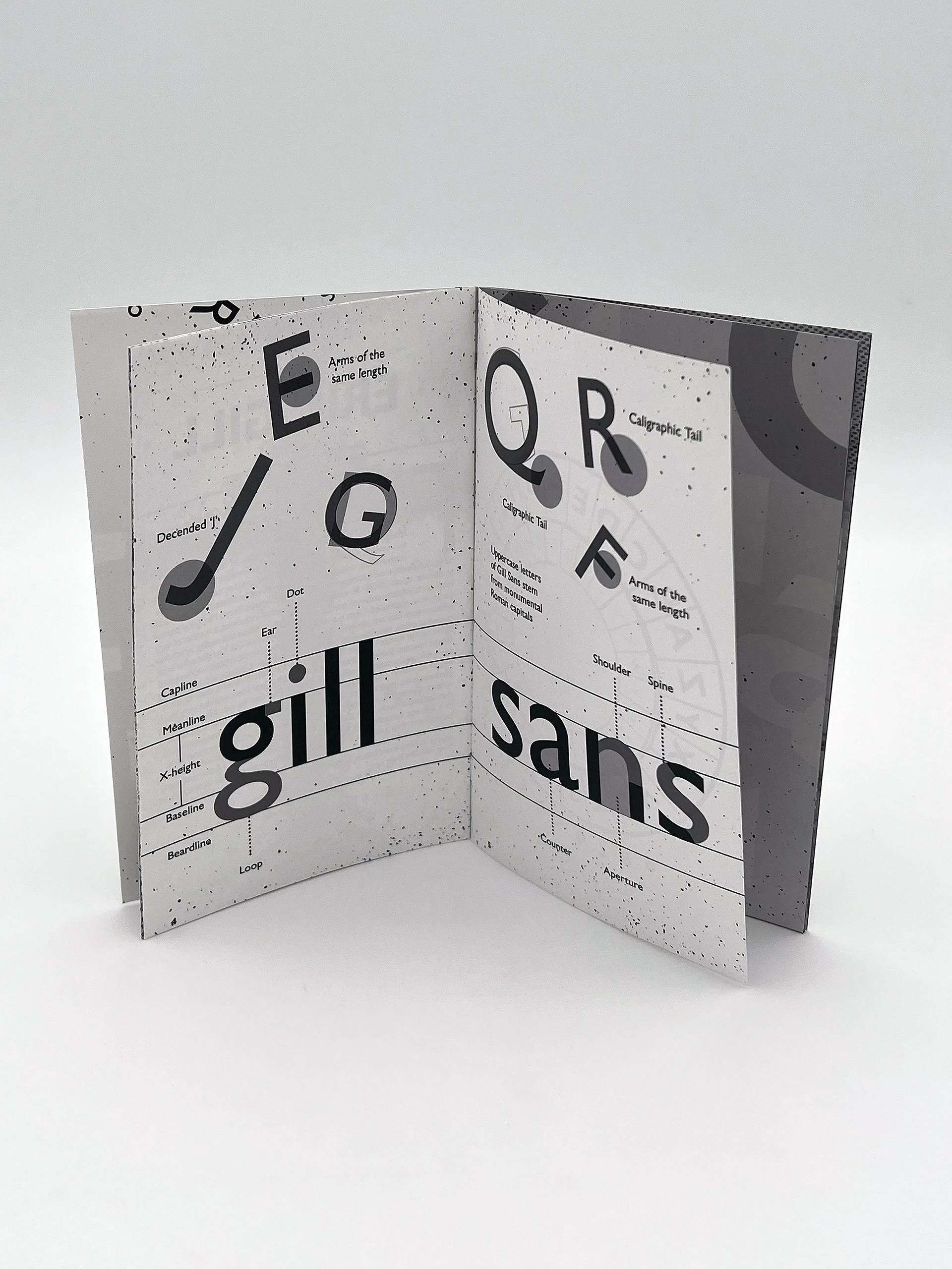
Gill Sans, designed by Eric Gill in 1928, is renowned for its clean, humanist letterforms and enduring versatility. However, its legacy is overshadowed by Gill’s deeply troubling personal history, as revealed in his published diaries. These diaries, written in code, detail disturbing aspects of his private life, including instances of abuse within his own family. This book grapples with the tension between Gill’s artistic contributions and his moral contradictions, presenting a typographic exploration that reflects both the elegance of the typeface and the darkness of its creator’s history.
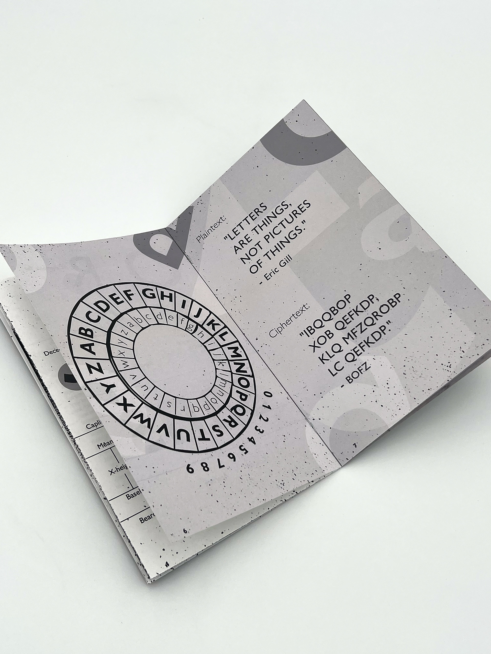

To emphasize this complexity, the book’s character page is designed in cipher text, mirroring Gill’s own encoded diaries. Throughout the design, principles of hierarchy, scale, space, rhythm, harmony, and contrast are carefully applied to create a compelling visual and conceptual narrative.
