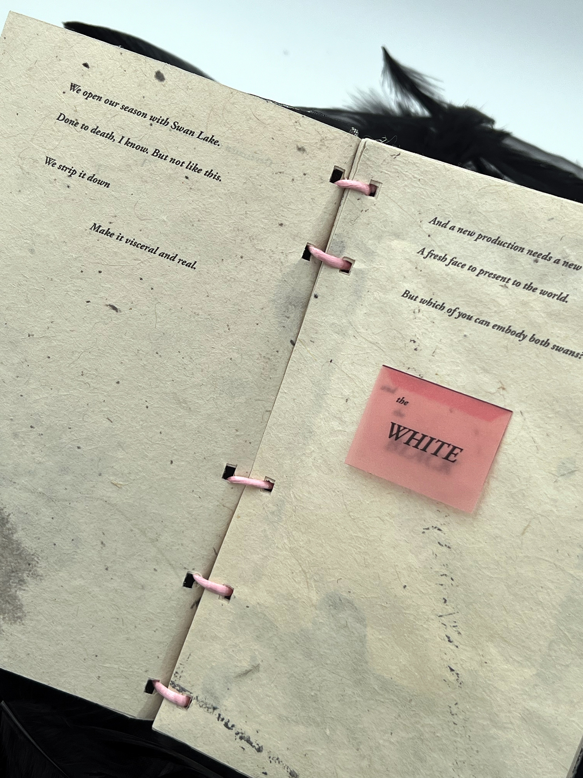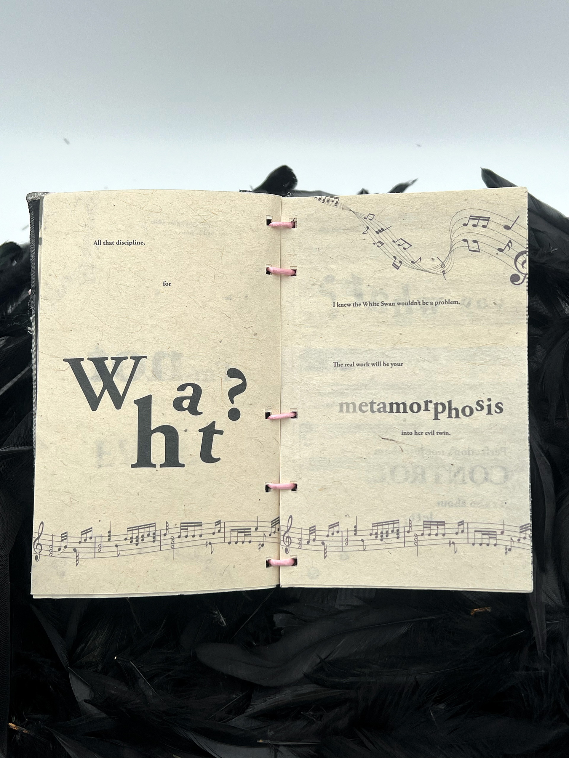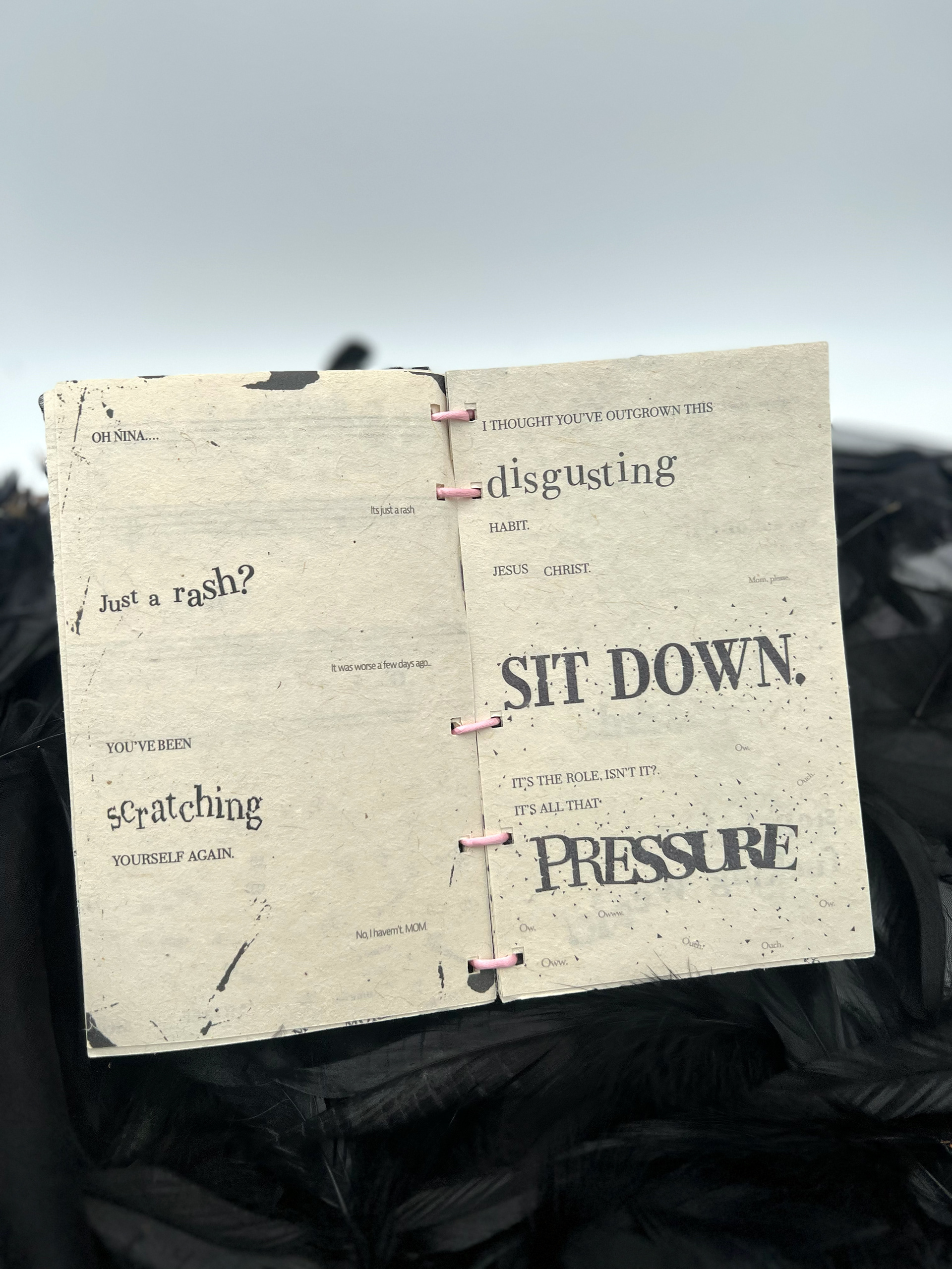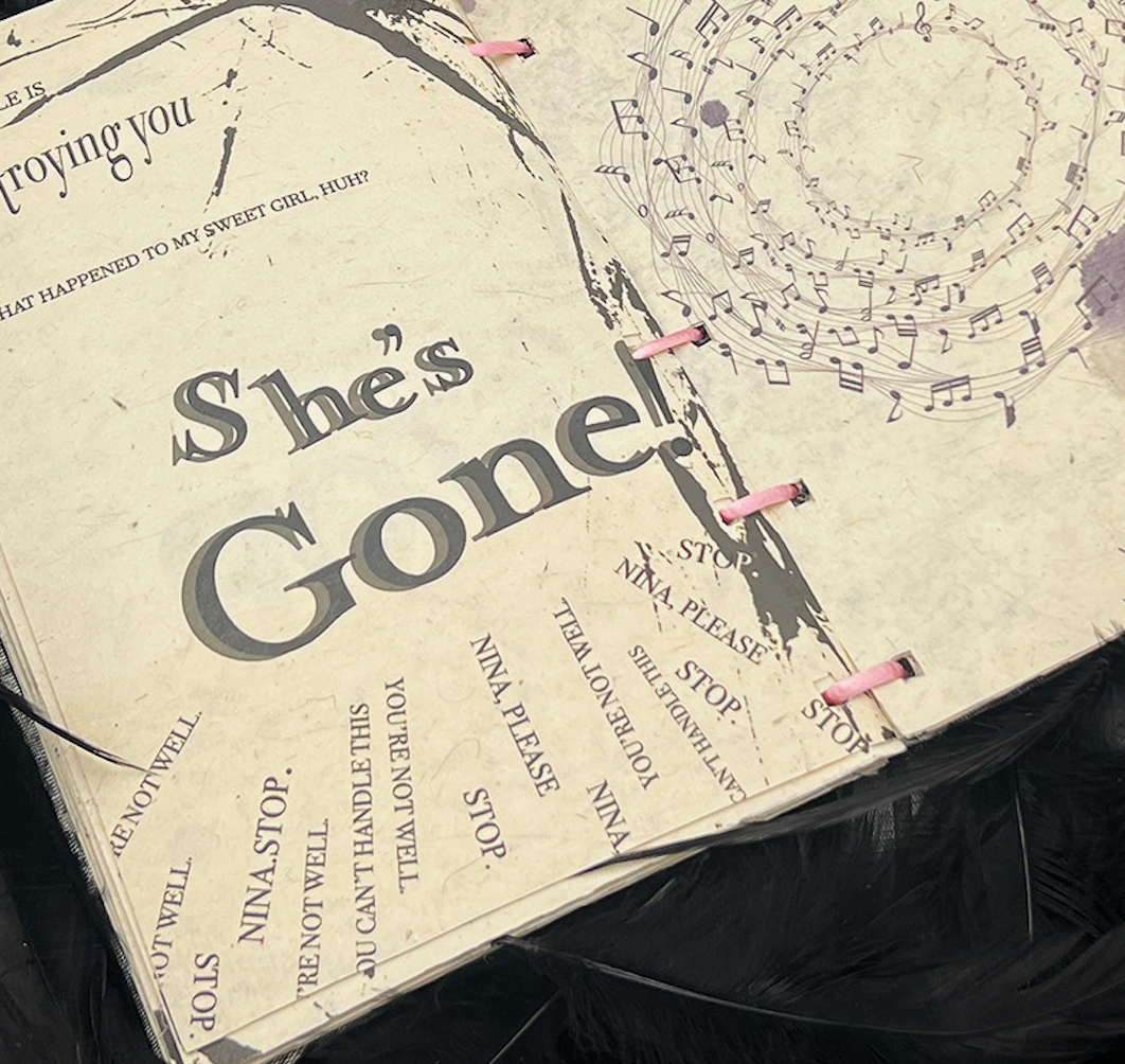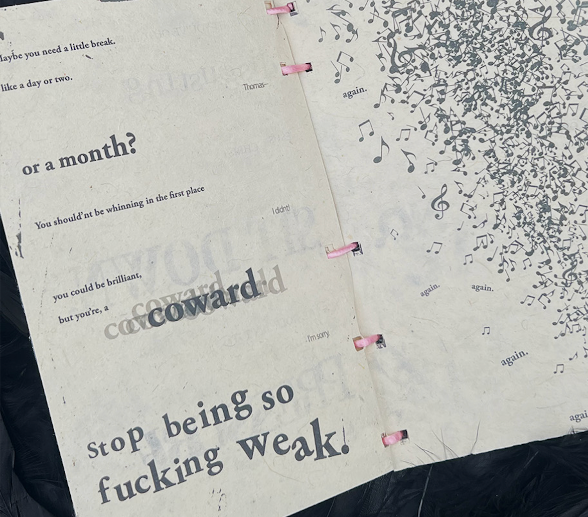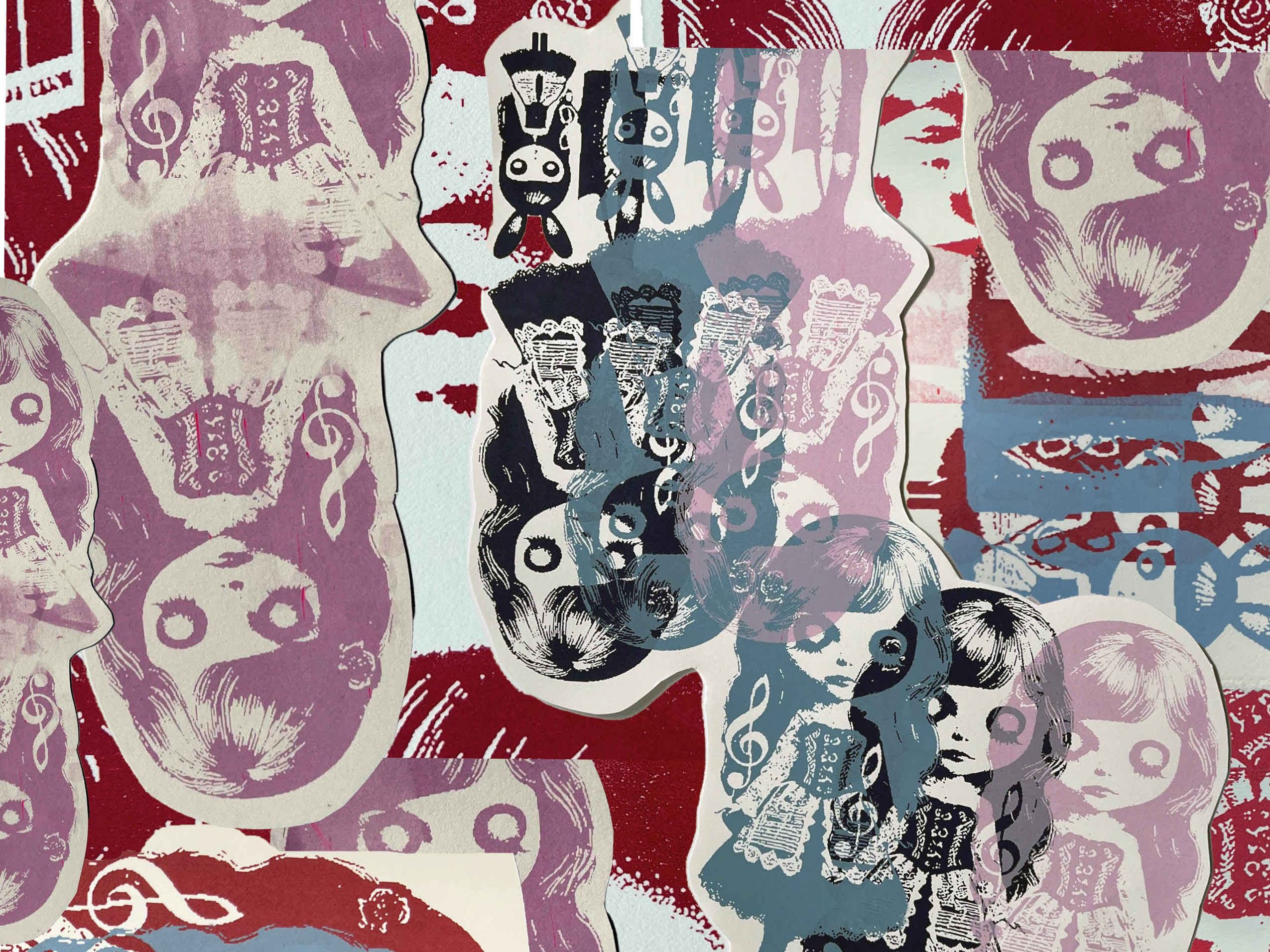
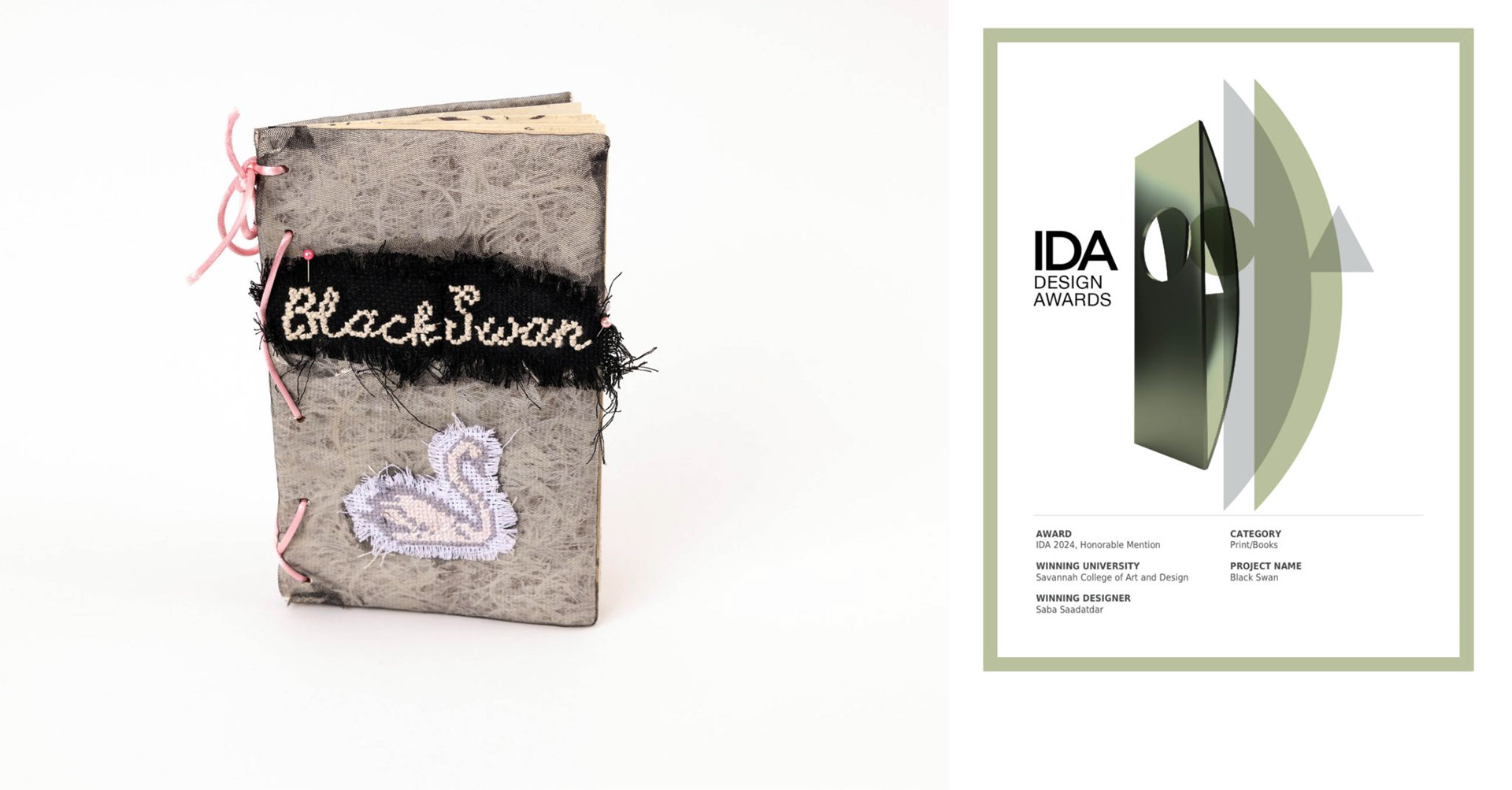
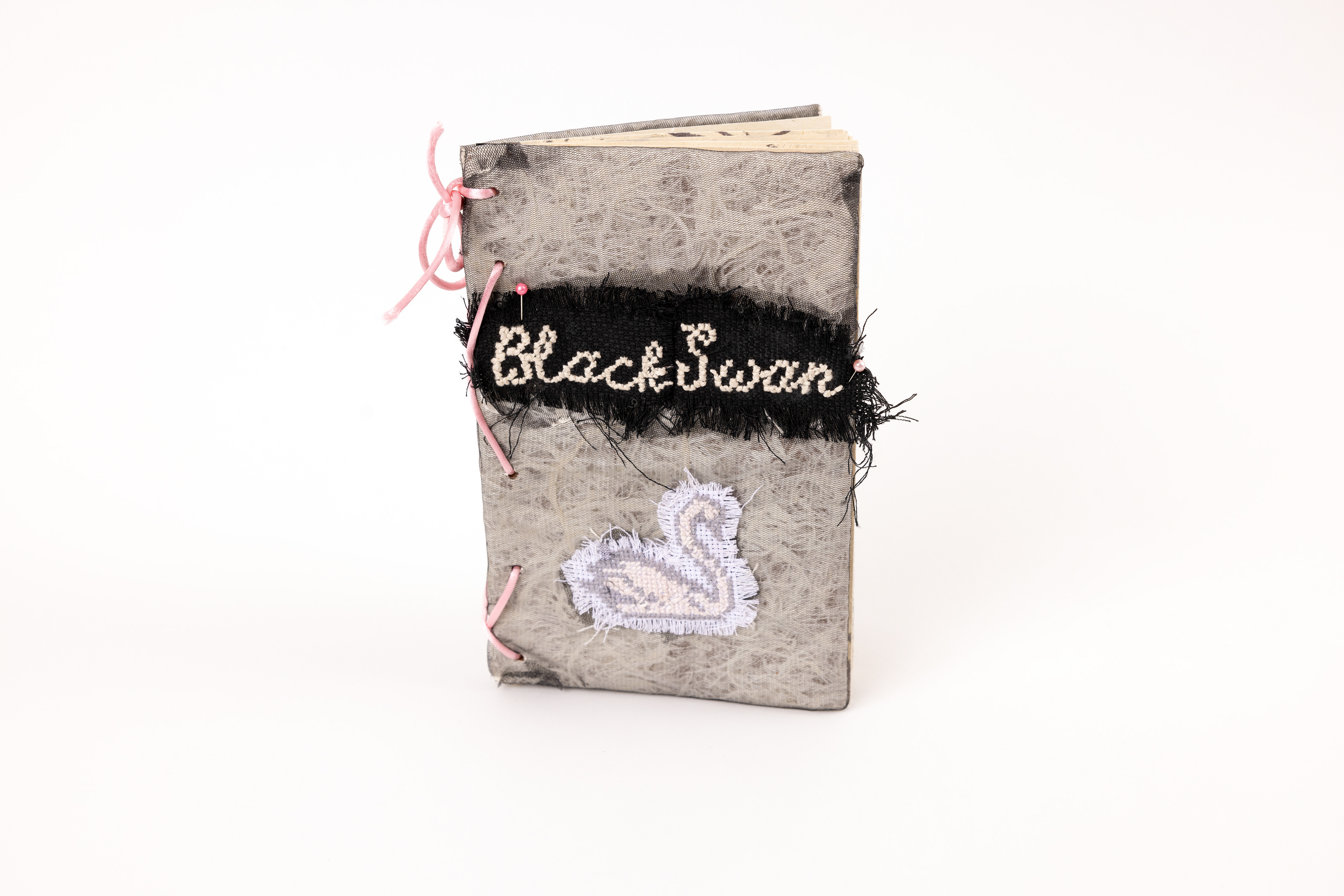
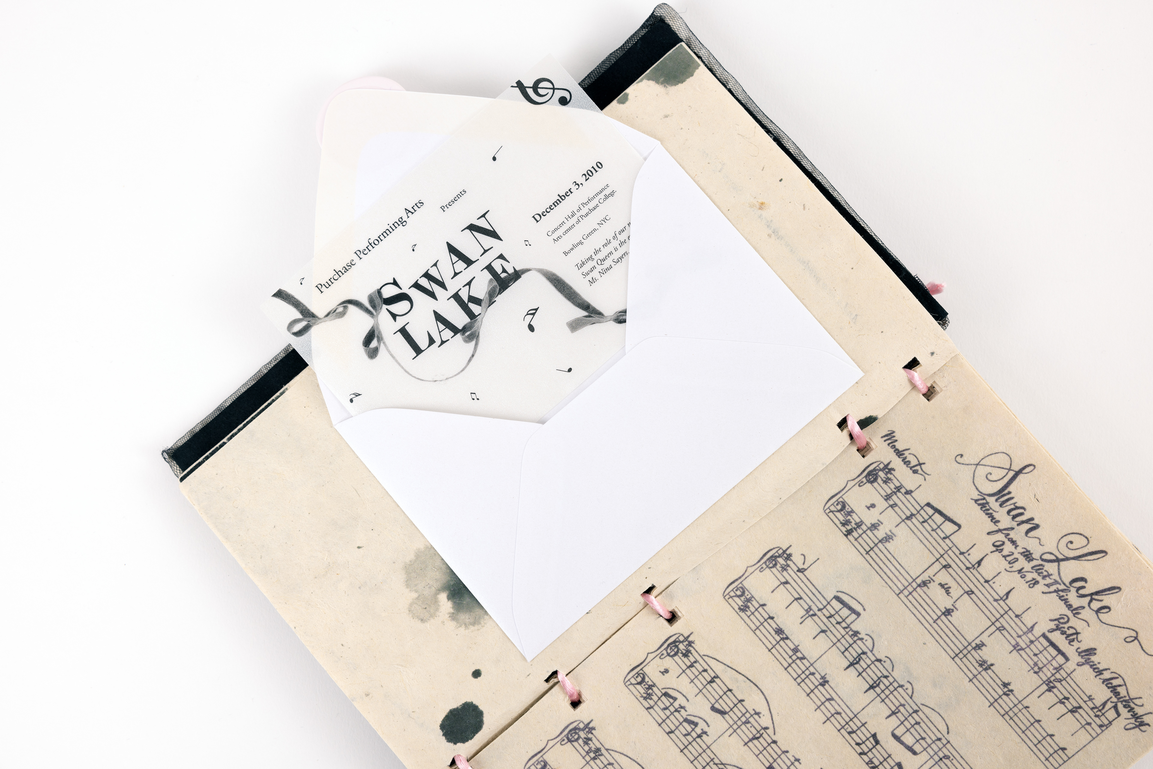
This artist book, created for Graphic Design Typography II, explores the themes of Black Swan, focusing on the protagonist’s obsession with perfection and success in a highly competitive world. The book examines Nina Sayers’ psychological struggle as she oscillates between the fragile innocence of the White Swan and the seductive darkness of the Black Swan.
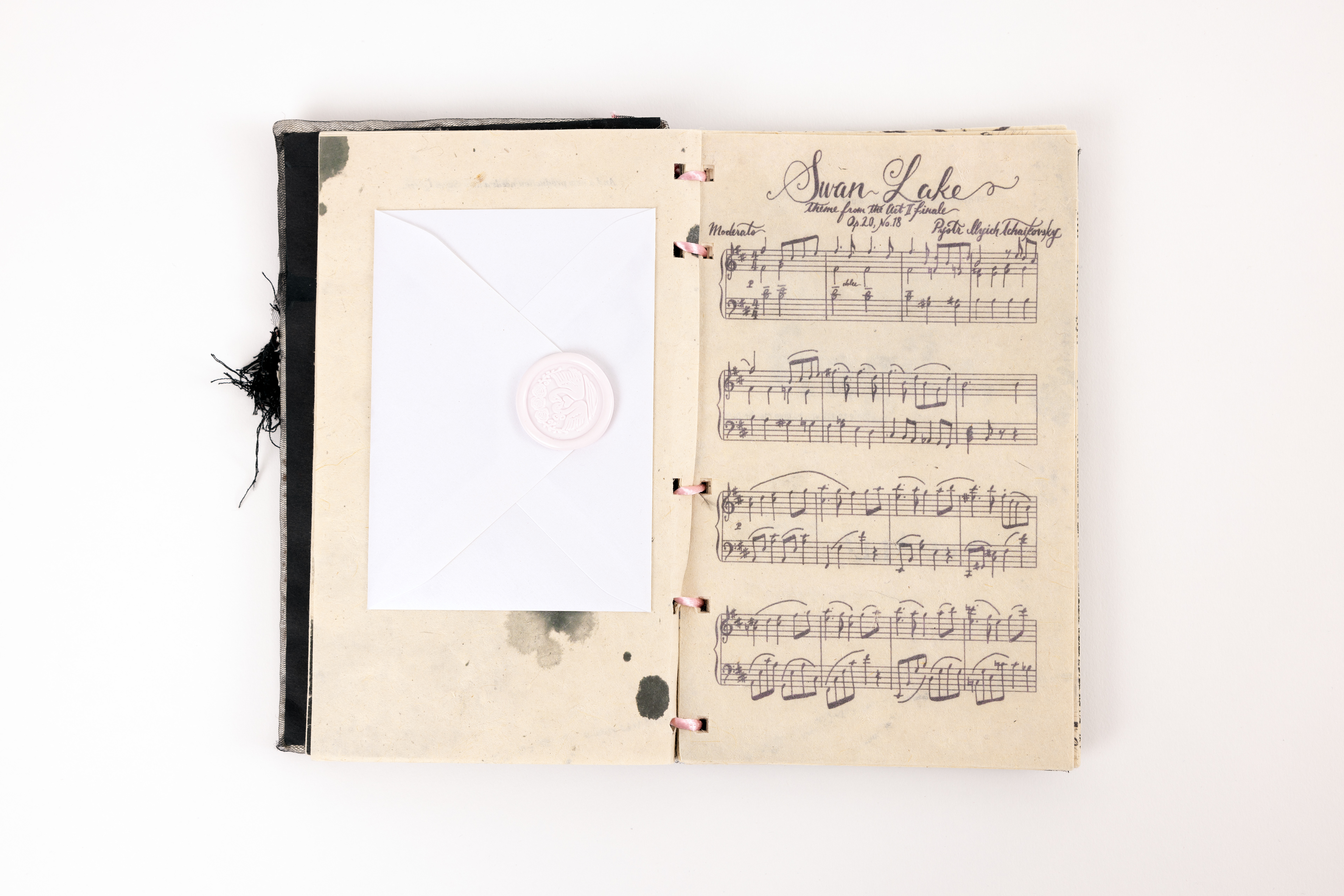
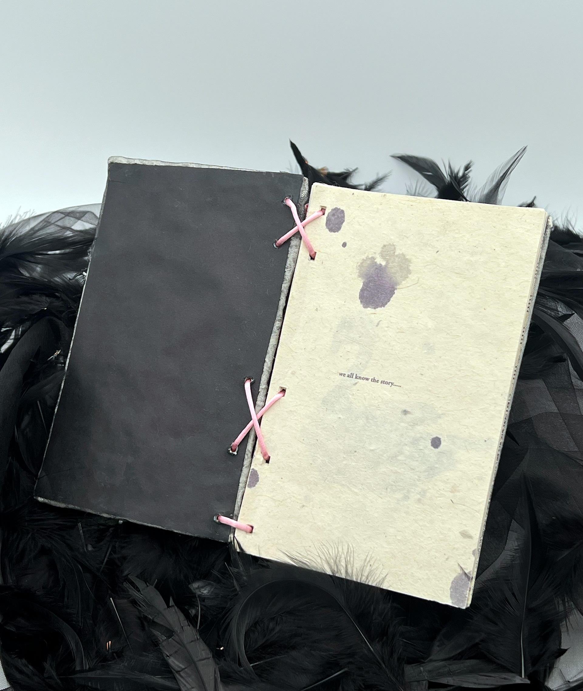
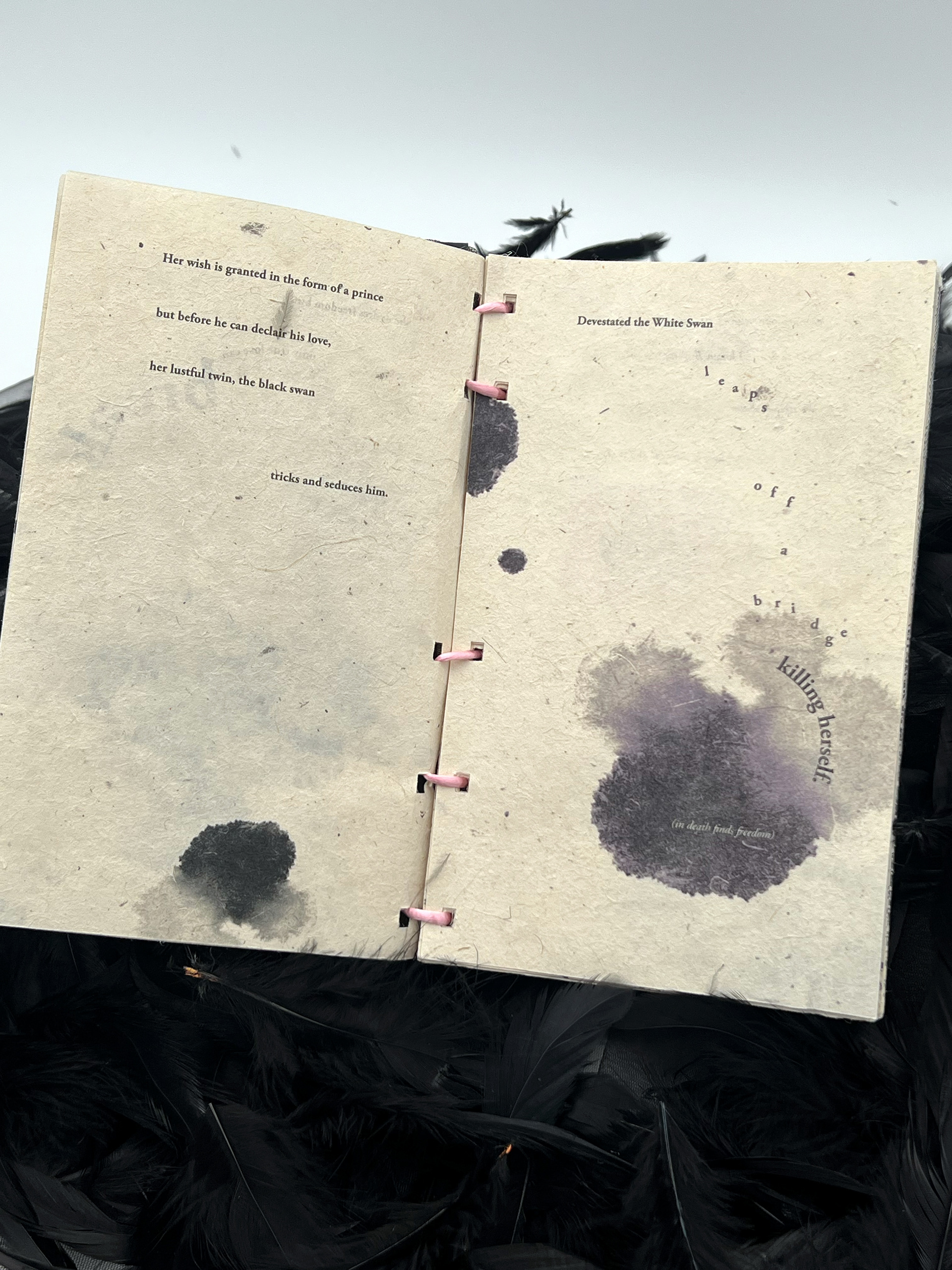
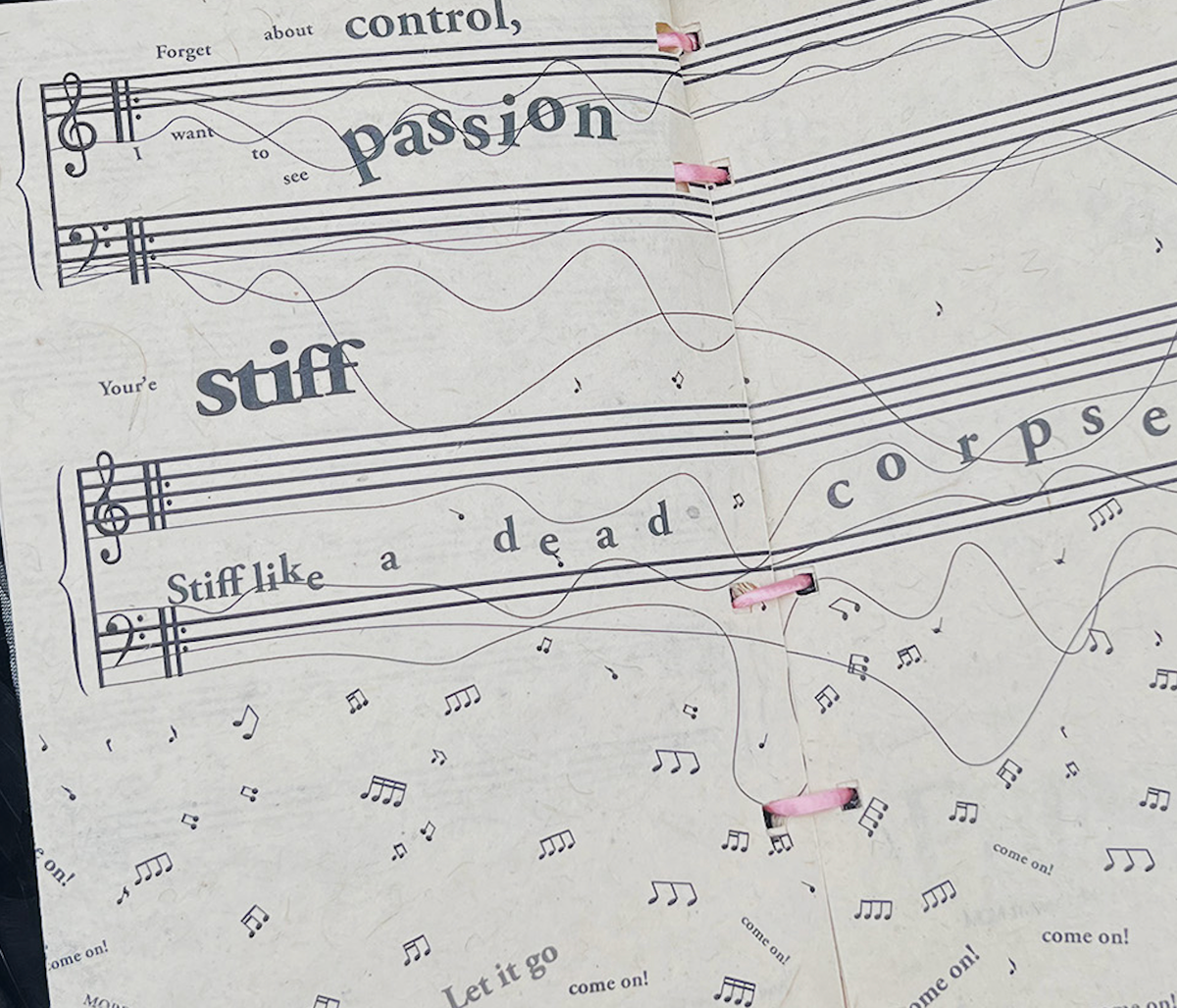
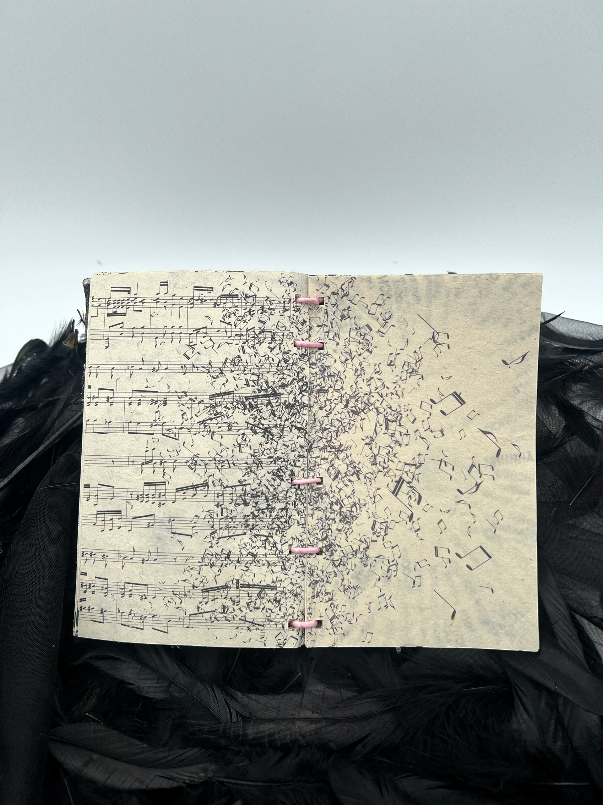
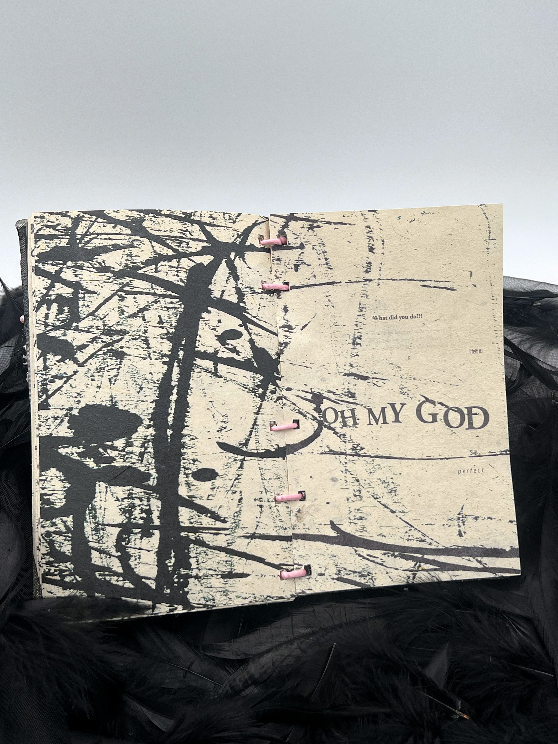
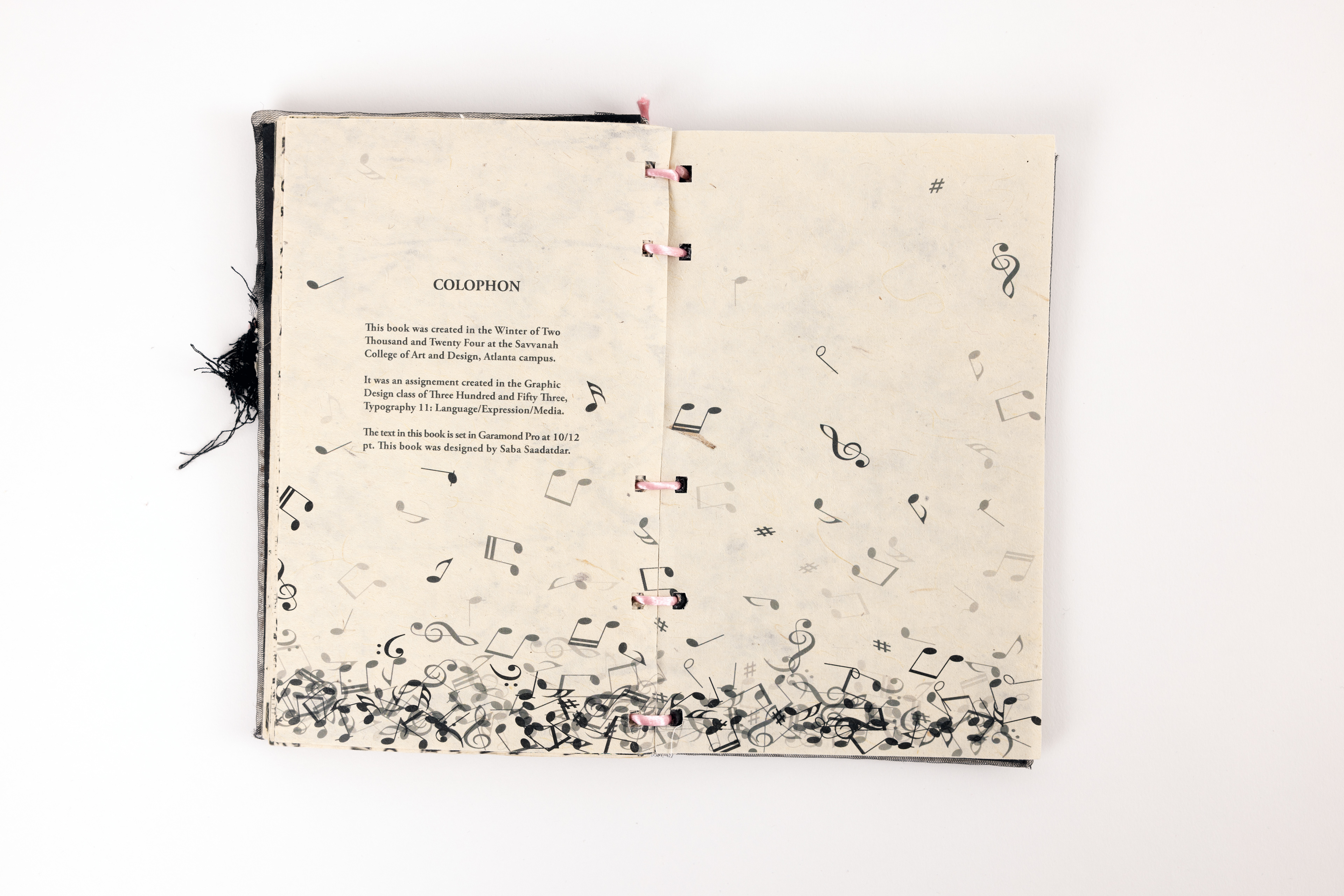
Typographically, Garamond Pro (10/12) was chosen for its classic elegance and readability, reflecting the tension between control and chaos. The book is printed on seed paper, symbolizing growth, transformation, and the cyclical nature of Nina’s journey.
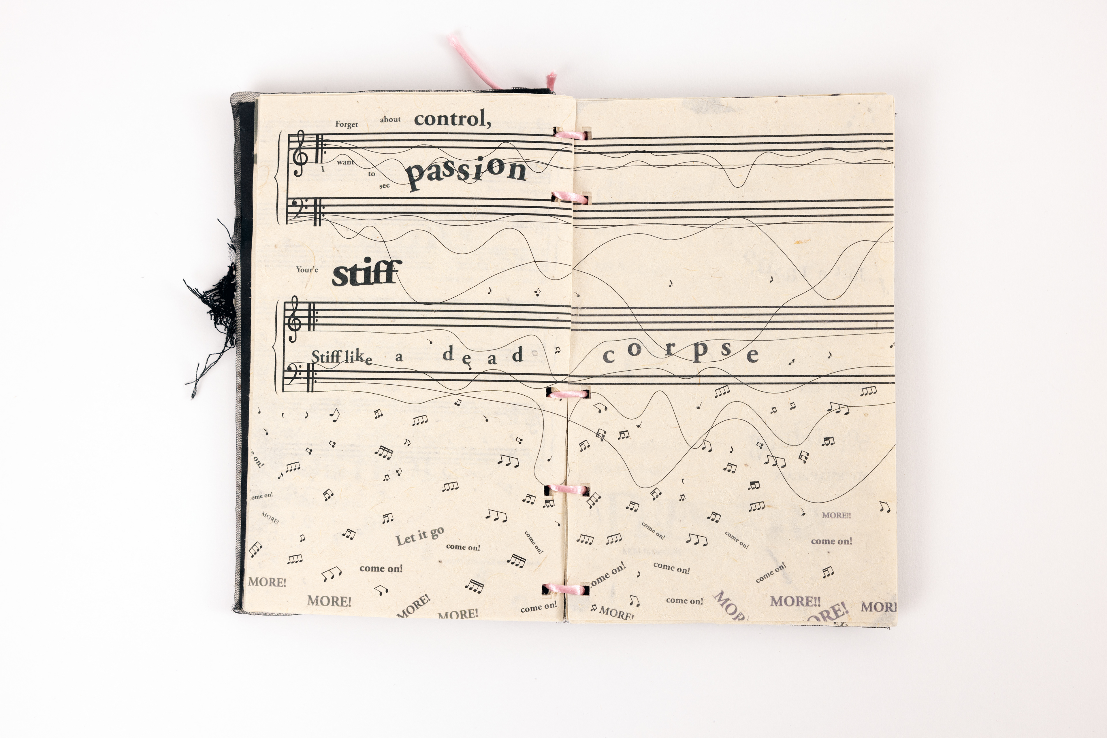
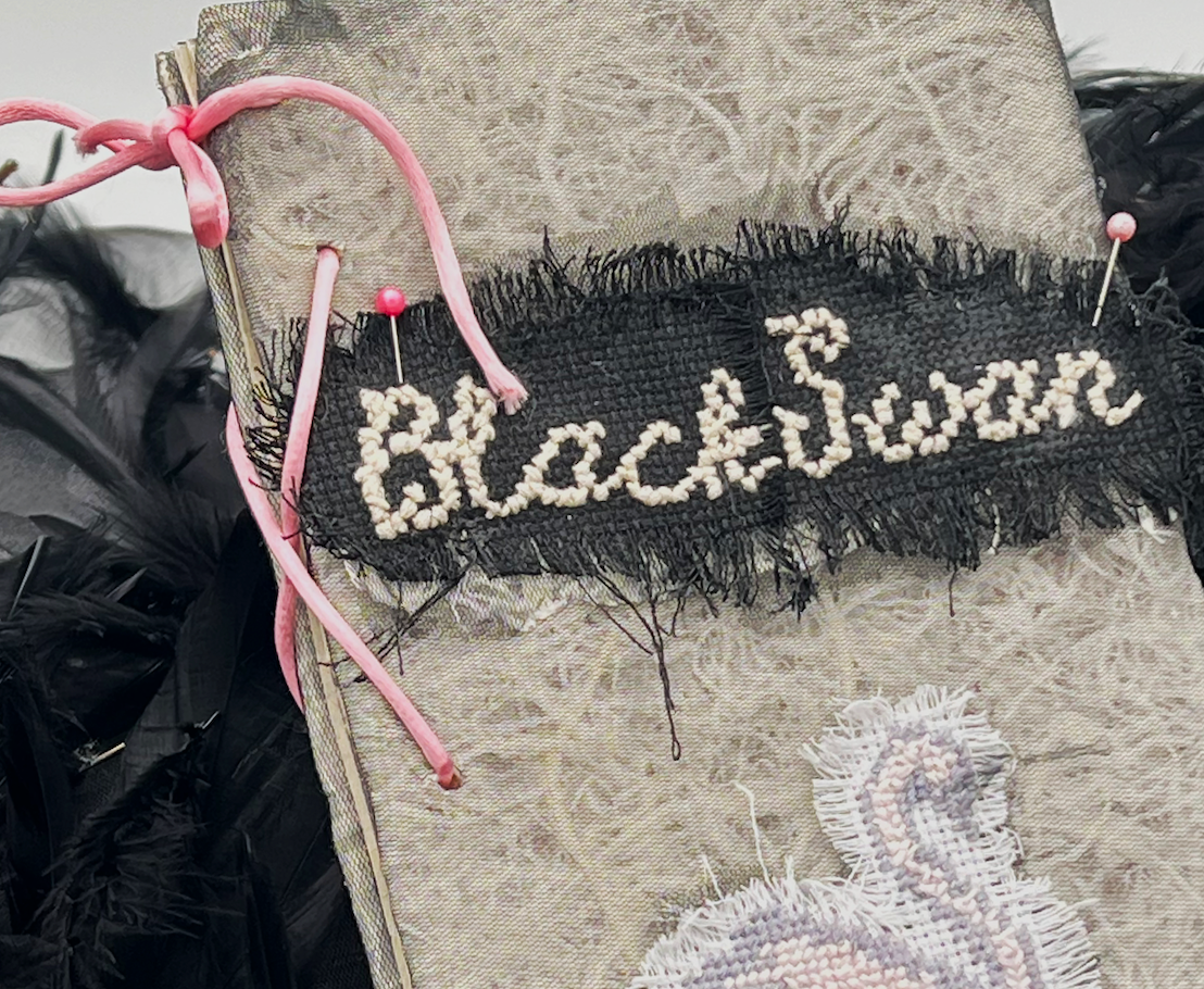
he physical design reinforces these themes, with a corset binding that references both the rigid discipline of ballet and the intense pressures placed on Nina. The cover is cross-stitched, India ink treatment introduces a raw, expressive quality that enhances the film’s psychological intensity.
This artist book was both designed digitally and handcrafted, allowing for precise typography, layout design, and material choices that align with the protagonist’s emotional and psychological descent. Recognized for its conceptual depth and craftsmanship, this book received an Honorable Mention at the 2024 SCAD Library Artist Book Competition, was featured in the Fall 2024 issue of SCAD SCAN Magazine, and received an Honorable Mention at the 2024 International Design Awards (IDA).